
Part 2 .

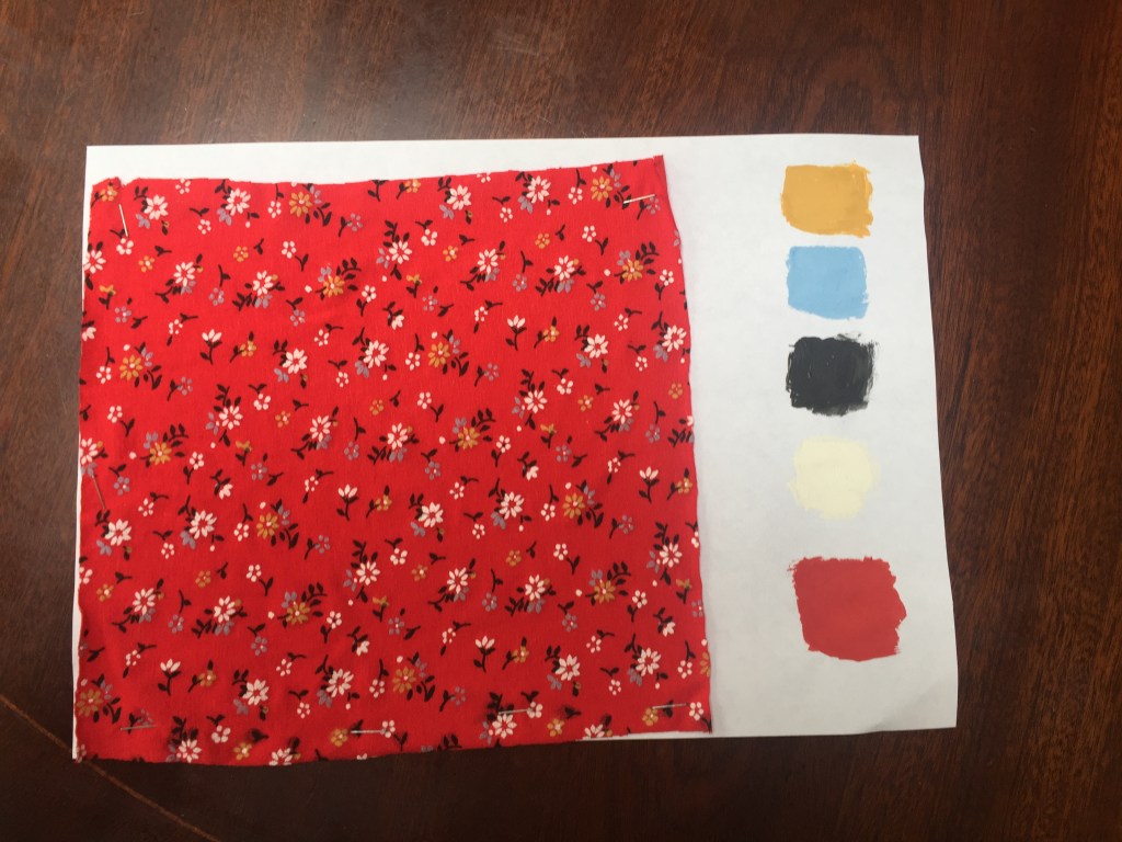
Even though I’ve tried really hard to match the colour , when it dried out it turned to change. Taking this on board , I was really happy with the result.
Part 3
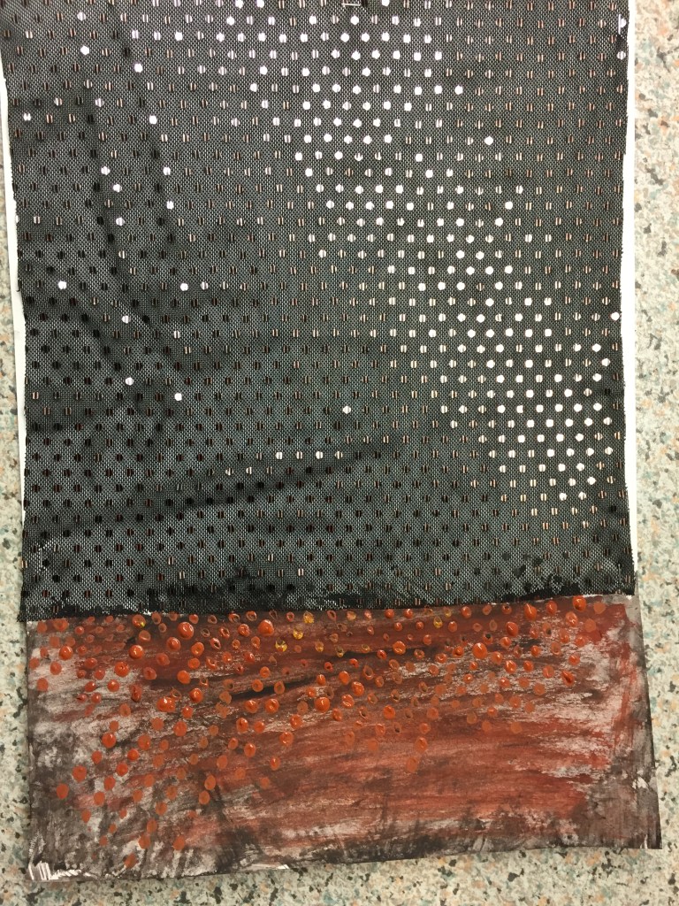
First tryout was with transparent fabric and bronze sequins .
Because the I’ve used a transparent swatch I’ve drawn the plank paper with the mix of all a cols and on top if it I tried to replicate the bronze repeat.
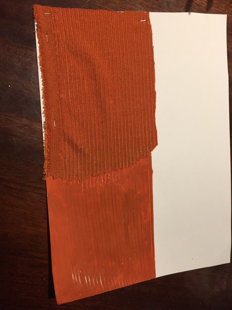
second tryout using rib fabric.
Again , the col dried leaving a different shade .
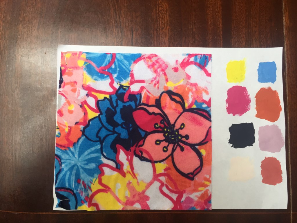
working on fabric along with paper and gouache coloring I came with an idea:
How a drawing would look using these elements?
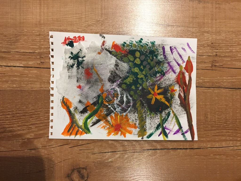
white gold glittered fabric drawn on when glued on a a gouache painting.
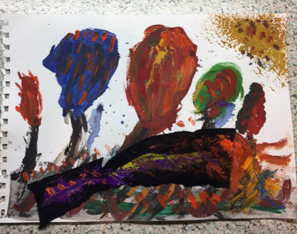
second tryout using black fabric.
