Research point (P.183)
Can you think of any designer brands characterized by their use of print and
pattern? You should be able to come up with at least one well-known high street example. Do
you think this is primarily about aesthetic considerations or is it in part an attempt to create
an identifiable brand that can then extend to other products such as fashion accessories,
household items, etc.?
Mary Katrantzou is a fashion and textile designer who takes placement print to an extreme
level. Using contemporary digital print technology, she designs the garment shape and cut
simultaneously with the print design, to achieve unique compositions on the body, quite often
fused with striking optical effects. Digital print technology allows photo-realistic images to be
printed directly onto textile substrates in millions of colours using a CMYK print process.
Do some research into her work. Start your research here:
https://www.vogue.com/fashion-shows/fall-2011-ready-to-wear/mary-katrantzou [accessed
08/12/18]
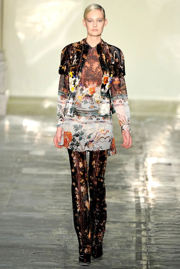
Last season, Mary Katrantzou’s tour de force of interior-exterior decoration put “the room on the woman.” So she said. This collection was more about “the woman in the room.” Stated the designer backstage today, “It’s more fluid, more real.” But the “more fluid” her “more real” got, the more you were left in the same jaw-dropped state of irreality that her Spring show had induced. That was mostly because Katrantzou imagined the woman as a connoisseur, surrounded by objects of beauty like Fabergé eggs, Meissen porcelain, cloisonné enamel, and Ming vases. And all of them were reproduced in hyper-vivid prints. The koi in one print were all but swimming before your eyes.
To match the luxurious collectibles that inspired these prints, Katrantzou borrowed silhouettes from the haute couture wardrobes of their imagined owners. (The names of legendary style icons like Diana Vreeland, Babe Paley, and the Duchess of Windsor were bandied around, though there was a bucket skirt shape that could have been in Armani’s last Couture collection.) But, to be honest, the artificiality of these shapes scarcely felt like a remove from Spring’s lamp shades.
Anyway, it’s a no-brainer that a flat, wide pannier or peplum makes a perfect screen for Katrantzou’s projections. Things got more interesting when the designer softened her silhouette. “It’s hellishly difficult to put a placement print on a bias-cut dress,” she sighed backstage. Even to those of us uninitiated in the art of printmaking, the challenge presents itself as something like nailing water to the floor. Remarkably, the designer mastered the bias, and a whole lot of other soft options besides, from a Lurex-shot Orientalist knit sheath to daisy-strewn panne velvet to a billowing purple infanta gown.
The softness was a plus for any woman who would rather wear her Katrantzou than hang it on the wall. But one day, it will belong there too, on the wall of a museum, in an exhibition dedicated to the absorbing aesthetic excess of our era. “I want to push print to the limit,” said Katrantzou, at the same time as she encouraged us to think there mightn’t be one.


What do you make of the article’s reference to ‘the room on the woman’ and ‘the woman in the
room’?
What Mary Katrantzou is trying to do through her unique and inspired work is to idolize the woman and treat her as a precious artifact, a piece of art. Her garments stand out. Her prints stand out from the crowd ; The wearer becomes ‘the room on the woman’ and ‘the woman in the room’.
Make some notes in your learning log
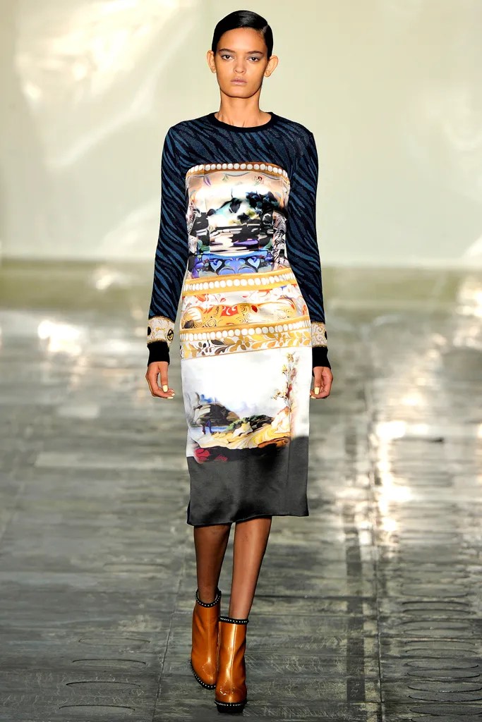
Mary Katrantzou, the Greek-born, London-based designer, burst onto the scene in 2008 with prints that were, as Vogue put it, “almost beyond imaginable limits.” Because of her innovations with computer-based prints of typewriters, shoes, jewelry, and perfume bottles—which were rabidly copied at every price point—the magazine dubbed her London’s “daughter of the digital revolution.”
Inquiry and flexibility seems to be part of Katrantzou’s DNA: She started out studying architecture at Rhode Island School of Design, the transferred to Central Saint Martins for textile design, gradually seguing from creating patterns for interiors to those for fashion while working with Sophia Kokosalaki. Since then, honors—including multiple prizes from the British Fashion Awards—and collaborations with Topshop, Current/Elliott, Adidas, and Lesage, among others, have been lavished upon her.
Though she found immediate success with her innovative patterns, to think of Katrantzou only in terms of print or tech would be a mistake, because she’s continually pushing and evolving. “The Marchesa Luisa Casati once stated, ‘I want to be a living work of art,’” Katrantzou explained, “and by adorning themselves in the culture and the history of art and design, women can indulge in the luxury of craftsmanship.” The luxury of craftsmanship is exactly what Katrantzou delivers, by means both high-tech and analog.

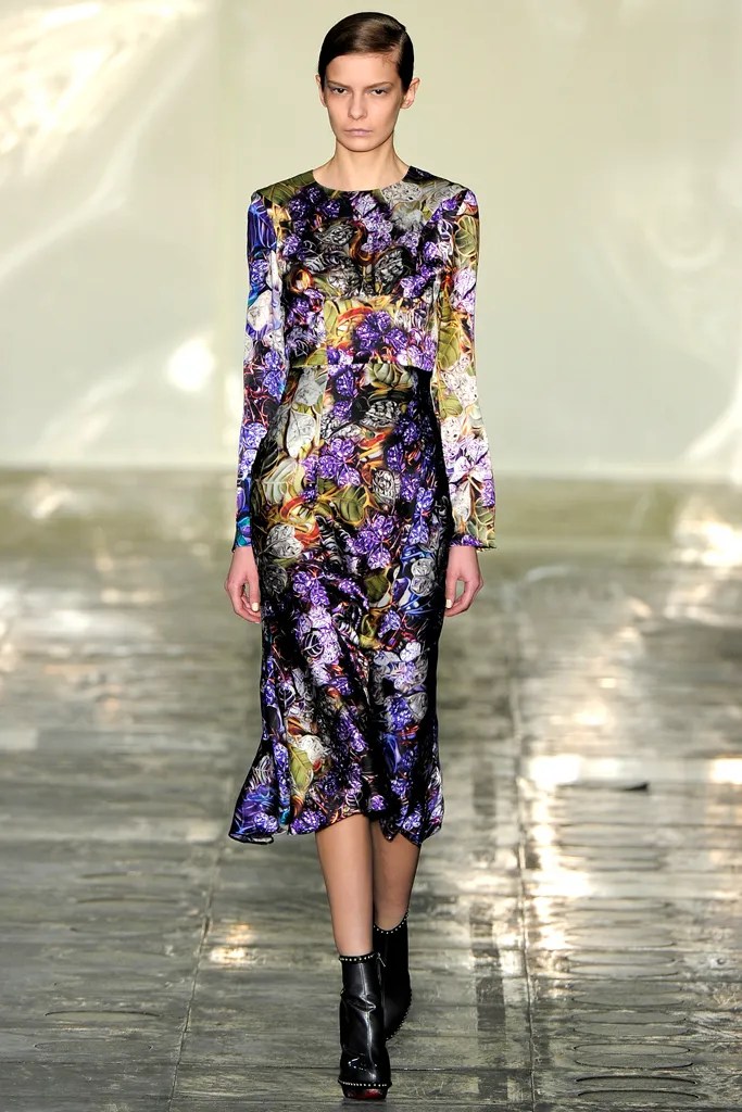
Portraits of Madame de Pompadour, the paintings of Fragonard and Nattier—what could the frills and curlicues of the rococo have to do with the digital print revolution? “Yes, it’s excessive, and decorative, and I know everyone else is talking about minimalism,” shrugged Mary Katrantzou, backstage after her show. “But I knew I needed to go a little outside the stuff I’ve been doing. And I do like a challenge.”
She was referring to the need to feel her way into new silhouettes as well as to find some way of breaking out of the kaleidoscopic swirls and sharp-angled geometric explosions that have characterized the sensational prints coming out of London in the last two or three years. Katrantzou, a print and textile expert, has been at the forefront of inventing a new visual language that has stunned fashion with its novelty—a language Alexander McQueen was also using fluently in his last two shows. Her problem, rightly anticipated, is that novelty quickly becomes cliché—and a cheap T-shirt dress on a market stall. To keep things interesting, Katrantzou knows she has to do something more sophisticated than a placement print on a shift dress.
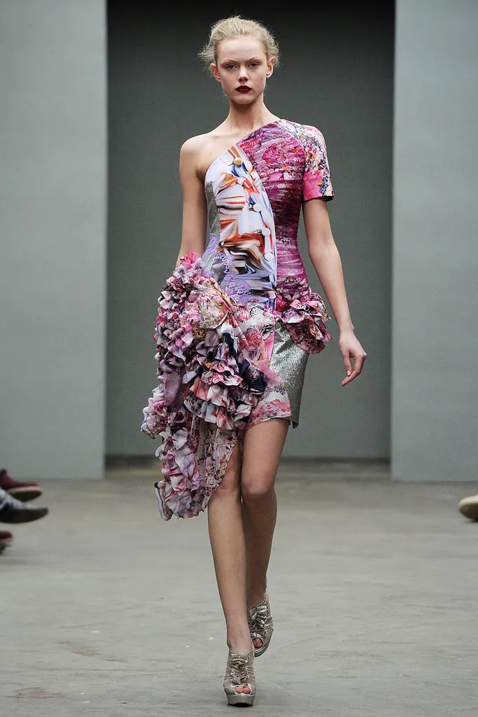
This time, she merged photographic images of lace, jewels, ormolu, medals, and sashes in ways that vaguely recalled Gianni Versace’s more-is-more scarf prints, and she sculpted some of them into shapes that echoed parts of military jackets. Printed vest-jackets, a couple of Napoleonic coats, and a frothy frill-front shirt added bandwidth to her offer, too. Still, the effects, though interesting, seemed slightly stiff and forced until Katrantzou let herself go at the end, sending out a couple of dresses that combined asymmetric bodices, lace patched against print, glints of metallic, and cascades of half-trains trailing off at the side. Somehow, they succeeded in hitting a note of oddness that seemed new.
SOURCE: VOGUE RUNWAY Mary Katrantzou Fall 2010 Ready-to-Wear BY SARAH MOWER accessed:22/11/22