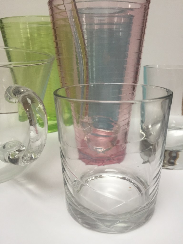
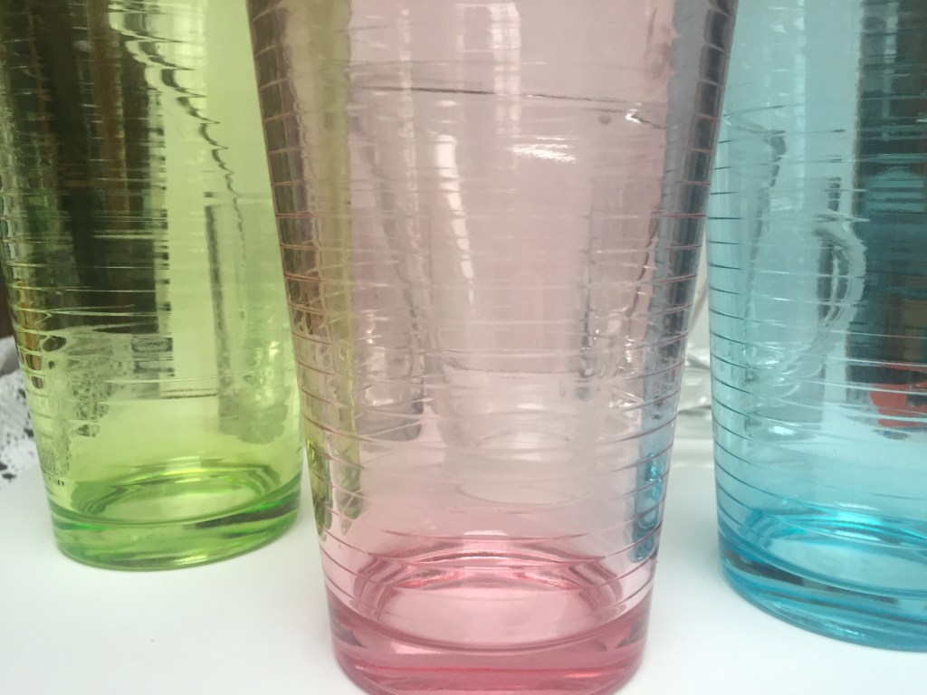
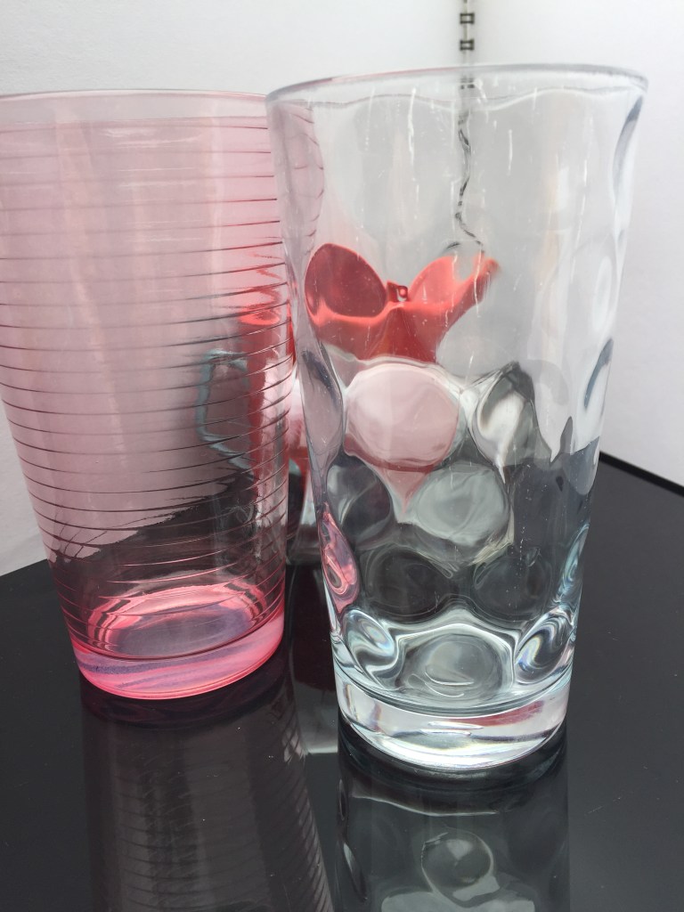
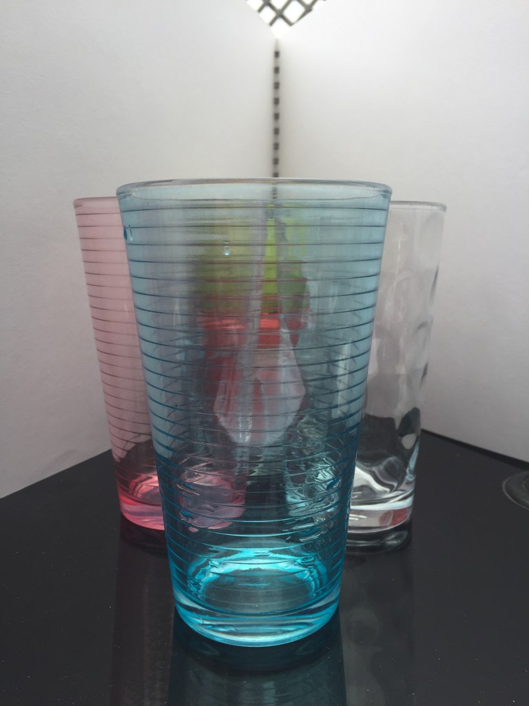
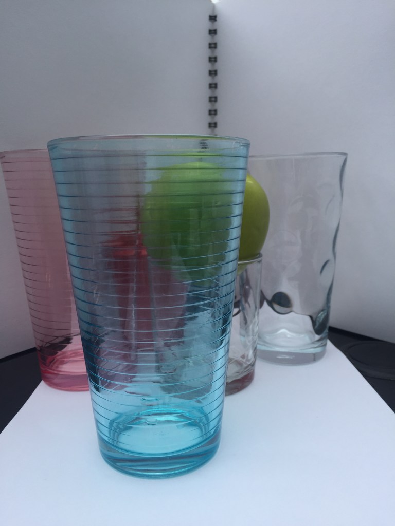
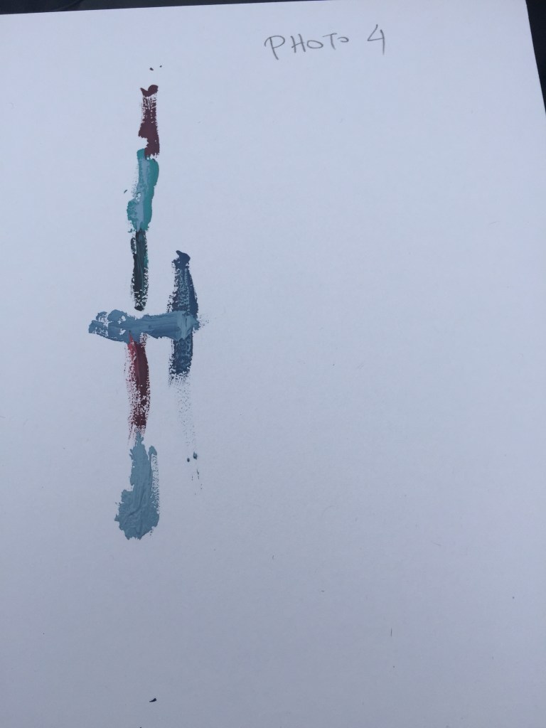
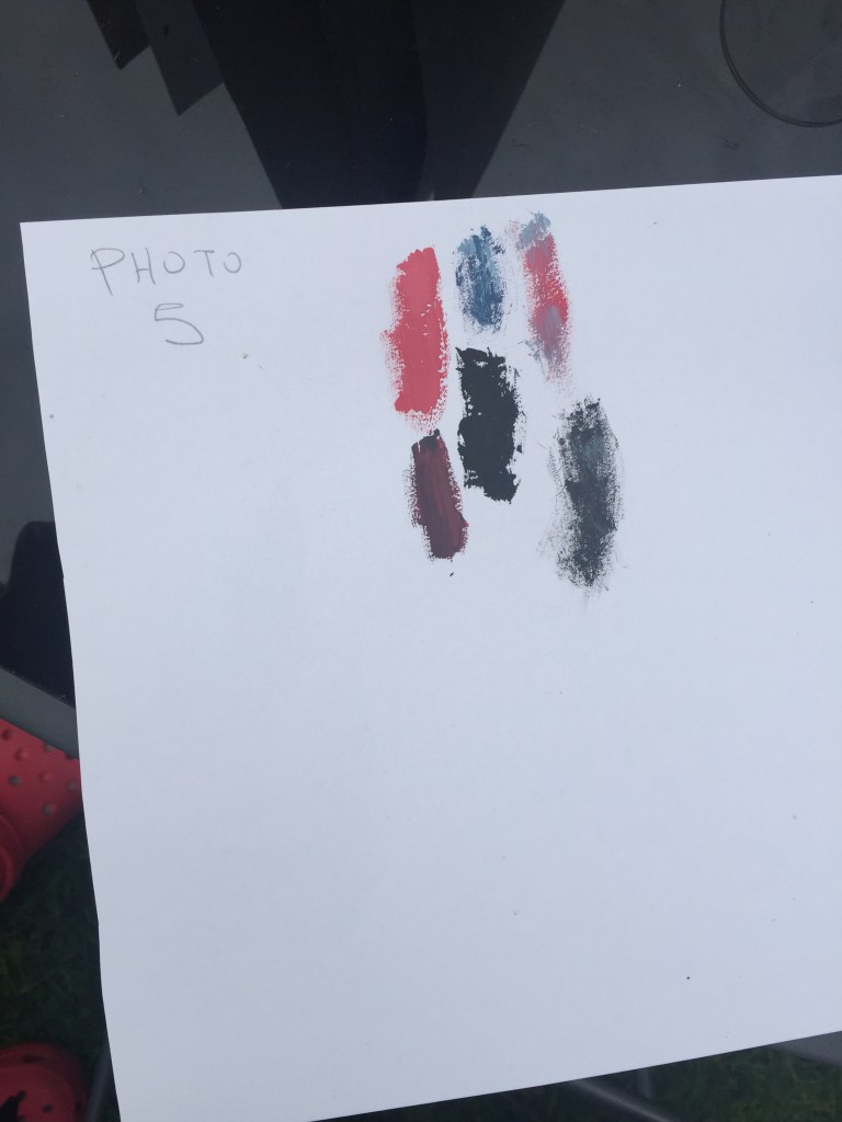
I’ve attempted to capture the different colours from glasses aligned as well as how the colour looks when shades merge .On top of that, to make it look more interesting and challenging, I found a transparent sauce serving utensil with a matching sauce spoon which displayed a different perspective and added more curves and depth to the picture and made the colour follow it’s shape.
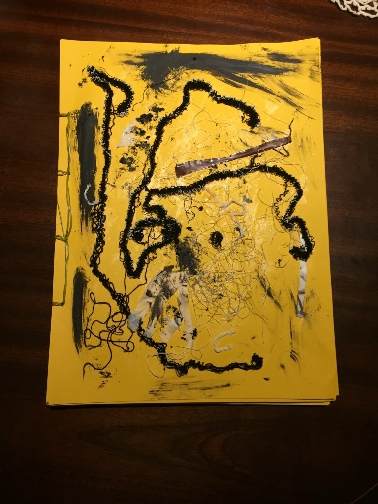
Following my tutors instruction , I’ve added extra work on this assignment.
To add a more colour depth and variety I’ve used a plastic green apple and a red sauce utensil with a light blue handle always sitting on the back.
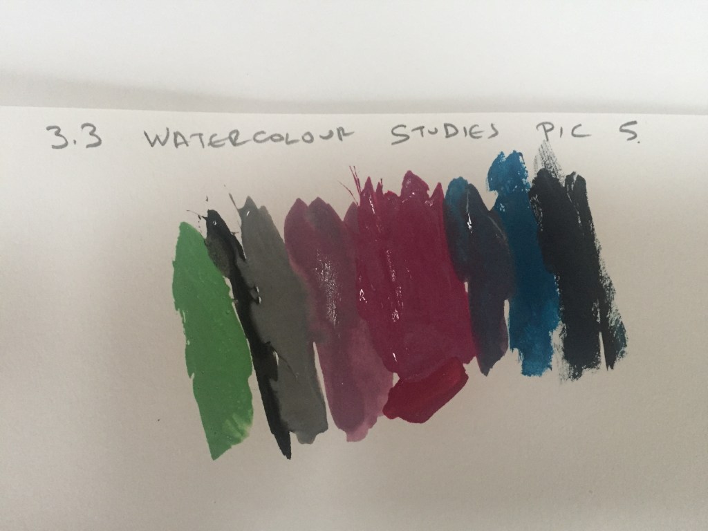
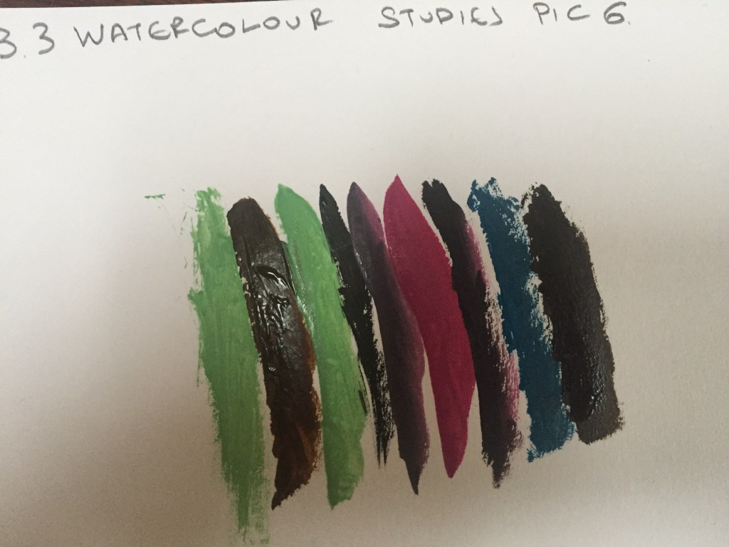
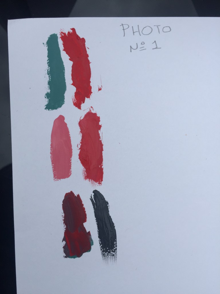
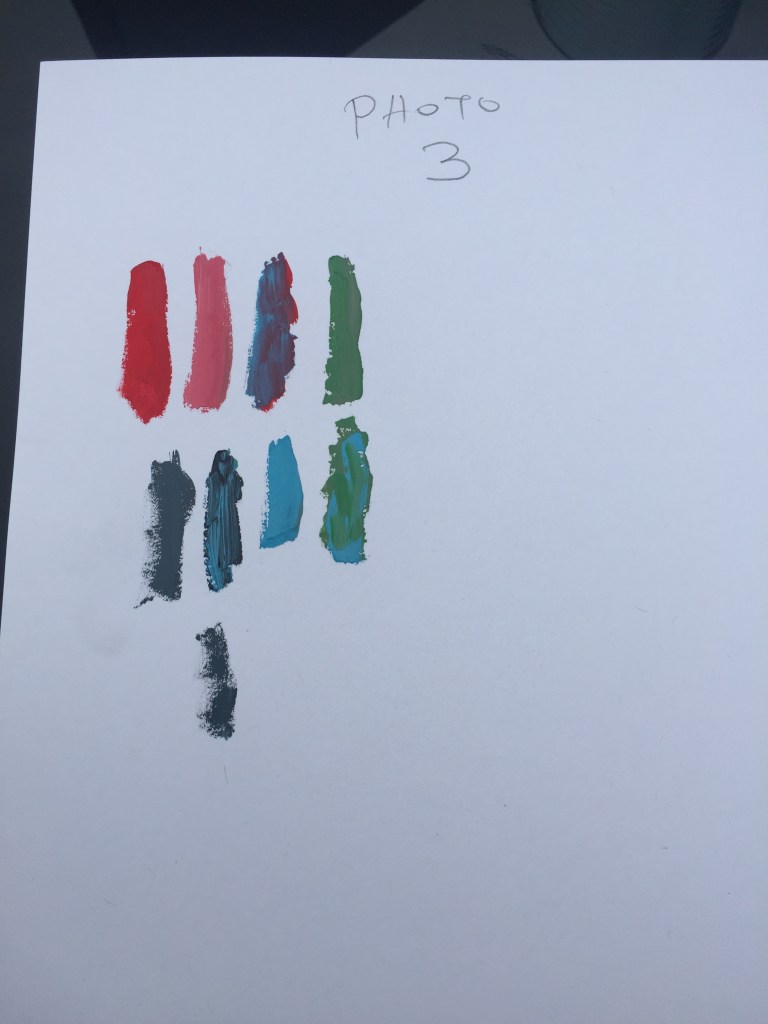
I thought what if I use the same glasses, but on a black surface with a white background?
I realized that colours tended to look darker.
On the following photo I’ve used same alignment of my glasses but I’ve used white surface to see the colour difference: Colours came out lighter.
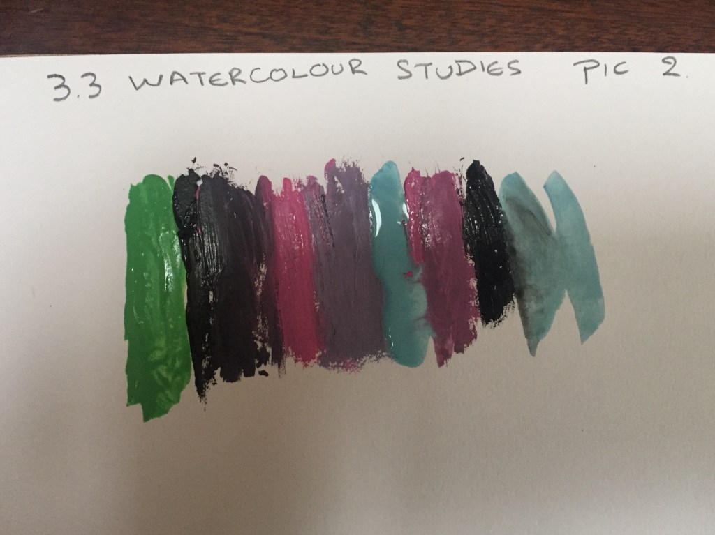
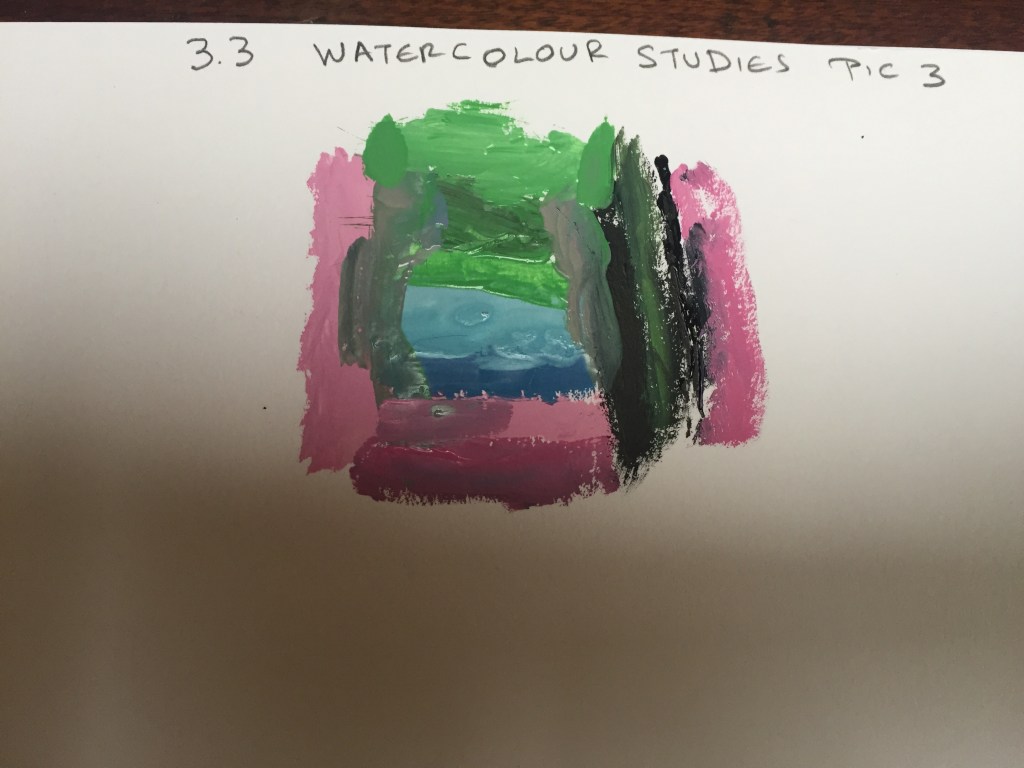
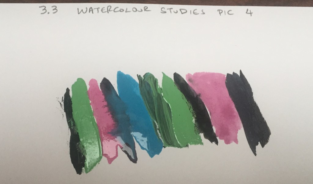
Assignment 3.3 worked for me really well eventually. My main gain was regarding how the colour works in different environments and how shades change through semi transparent surfaces . Playing and observing colours was an exciting expedience .
Assignment 3 had been a roller-coaster :each time I was starting to work on a new project I was feeling like I was going down ;then, when I was getting my self comfortable finding my way through it, I was having great boost of confidence getting excitement and fulfillment. I’ve learned so much and the most important thing is I’ve realized that there is a lot more to discover and more tools to take on board.
My main strengths are my textile background and my vivid imagination: doing my work I had got a lot of inspiration from paper cutouts where (my imagination) had been triggered by colour and the relation with it. I’ve created pieces I’m really proud of and best of all reflect on my feelings creating them.
By the end of the assignment , on the last few pieces, I felt I wanted to do more, tell a story, I wanted to communicate my feelings whilst I was working on my project and to my great satisfaction the tools I was using and studying on did a brilliant job.
Main gain of this part of my journey is that I have discovered collage in particular as a way to express myself and to my great surprise how it works with gauche colours on different surfaces and paper textures.
Research the colour work of some textile artists and designers, starting with the names listed below.
-Voyage Decoration
-Wallace&Sewell
-Paul Smith
-Marimekko
-Cole & Son
-Vlisco
-Mary Katrantzou
-Norma Starszakowna
-Ptolemy Mann
Voyage Decoration
footage copied from Voyage Decoration web site
Interior design fabrics made to create cushions and furniture upholstery: the painting style is bold with playful shaping, detail and content, using an opulent colour palette portrays richness and personality making you feel welcome in a cozy and relaxing environment.
a voyage decoration cushion with pale easy in the eye colours with a vintage and nostalgic colour palette
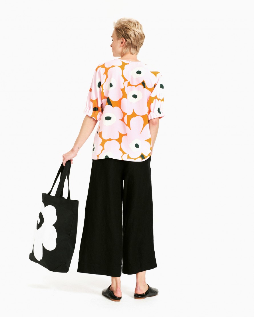
Marimekko
Marimekko is a Finnish lifestyle design house celebrated worldwide for its original prints and colours :there are monochrome designs as well as really vivid and bright colour prints which create a great contrast and colour coordination.
footage copied from Marimekko web site
monochrome combined with vivid coloured floral design top . Colour combinations that make the coloured print stand out even more.
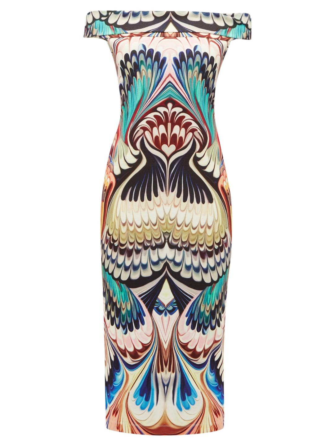
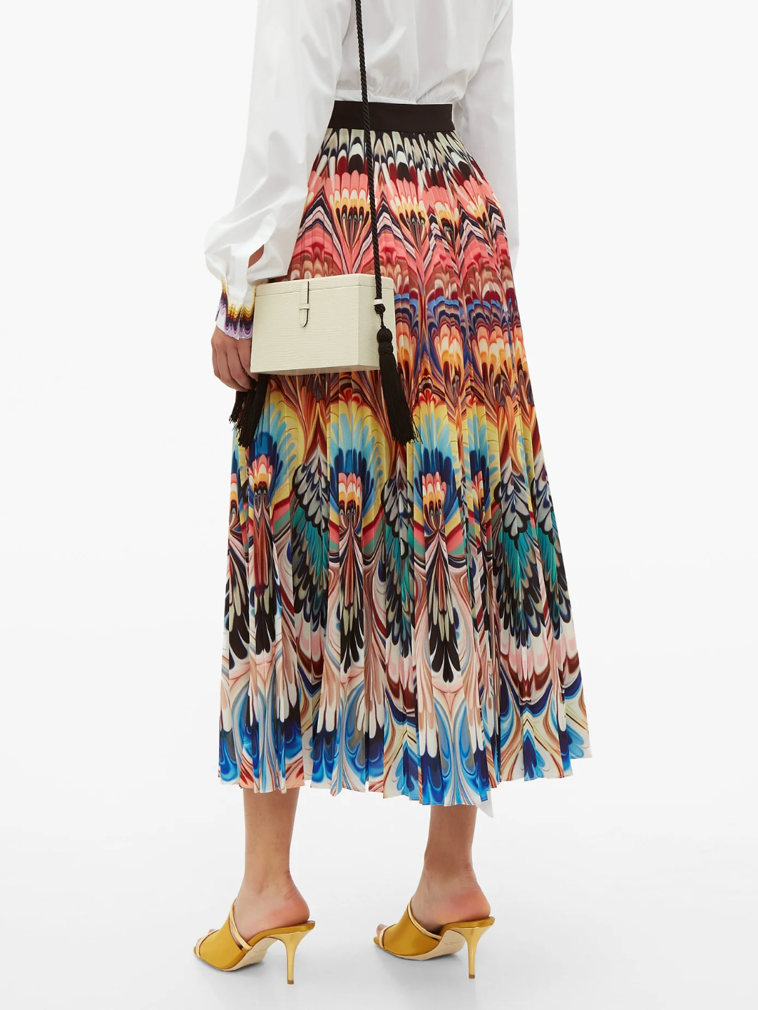
Mary Katrantzou
Mary Katrantzou– or as fashion world likes to call her, Queen of Prints – is unrivaled in her innovative, architectural approach to fashion design.
Her catchy and bold colour coordination along with carefully selected prints and jacquard patterns create a unique handwriting.
Colours are bold and in proportion either they are in colour block designs or stripes:
footage copied from Katrantzou web site
The Mary Katrantzou Cardigan in Malachite features. A knitted print reminiscent of the organic earth malachite patterns(malachite is a green gemstone with characteristic concentric eye like rings) in optic prints and earthy fresh and vivid rainbow colours: ideal for Spring Summer outfits. A colourful marble print adorns this jersey off-the-shoulder dress : It skims the figure for a flattering silhouette, while the curved pattern enhances a feminine hourglass shape Famed for its use of vivid patterns, Mary Katrantzou showcases an eclectic mix of textural prints on this multicoloured long striped dress
The kaleidoscopic print which adorns Mary Katrantzou’s Uni Marble Placed skirt is ideal for summer – inflected with warm hues of orange and pink which then fade to cooler tones towards the hem. It’s crafted from textured crepe and pleated for a feminine drape which accentuates the abstract pattern
Wallace & Sewell
Wallace&Sewell are renowned for their range of quality throws and blankets and scarves.Inspired by paintings, they create individual contemporary fabrics with strikingly bold, asymmetric blocks and stripes of varying scales.
pale oil painting lookalike colours along with design create wearable or (in case of throws) everyday use work of art.
Cole & Son
Wallpaper inspired fabrics , colours used to give a dramatic and loud outcome: Colour is celebrated at it’s best used as a background as well as the main element.
Footage copied from Cole & Son web site
A mid-blue, Petrol’s green base bestows a warm core, whilst its blue overtones offer a bright, light finish. A perfect pairing with the gentle earthiness of golden ochre, a mid-yellow whose tone enhances the warmth of this contemporary palette.
Norma Starszakowna
The artist has used colour to help convey her feelings about Scotland’s history and achievements – there are dark tones of Celtic standing stones and local mining industries, greens and blues of agricultural land and seascapes, bright colours of philosophy, education, science and medicine through to the gold and silver that the artist uses to convey her feelings about the Scottish Enlightenment period.
source of the footage Victoria and Albert Museum
Each piece is inscribed with fragments of graffiti and messages that are highly evocative and include subtle references to both universal truths and highly personal experiences. Born in Scotland, Starszakowna remembers as a child standing on her father’s shoulders, pinning his political pamphlets high up on walls beyond the reach of human destruction . source: Victoria and Albert Museum
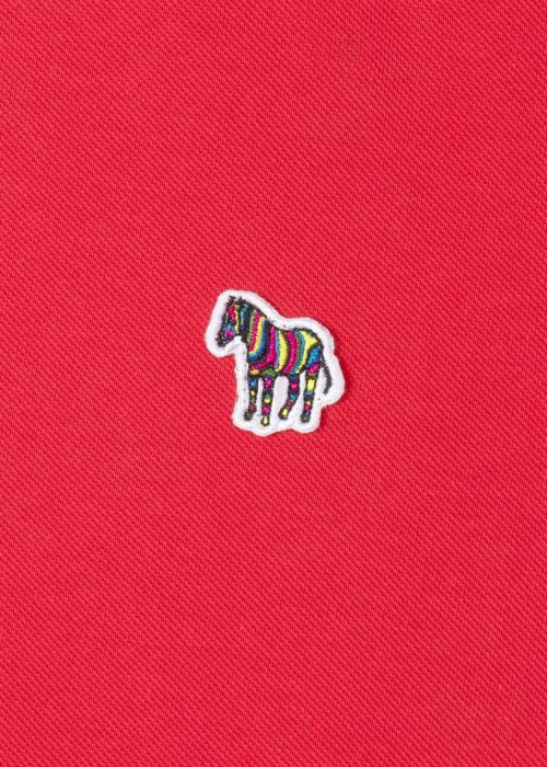
Paul Smith
Sir Paul Smith is almost the last of the great indie designers. A gentleman who has built a global brand on style and cool clothes. His signature design include stripes: lots lots of stripes in different colour and different size in order to avoid repeat as much as possible.
footage from Paul Smith website
His signature logo is a Zebra : Zebras have stripes which are unique to every animal . Paul smith uses colour in order to emphasize uniqueness. Signature stripe beach towel: Uneven stripes in a non uniform repeat in pale earthy colours create a unique fabric Men’s signature stripe silk Pocket Square : earthy colours that stand out and create a beautiful contrast
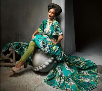
Vlisco
Vlisco has been designing and manufacturing distinctive fabrics loved by African women since 1846. Inspired by Africa, made with a technique derived from Indonesian Batik, designed in the Netherlands, Vlisco’s heritage and design signature is a multicultural melting pot of beauty and industrial craftsmanship.
footage from Vlisco website.
colours warm bold and exotic , inspired from Africa
Ptolemy Mann
Ptolemy Mann is a rug designer with a unique handwriting , working in collaboration with Julian Blair with whom she is sharing the same passion.
Her designs are colourful and unique inspired by weavers and dyers from India and Nepal.
footage taken from Ptolemy Mann website.
each rug is hand-dyed and meticulously hand-finished a unique look
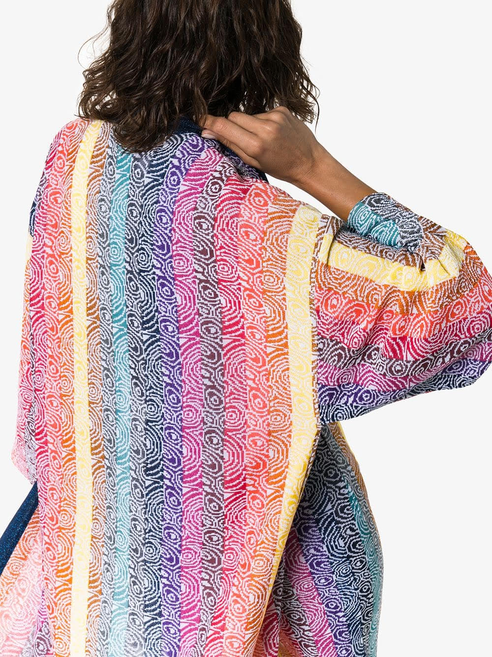
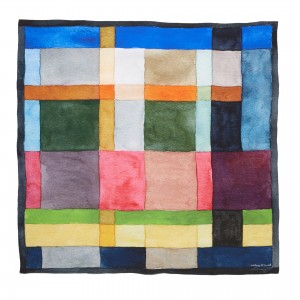
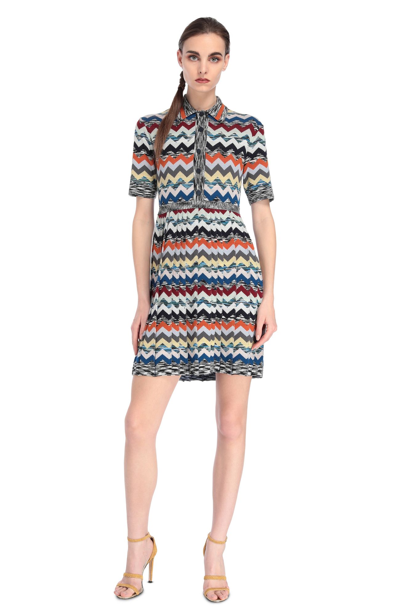
MISSONI
colour in its best!
Missoni has a unique way of using colours and colour combinations in order to create high end fashion items.
Starting with a few simple chevron-patterned wovens produced in a small factory in Gallarate, Italypioneered the now widely used space-dying technique for yarn — still the magic ingredient in the house’s signature kaleidoscopic knits.
footage taken from MISSONI website
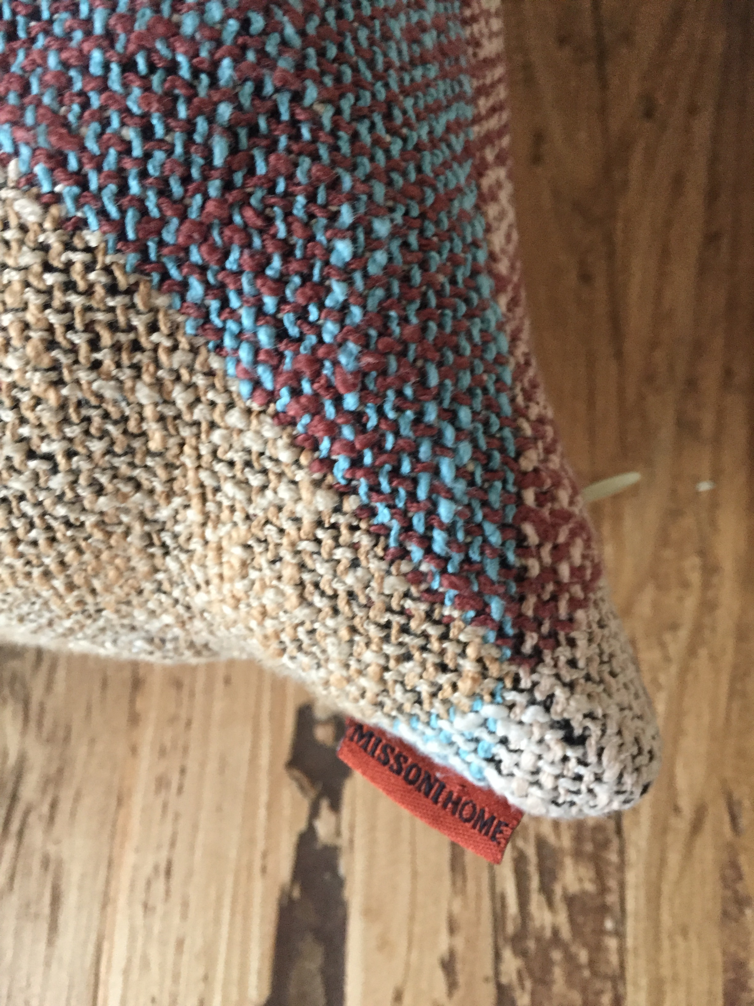
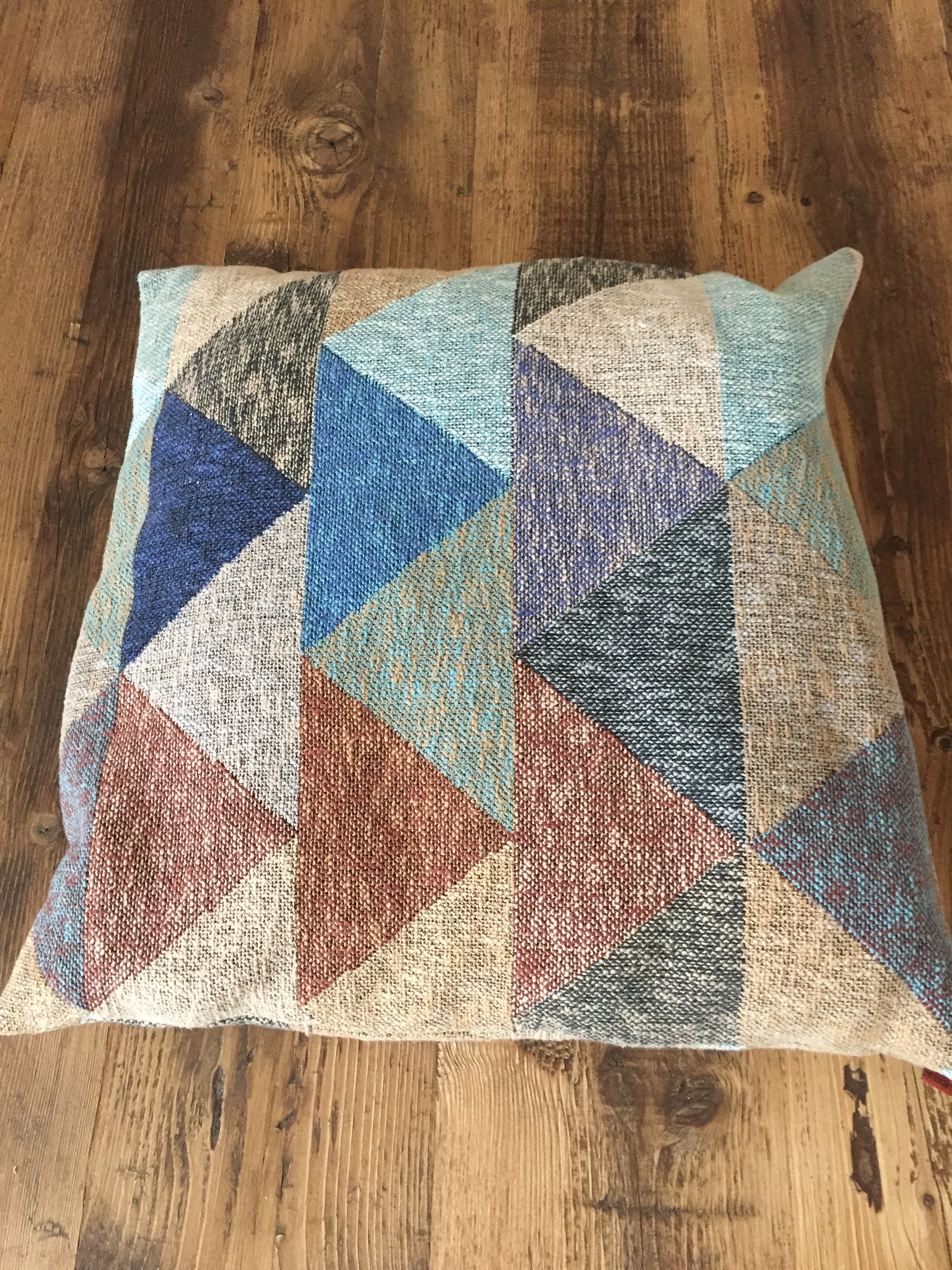
one of the House’s signature designs multicolour zigzag patternI found these pillows really interesting. they’ve got the Missoni signature chevrons created with pale earthy and subtle colours .Easy on the eye, simple colour combination but along with the signature design they stand out !
These pillow pictures come to compliment my comments regarding Missoni handwriting: no matter the product , colour selection plays significant role to the design house and shows the unlimited colour coordination possibilities.
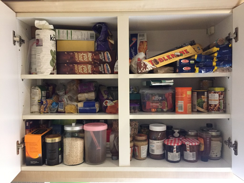
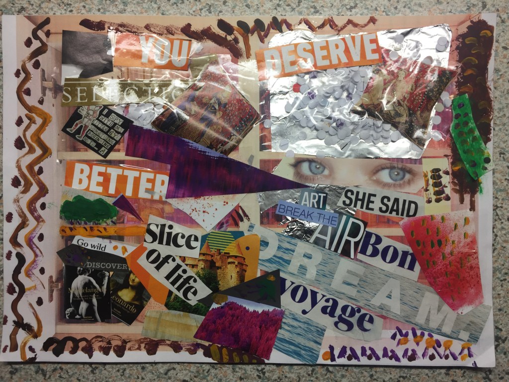
It captured my attention because I found it colorful (a bit messy but in a sort of order) as well as I loved the idea of having things placed in sections.
I would never imagine how I could make this work .
To my big surprise , when I’ve gathered the materials together I could see every single paper cutting to be a potential item to use.
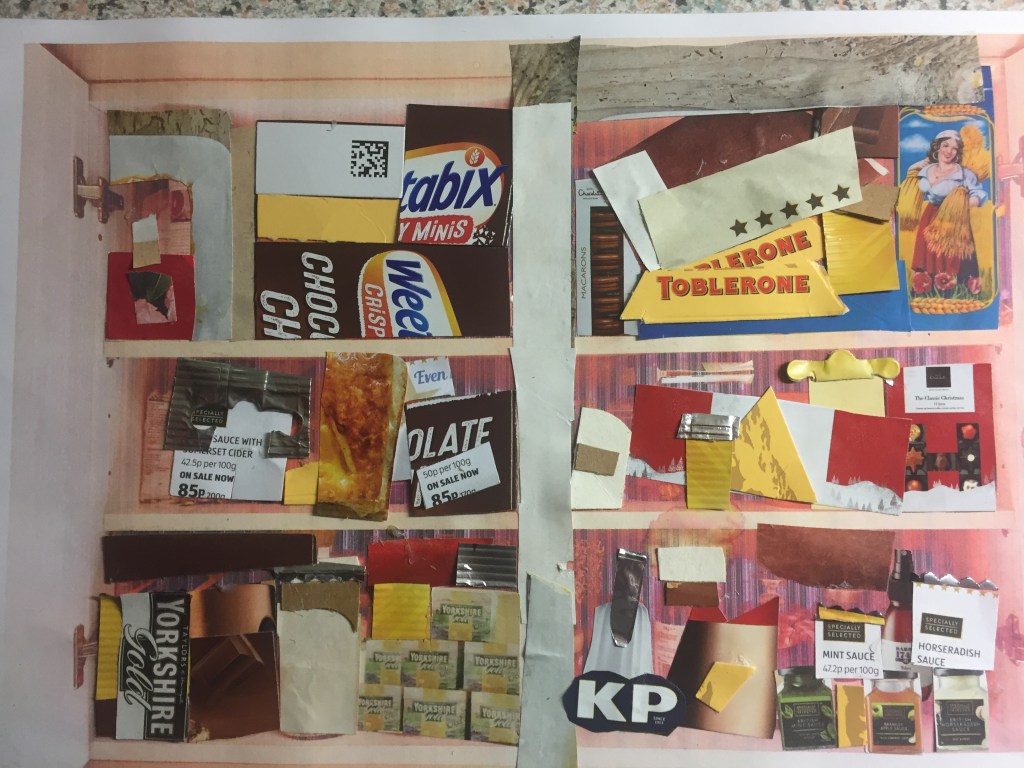
My process was simple: capture a picture of my subject ,print it and then keep it as a template to ”build” on it.
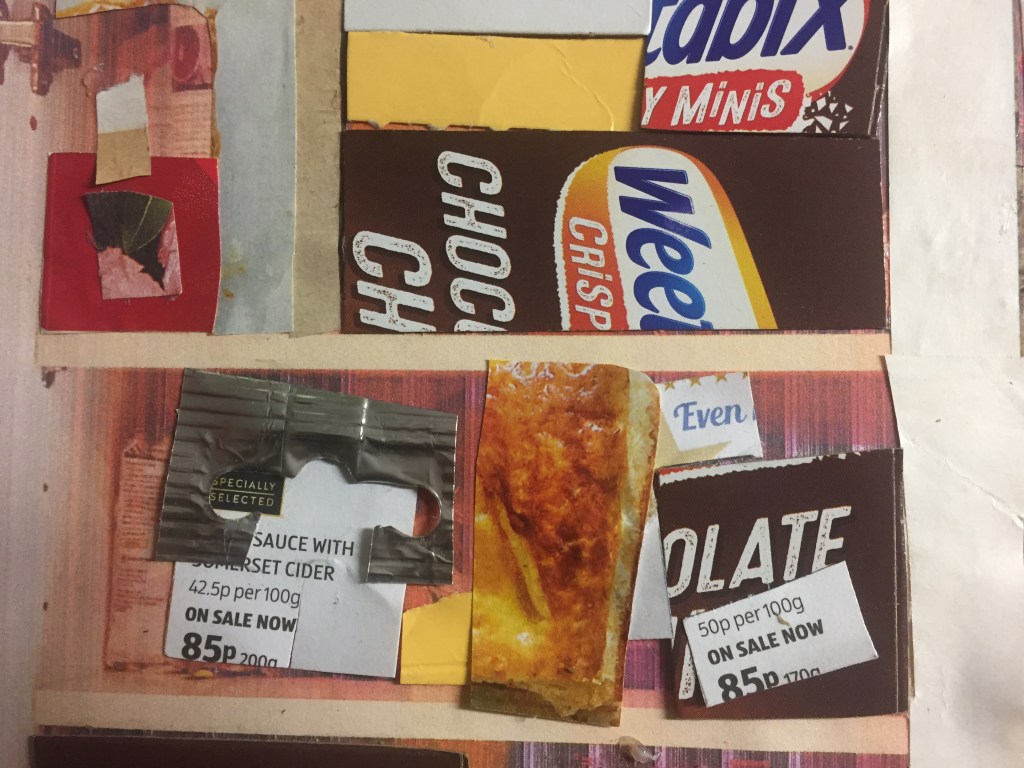
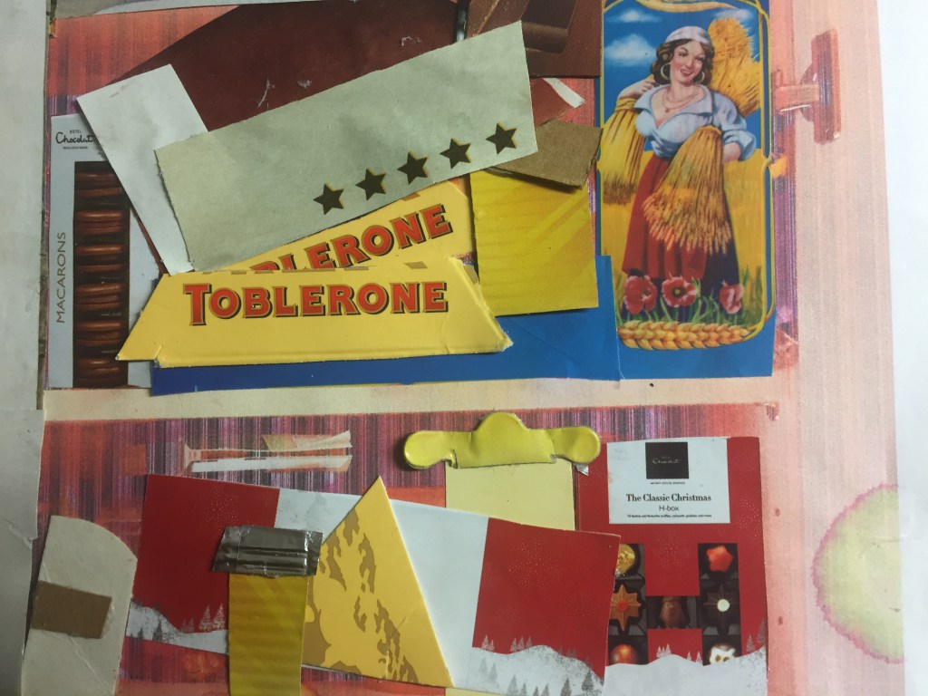
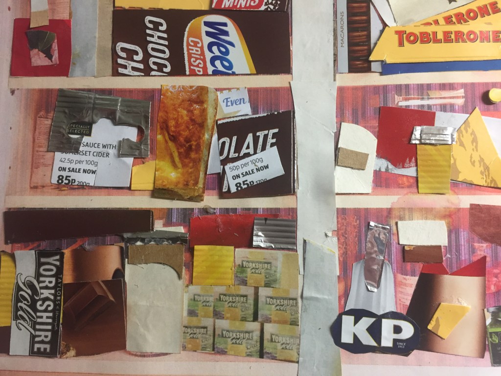
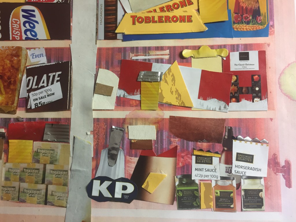
original image: a cupboard full of jars , boxes and food containers.
I’ve used magazine sheets along with covers of all sorts:pasta wrapping film , cereal cartons,chocolate boxes, as well as foil bags .
FINISHED COLLAGE TOP LEFT DETAIL…TOP RIGHT DETAILBOTTOM LEFT DETAILBOTTOM RIGHT DETAIL
Reflecting on the first inspiration image have intrigued me to push my imagination far beyond the limits : What if I mixed all the cols of the original picture and create a new vision of it?
By taking inspiration from Jackson Pollock’s abstract paintings I’ve drawn the background using a colour mix abstract painting and then I’ve created a central frame with masking paper in order to give the same cupboard-block shelf impression.
After that , I’ve decided to cover 3 out of six sections with collage .
Again I’ve tried to use as many colours as I could but I also , make it as abstract as possible.
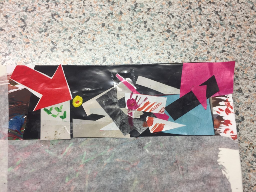
I get a great inspiration by using arrows !I find them really powerful features to play with: they sort of give you a sense of movement, a sense of pointing on something, they capture your attention and make you see things differently …
I’ve used gauche water colours to finish it off.
getting to the point:literally.bottom left using an arrow againbottom right .
For my final piece of work I wanted to be more metaphorical :
I saw the open cupboard with my displays in as a window : it might contained food, which is the main element to keep us alive , but I’ve perceived it as a view, as frame from where you can look through and communicate with people’s hearts , people’s subconscious…
Using a print out of the original picture as a template again, where I can glue things on , I’ve noticed that it looks like as a comic book page, taking you from one block to the other, which helped me tell my story even better.
I’ve cut words I find really strong out and I’ve assigned them in such a way that can be read and perceived in many ways so anybody can make a different conclusion out of it.
Colour is again the main subject: using gauche colouring as well as different colours of magazine sheets .
I’ve played with layers and surface a bit by using cuttings of a hole puncher which they might represent ideas glued on foil (subconscious) and enclosed with sellotape(conscious) , standing on top of a pair of eyes representing a head.
I’ve placed an arrow (again) pointing on a word in a way it finishes a sentence off.
To my great surprise I found sellotape as a material really useful to work with as it doesn’t only put things together , but it adds transparency and sheen.
My final collage using gauche colouring
Working on these pieces was really challenging : At the beginning I was struggling to work how to process the idea ,the inspiration, to find a piece interesting for me to build onto and take it further.
But ,when I captured the picture , and made the necessary collage creating research ,the whole work flowed really well and to my great pleasure it was a bit of a therapy to me.
—————————————————————————————————————————————-
PART 2
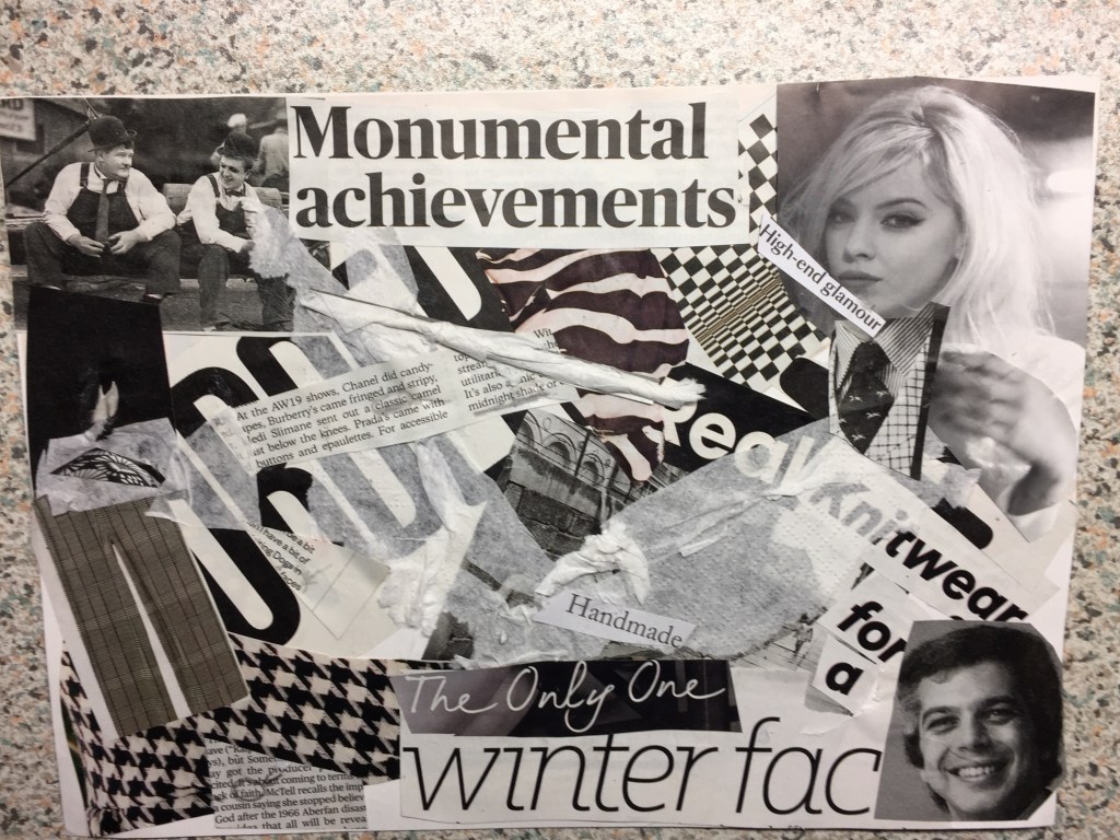
Using my last collage as a starting point and being asked to do a monochrome work based on one of my previous pieces I found myself working on the same concept unconsciously.
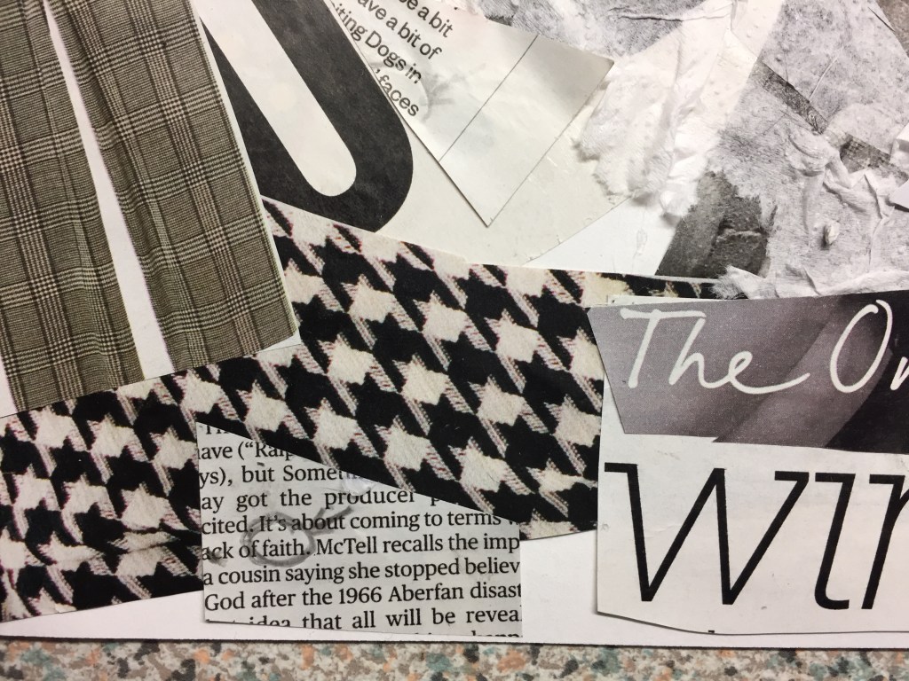
In addition, as I was working towards my piece, a dog tooth pattern caught my eye which is a basic monochrome design and made me look for more black/white patterns.
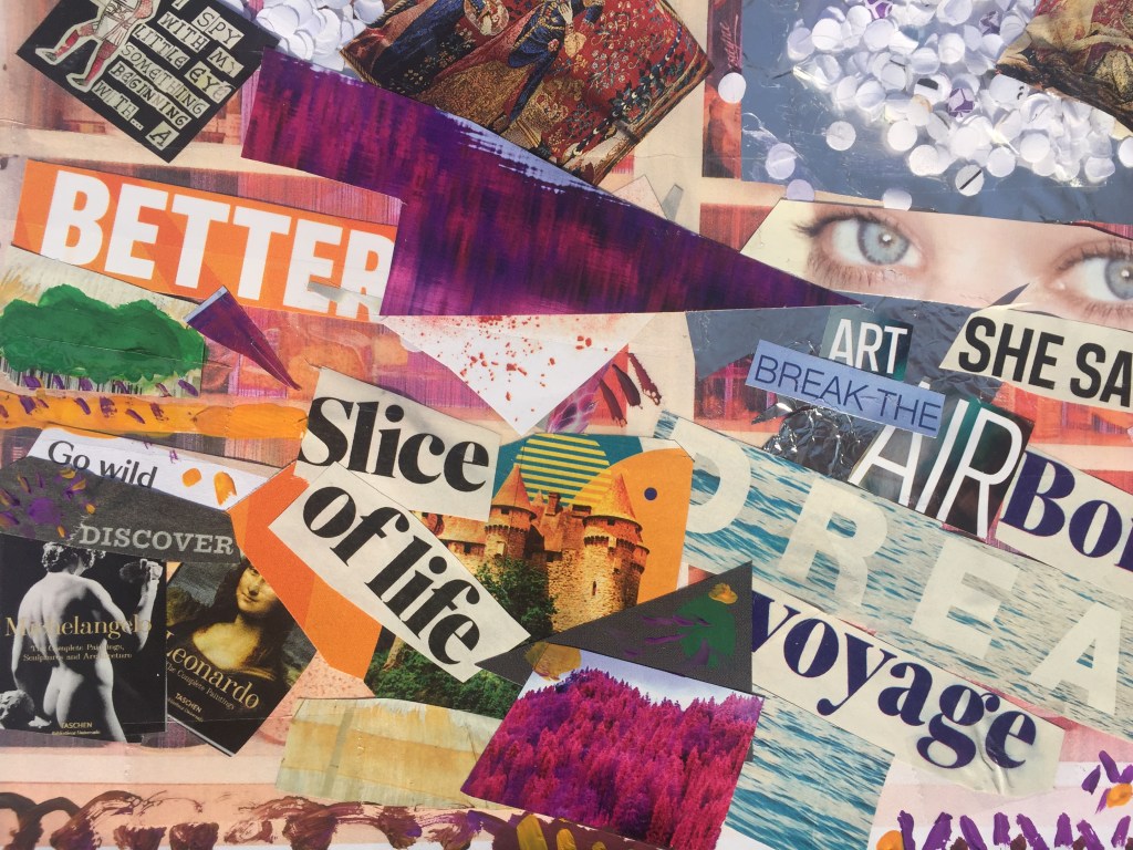
I’ve used mainly magazine sheets as well as tissue paper which I found really useful: It is transparent and flexible to use, especially when you want to do layering or create abnormal forms .
I’ve glued few text pieces on and I’ve highlighted words I find really strong in order to show that inspiration is everywhere : you can find it as long as you look closer…
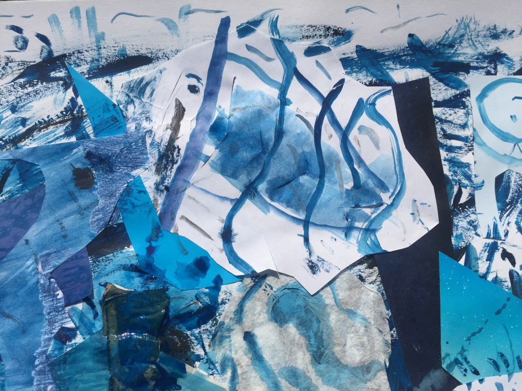
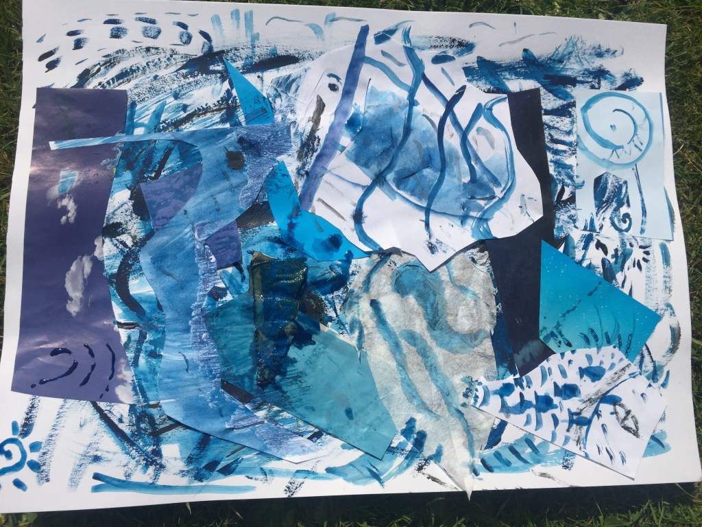
Taking the single colour project few steps forward and the open window to another world concept,I’ve asked myself how would looking through a glass into the sea floor look like?
Blue is the colour of my home country:Greece!
The sea and the blue sky shades are on its best especially on summer time!
So, I’ve created different pigments of blue and by playing with white paper again along with magazine pictures and matching colour cuttings and I’ve created my story…
the underwater world had always fascinated me. Sea horse detail.a sole fish I loved the idea of drawing large eyes: Ancient Greeks used to decorate their ships’ bows with massive eyes on either side and then (many years later) Pablo Picasso used this feature on his projects a lot.the whole picture finished. Layers of sea creatures swimming towards different directions. —————————————————————————————————————————————————————————————
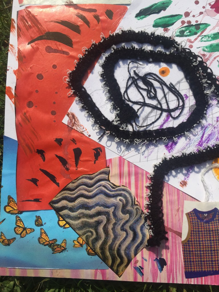
For my final piece I wanted to push the boundaries as much as possible.
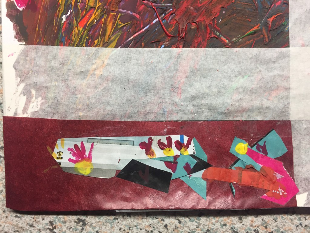
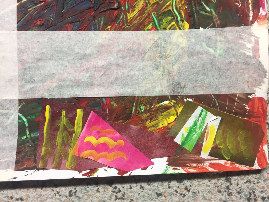
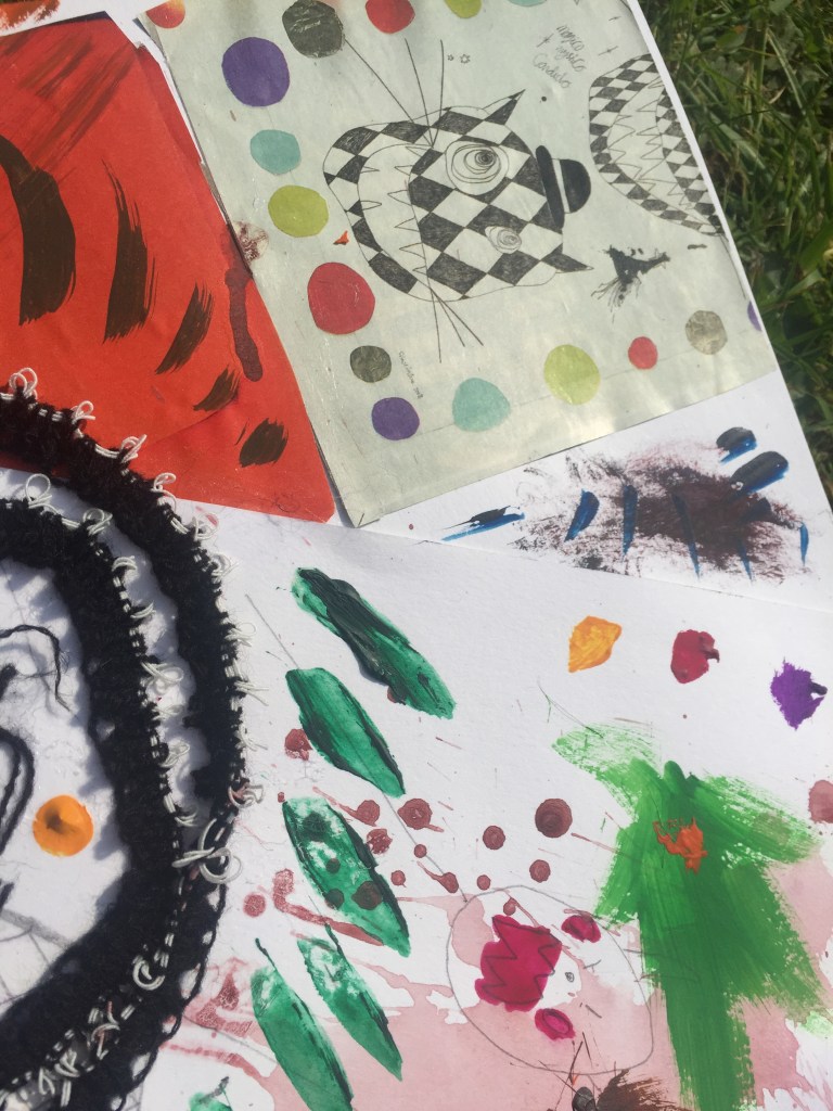
I tried to build a ”creative chaos” using different colours, cuttings and materials: Yarn, knitted ribbon, collage pieces, mark making drawings being cut out and presented in a different way as well as gauche cols along with brushes of different sizes.
Colour again as the epicenter of my study.
Knitted ribbon detail rolled like a spiral piece with yarn unraveled.Two pictures surrounded by yarn : As a second view it can be seen as a face with the portraits representing the eyes …the furious dialogue. I think it looks interesting even from this point of view.
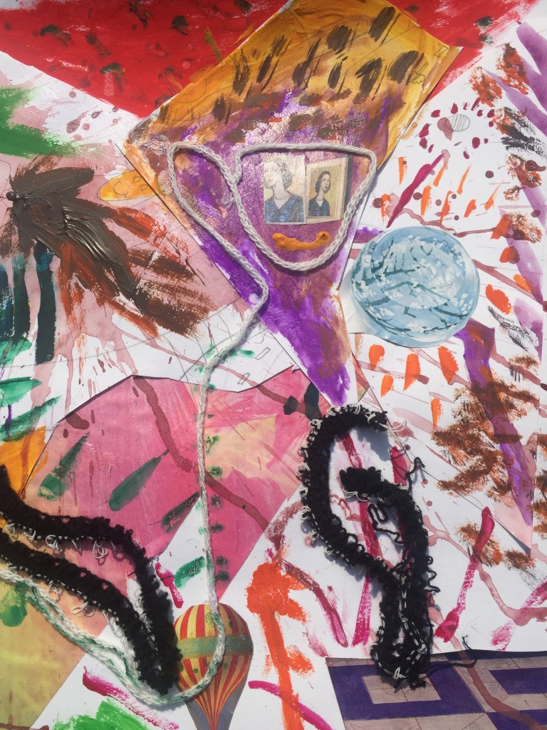
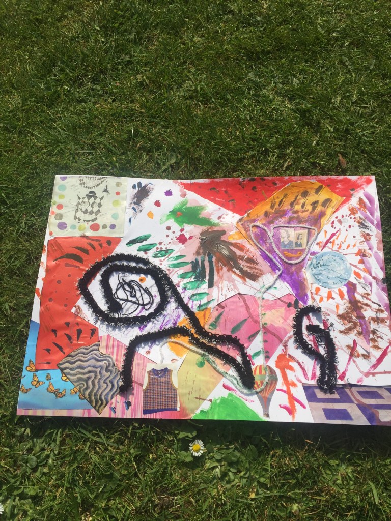
Following my tutor’s advice to push and explore my limits a bit further I’ve created extra pieces of work by using different materials and different techniques. Colour and the use of it is again my main inspiration .
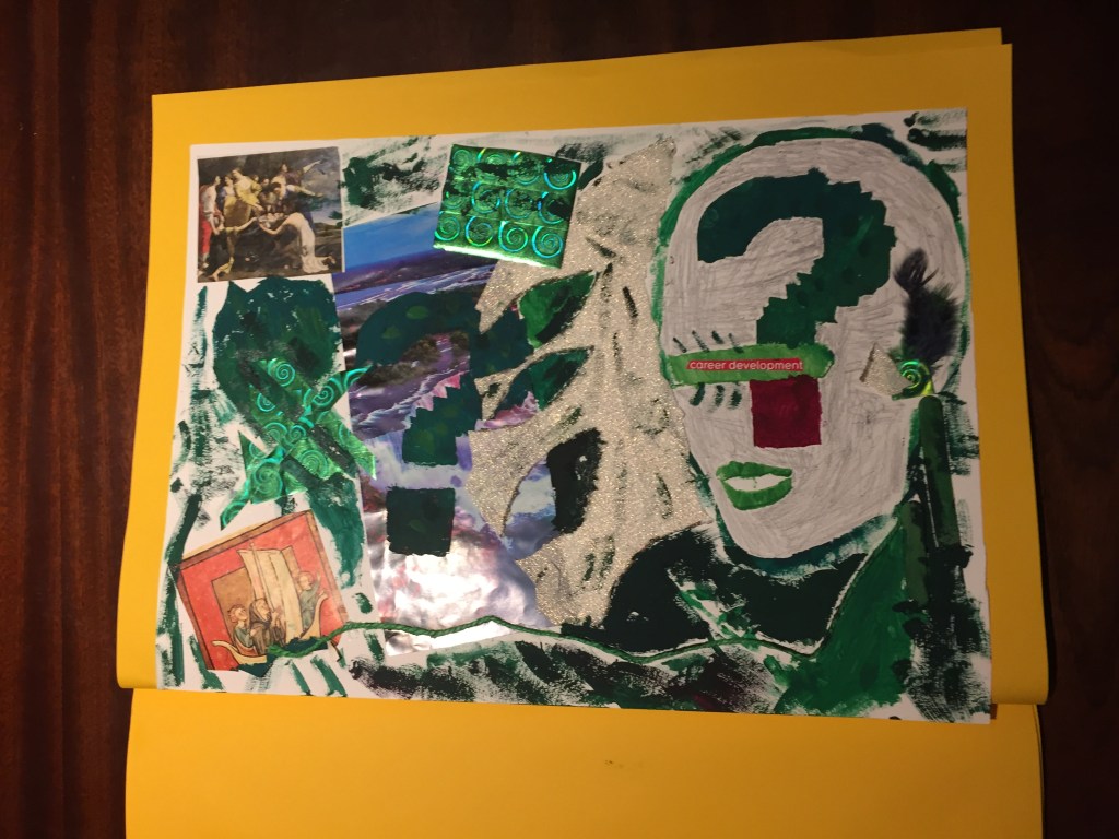
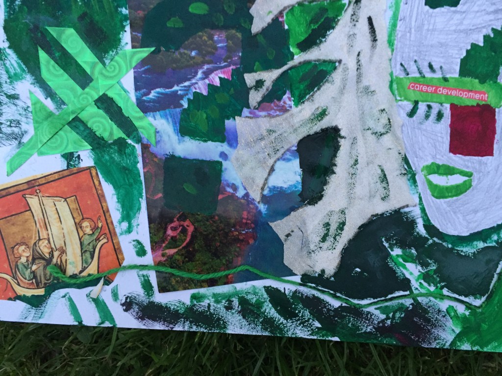
The first piece of work is divided in two sections :
The left side is dedicated to the past where people (top left corner) used to discuss and sometimes argue about the uncharted, the unexplored world so they are pointing at the waterfall direction with a big exclamation mark representing the unknown where at the bottom is a group of explorers sailing for the world to be discovered.
On the right side there is a face representing the modern person blinded by career development and wealth who doesn’t care about earth’s wonders (wonders that people, from the left section ,spend their lives to explore it) but wants to take advantage and exploit nature as much as possible .
At the bottom there is a green string bonding the past with the present.
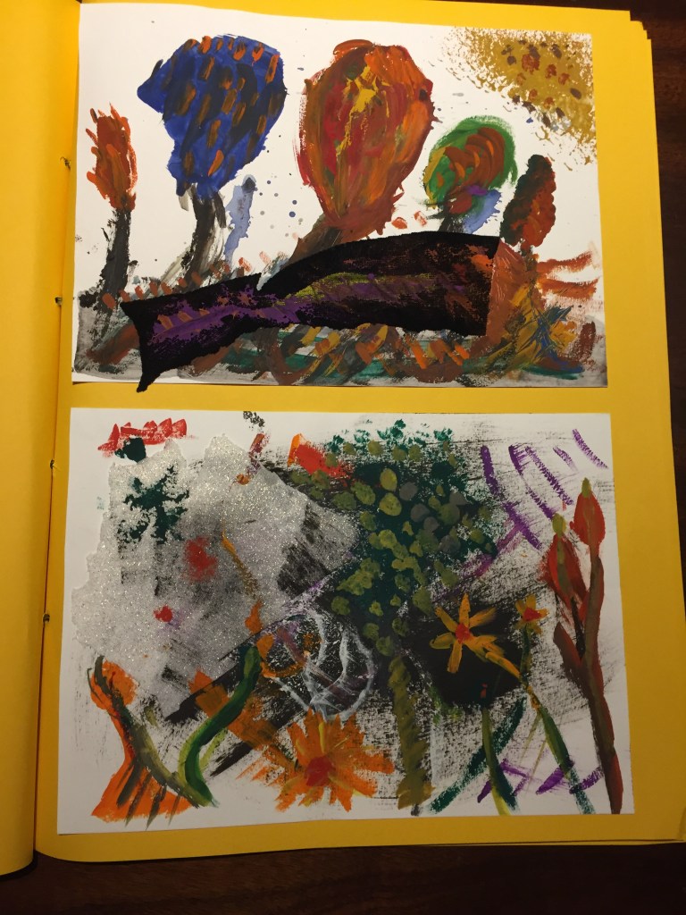
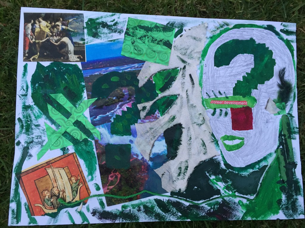
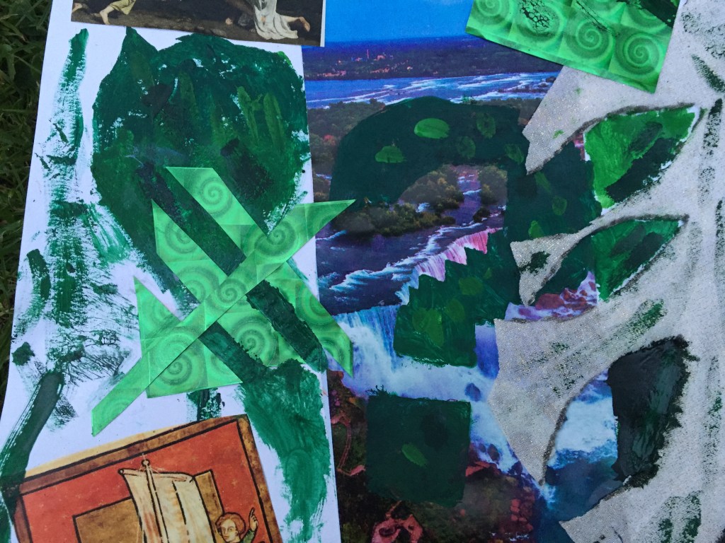
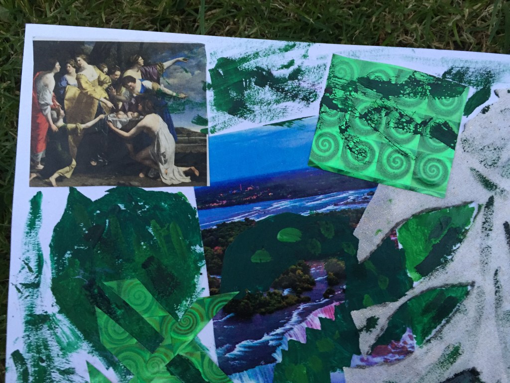
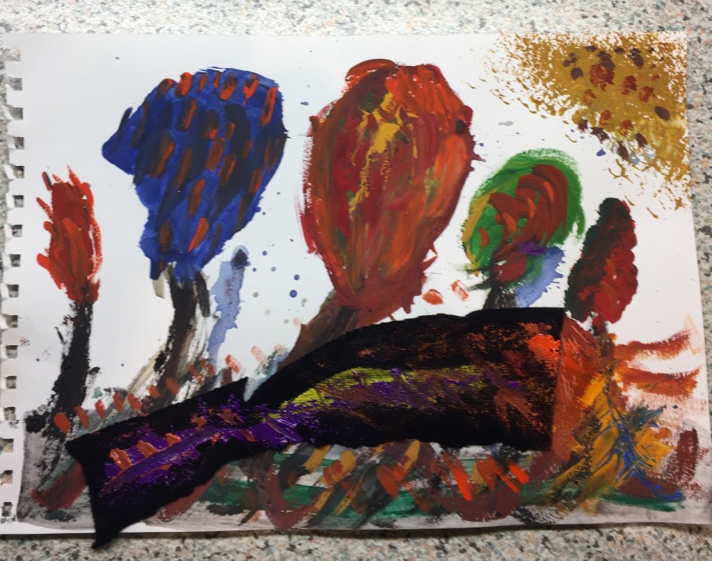
I wanted to work and explore green colour this time.
I’ve mixed various shades together as well as with white.
I’ve attempted to use stencil painting technique : it was interesting of how you can make forms and shapes but to my great surprise I realized that gauche creates colour bleeding which I thought it was a good feature eventually.
Shades of green , the colour of the natural world, dominate the whole piece of work.
Need for more wealth urges the person to destroy the natural habitat (the gold printed fabric is about to conceal the waterfall and blocks face’s view ). The whole process creates green flames.Artificial feathers placed on the back side of the head representing the will of the person to fly , to escape … a piece of paper with spiral design printed on representing ideas spinning around on the back side of the brain as well as gold printed fabric showing peoples will for wealth…
green splashes representing natures bleeding. Interesting how colour works on different surfaces A green hope set to fly above traumatized nature(Only feature not been splashed with ”green blood”) ———————————————————————————————————————————–
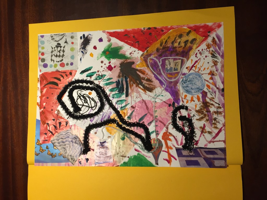
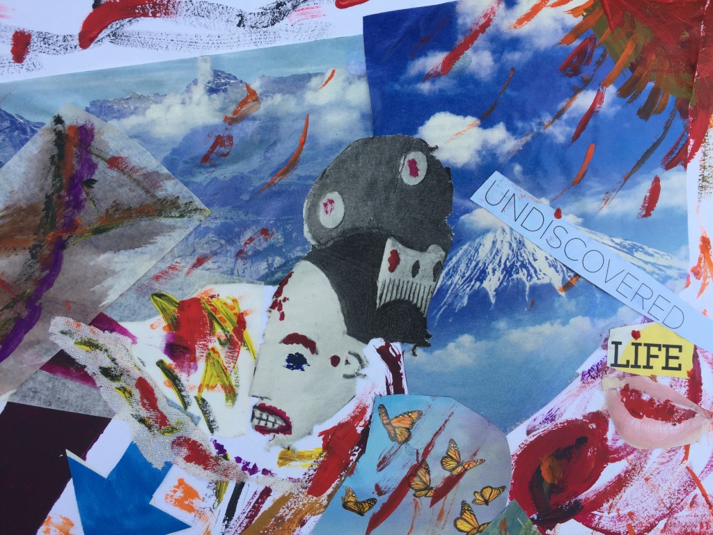
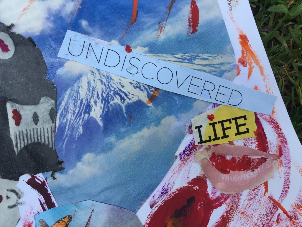
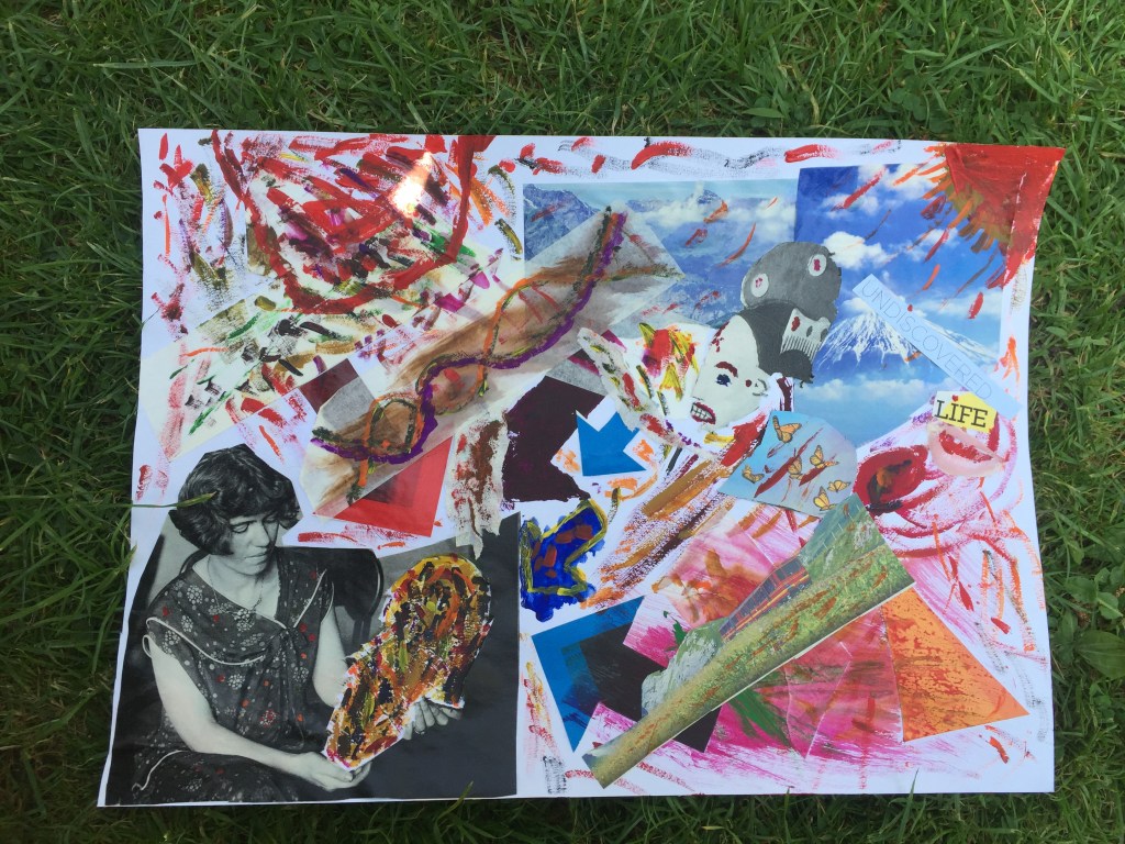
When I was going through magazines to get inspiration the following picture captured my attention.
A young lady holding an old mask. The way she is looking at it me made me wonder :What if she doesn’t know what it is and what it represents?
Masks had many uses : from been worn by hypocrites (word originally used to describe actors) in ancient Greek theaters ,to impersonate deities in many civilizations across the globe , making it an work of art and intelligence.
Taking this forward I’ve removed the mask and I’ve glued it a different position.
On the blank space I wanted to be as colourful as possible showing confusion of the person holding it.
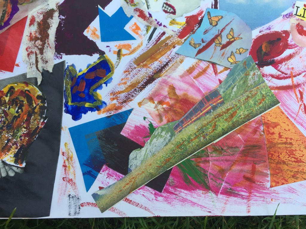
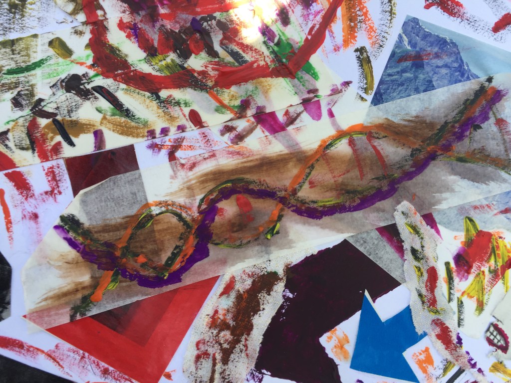
I’ve used arrows pointing at the mask , showing attention to the item and not at what it represents.The more colours the better!that’s the mask she was holding staring from above. top right corner :The sun over mountain Fuji in Japan. Different surfaces have been used.White masking paper helped me to achieve that. I’ve been quite bold with colour to see how it works. A jaw outline painted using stencil technique. It was made the opposite side of the mountain to represent outer-world/inner-world contrast: The outer world is what we see . The inner world is what we feel. Colourful chaos showing our constant interaction with outer world and how feelings are affected. A beautiful set of female lips saying that there is lots to discover in life : The more you are looking the more you realize that you don’t know. Train representing mind who’s taking you far away. Butterflies is what you get when you discover something new in the inside or the outside world.A colorful DNA spiral: colour runs through our genesThe whole piece of work together.
Synopsis of 3.4
Having finished the whole assignment and looking back on the project that I’ve been working on over the last three months , I have a great feel of accomplishment and fulfillment. I found collage along with colour as the best way to express myself : the layered detail can work in many ways in my mind and the more I observe, I realize things I didn’t notice in the first place.Also, being able to use different materials , different textures, pictures , cuttings , words , even different ways of putting things together makes me understand the potential of this way of expressing myself and how useful it can be going forward. It is a great process that soothes my mind , brings me peace and above all a fantastic sense of achievement…
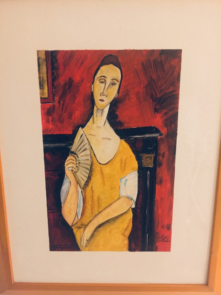
AMEDEO MODIGLIANI :LADY WITH A FAN . (SELF OWNED REPLICA)
I bought this painting from a Venetian artist in Italy 15 years ago. I loved the cols and the drawing trying to copy Modigliani’s original painting.
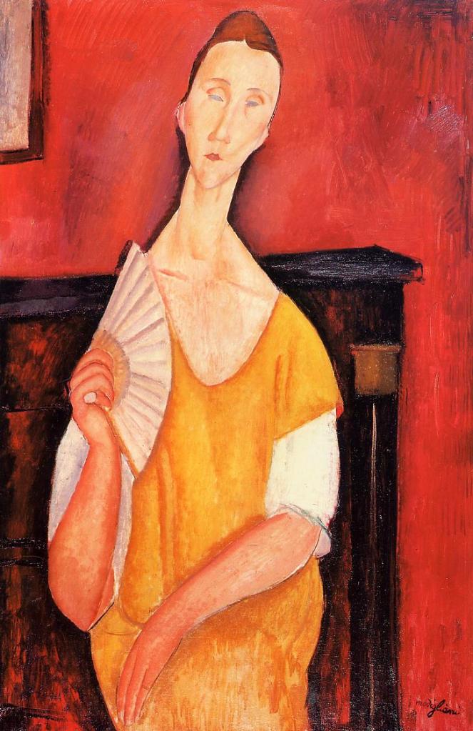
original painting
Having the chance to analyze the drawing and the colours used, I came with yarn wrappings which I’ve wrapped them on a cone , in a way that colours blend and merge one to the other.
I’ve managed to find marl pre-twisted colours in order to be able to present the black/scarlet background and the white/light blue sleeves.I’ve also managed to find a soft woolly brown yarn in order to be able to demonstrate lady’s hair.
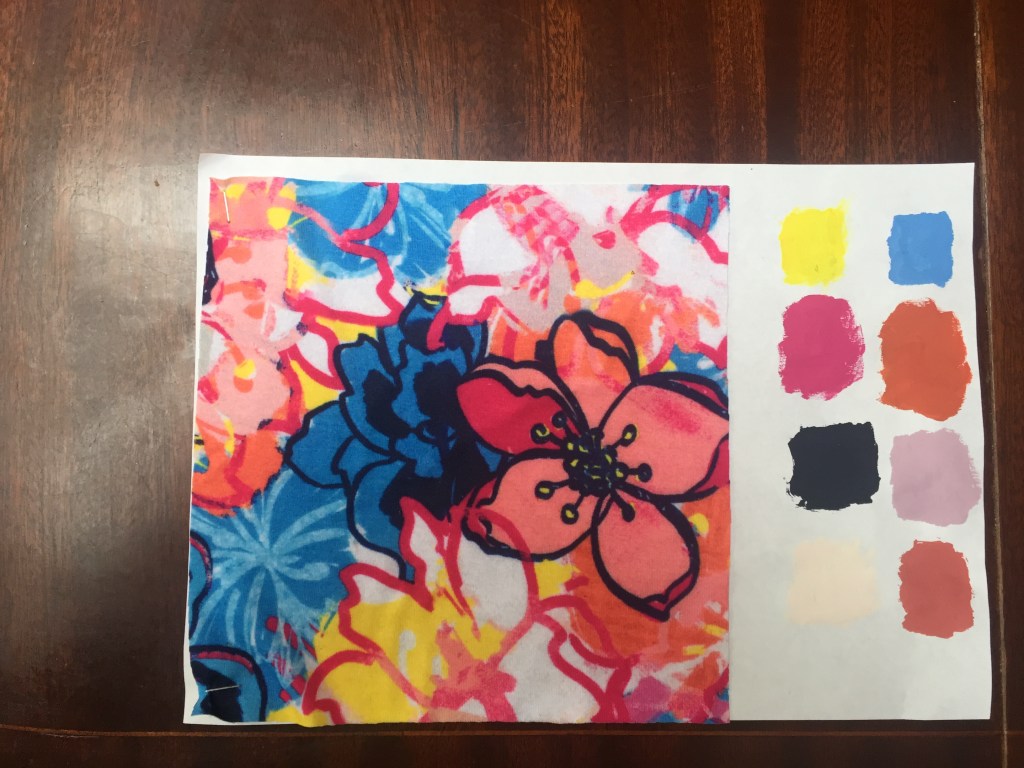
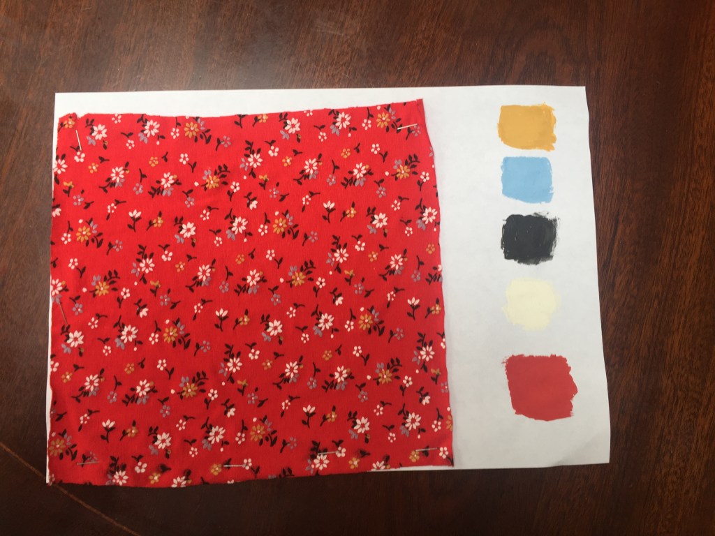
I found this piece of fabric quite interesting as it has a sort of free handwriting print with vivid colours. I liked this one because it had three different shades of purple which I found quite challenging to achieve.This was quite basic but I liked the red and Ochre.
Part 2 .
I’ve decided to use a larger piece of textile and tried to be more imaginative : from precise print designs to more abstract and free hand drawings creating a frame around the fabric.
Even though I’ve tried really hard to match the colour , when it dried out it turned to change. Taking this on board , I was really happy with the result.
Part 3
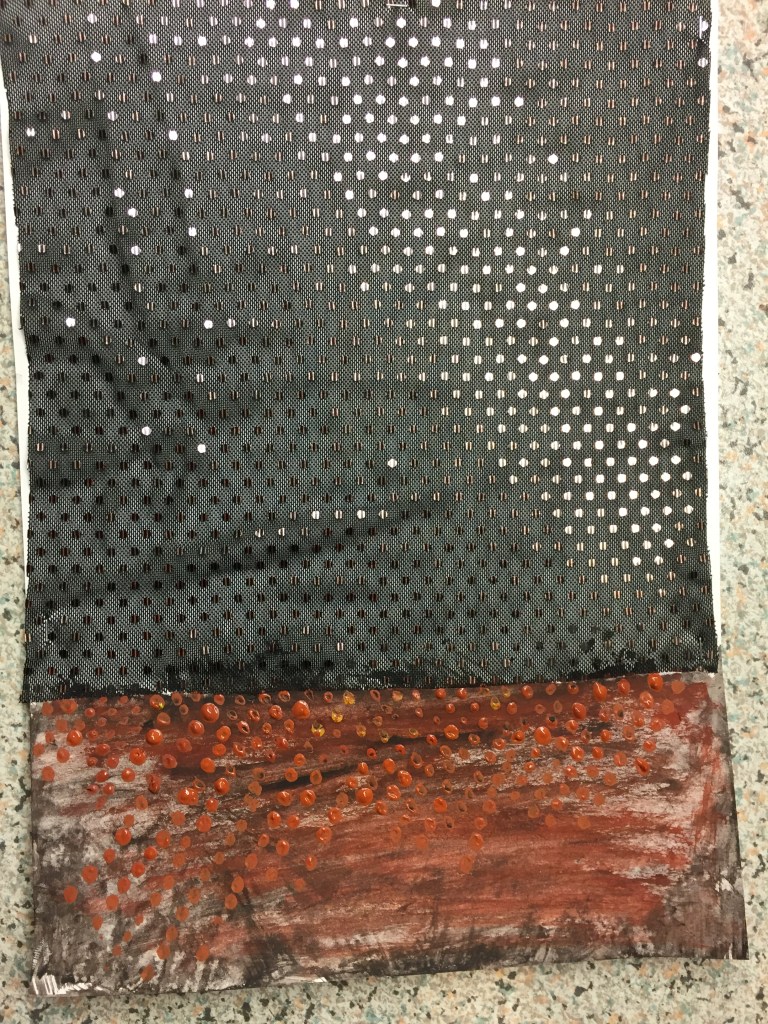
First tryout was with transparent fabric and bronze sequins .
Because the I’ve used a transparent swatch I’ve drawn the plank paper with the mix of all a cols and on top if it I tried to replicate the bronze repeat.
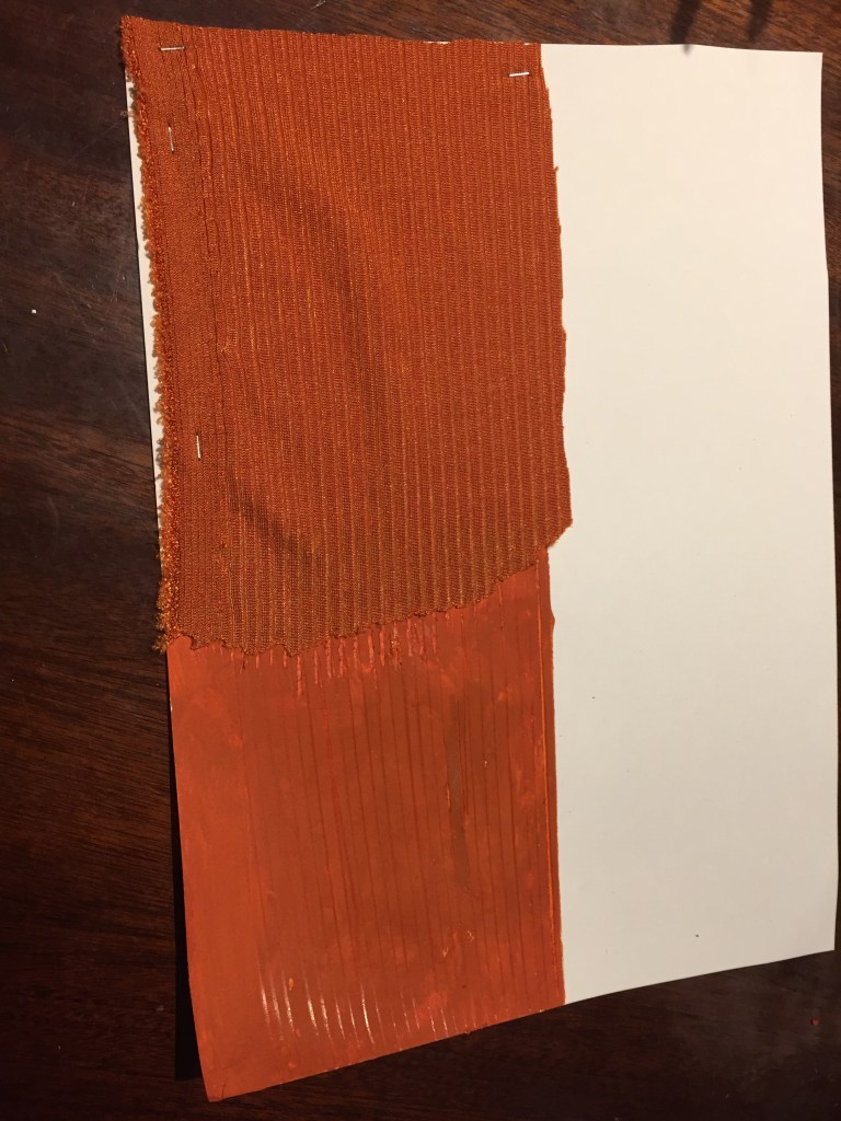
second tryout using rib fabric.
Again , the col dried leaving a different shade .
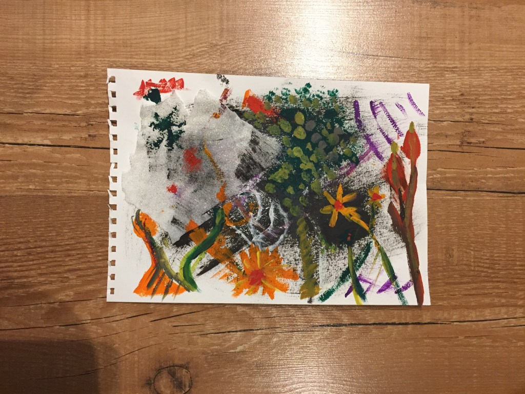
working on fabric along with paper and gouache coloring I came with an idea:
How a drawing would look using these elements?
white gold glittered fabric drawn on when glued on a a gouache painting.