PART 1.
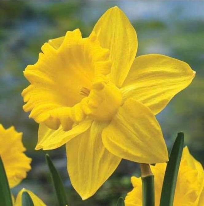
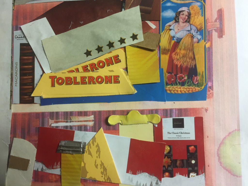
Inspired by an everyday feature : a cupboard .
It captured my attention because I found it colorful (a bit messy but in a sort of order) as well as I loved the idea of having things placed in sections.
I would never imagine how I could make this work .
To my big surprise , when I’ve gathered the materials together I could see every single paper cutting to be a potential item to use.
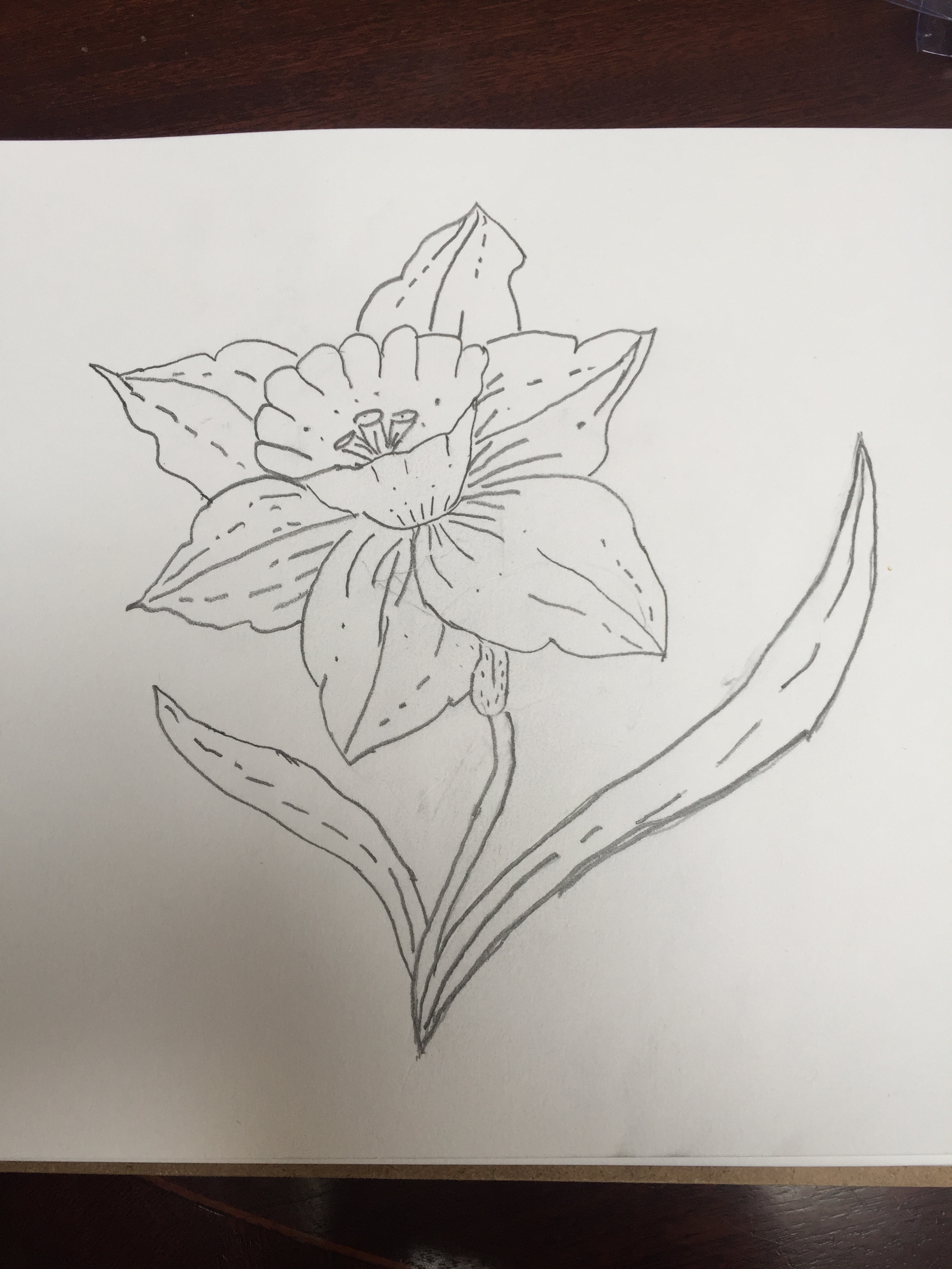
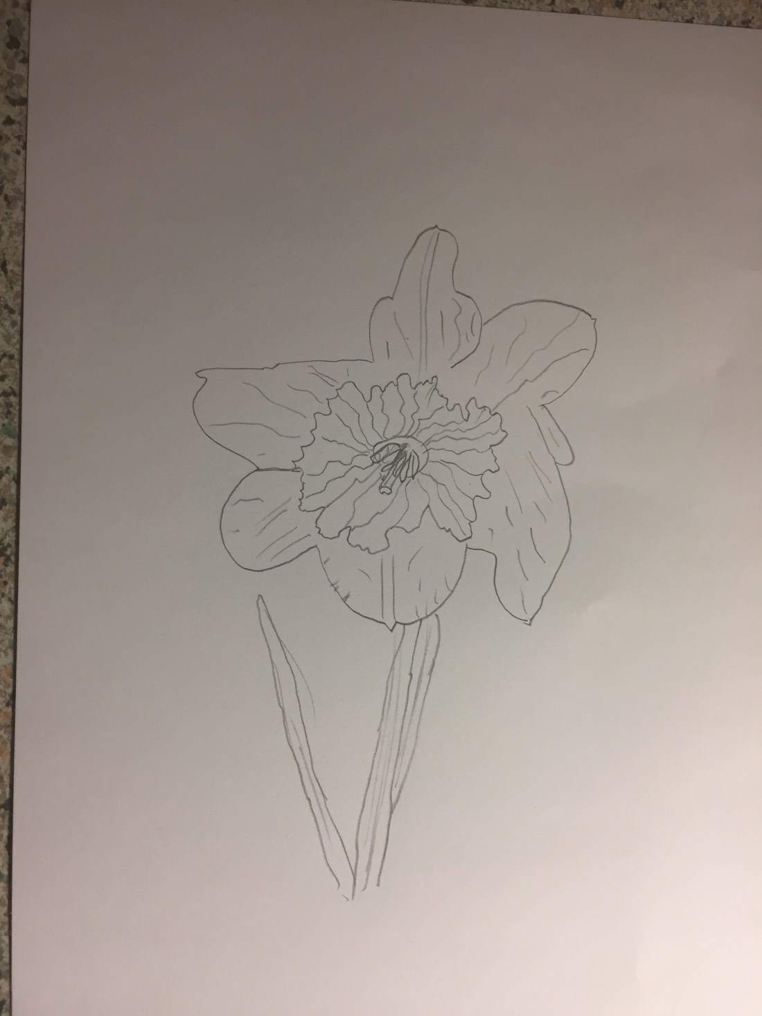
My process was simple: capture a picture of my subject ,print it and then keep it as a template to ”build” on it.
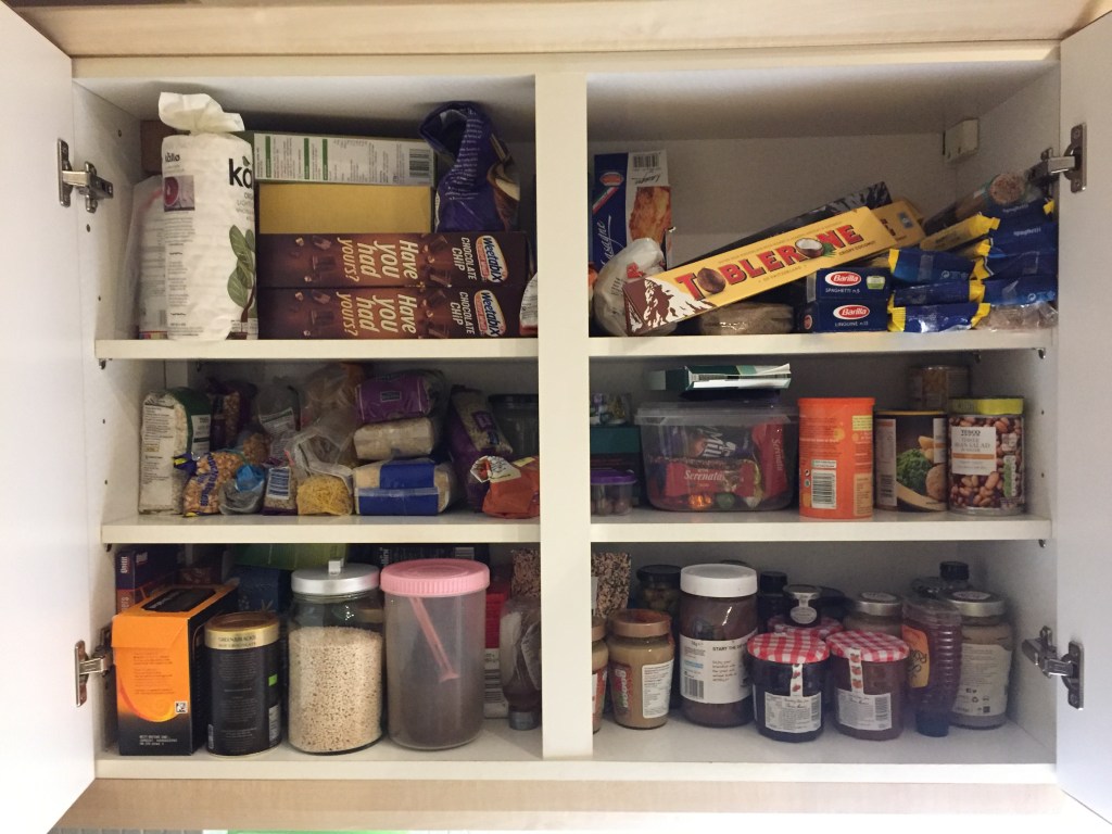
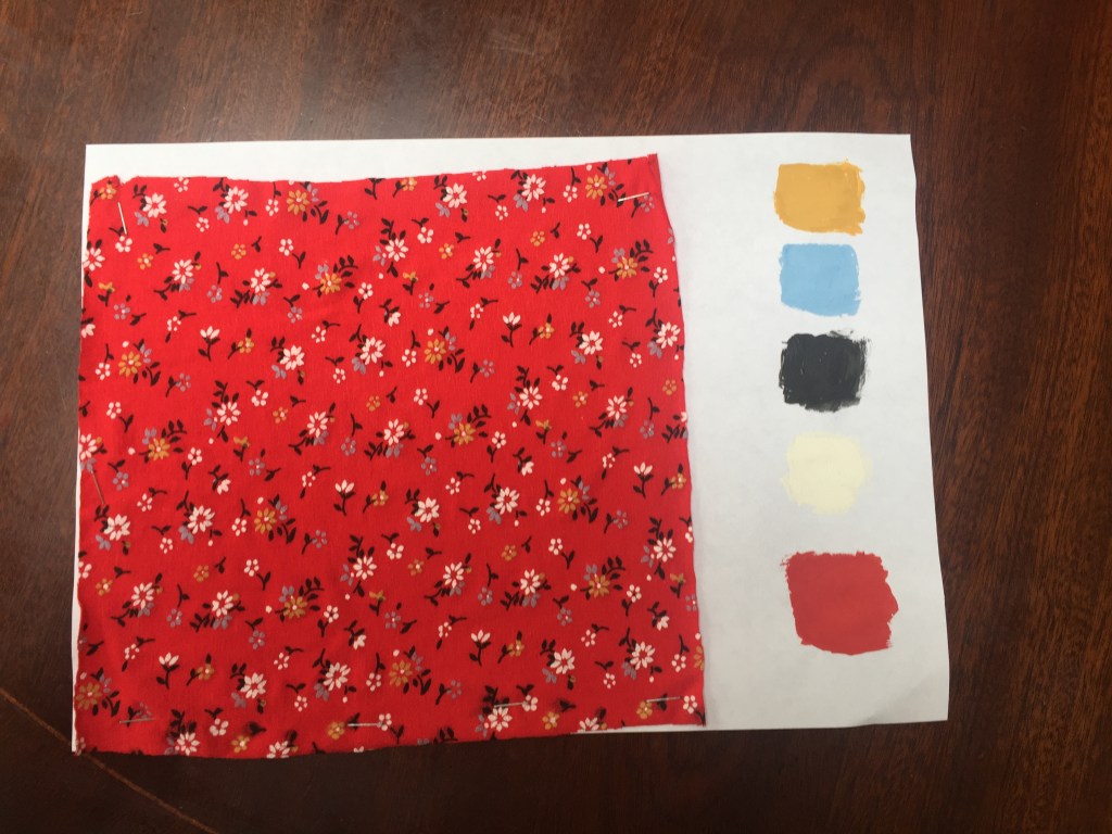
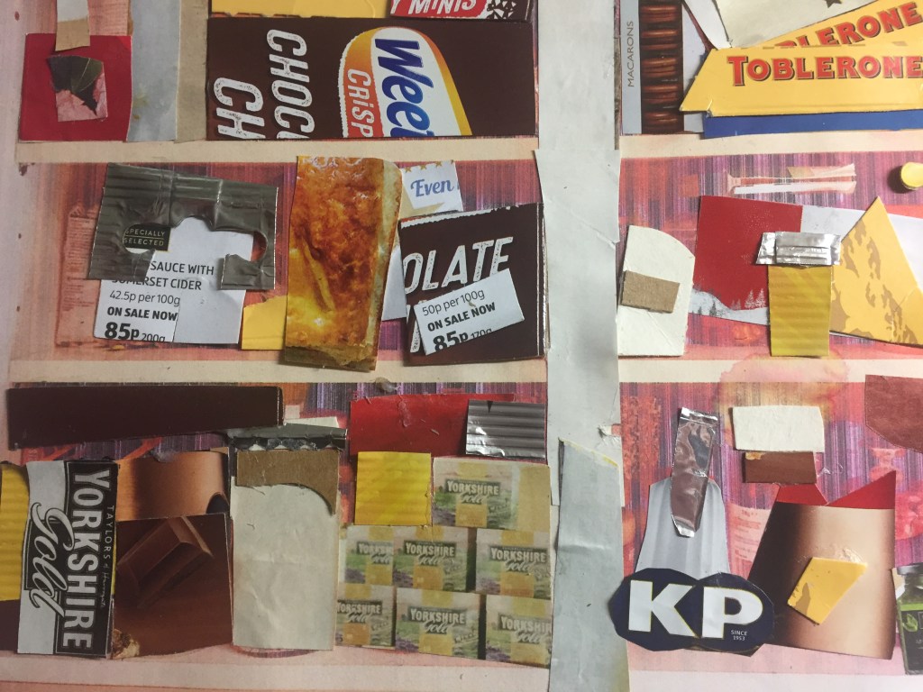
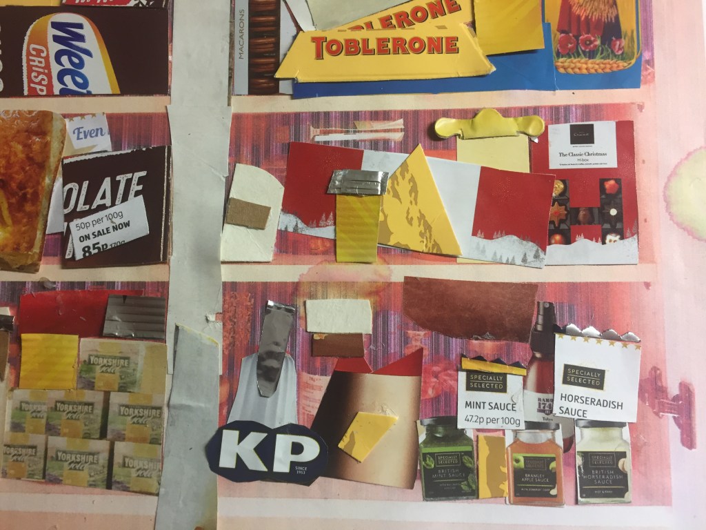
I’ve used magazine sheets along with covers of all sorts:pasta wrapping film , cereal cartons,chocolate boxes, as well as foil bags .
———————————————————————————————————————————————————–
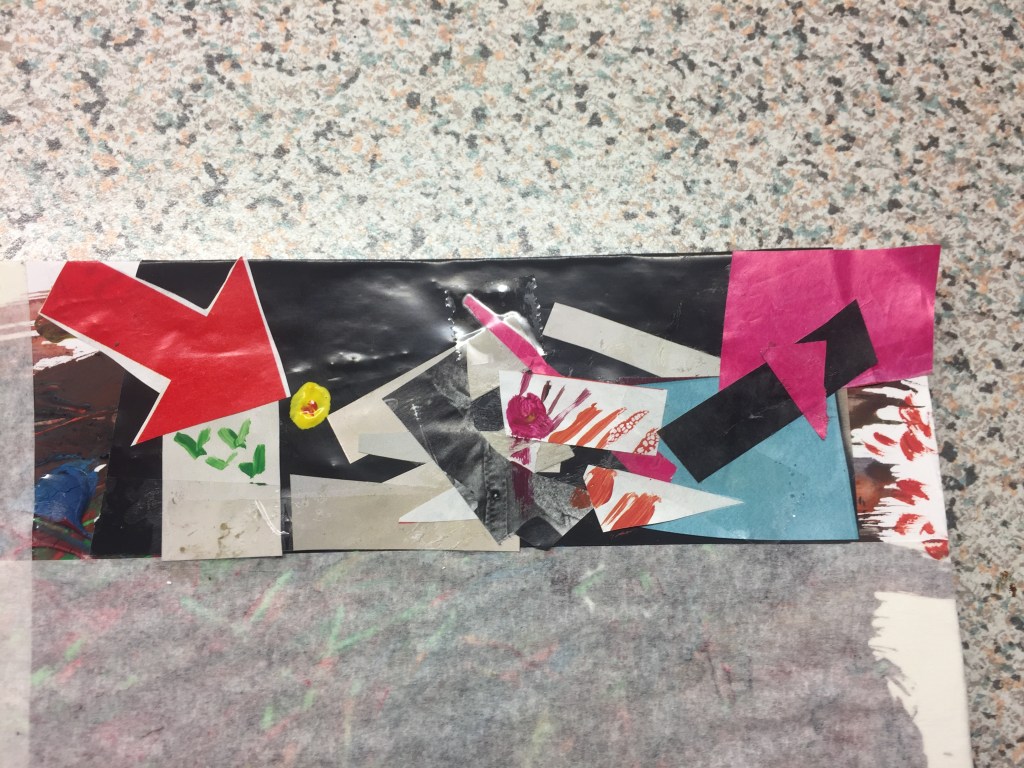
Reflecting on the first inspiration image have intrigued me to push my imagination far beyond the limits : What if I mixed all the cols of the original picture and create a new vision of it?
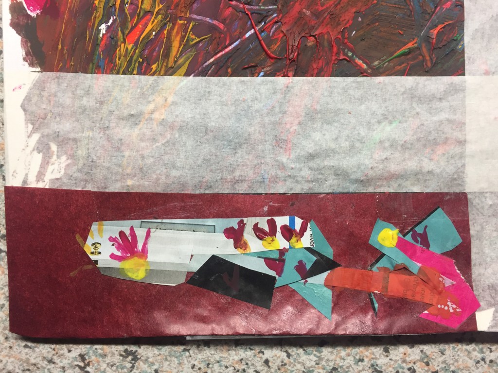
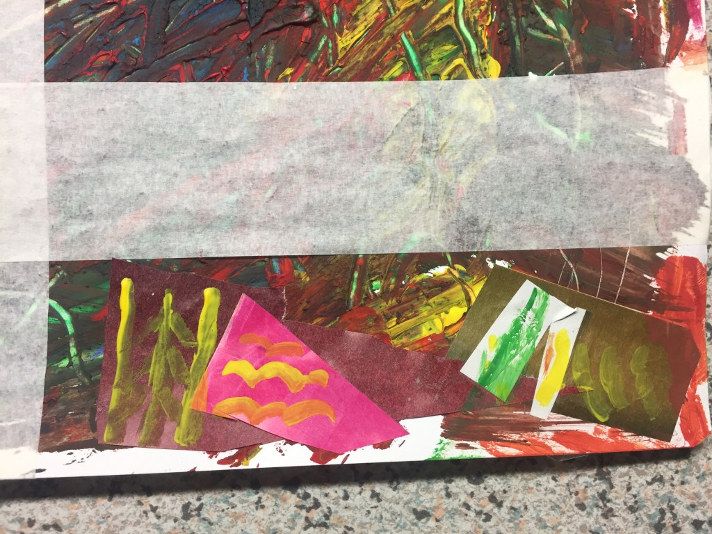
By taking inspiration from Jackson Pollock’s abstract paintings I’ve drawn the background using a colour mix abstract painting and then I’ve created a central frame with masking paper in order to give the same cupboard-block shelf impression.
After that , I’ve decided to cover 3 out of six sections with collage .
Again I’ve tried to use as many colours as I could but I also , make it as abstract as possible.
I get a great inspiration by using arrows !I find them really powerful features to play with: they sort of give you a sense of movement, a sense of pointing on something, they capture your attention and make you see things differently …

I’ve used gauche water colours to finish it off.
——————————————————————————————————————————————————-
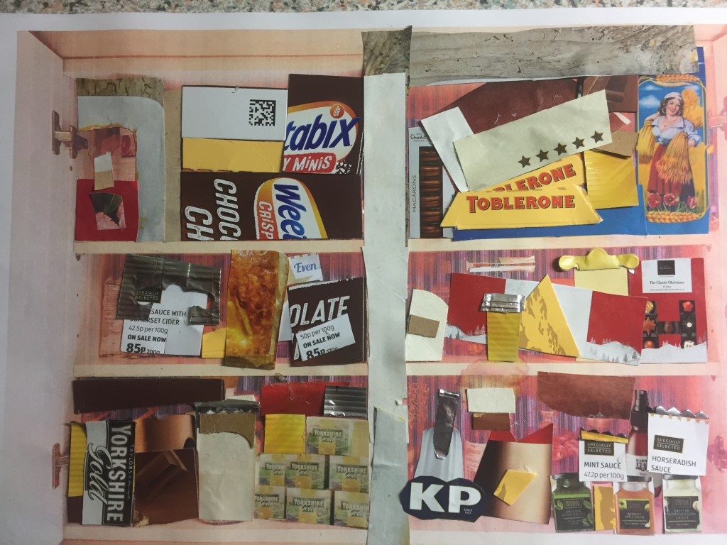
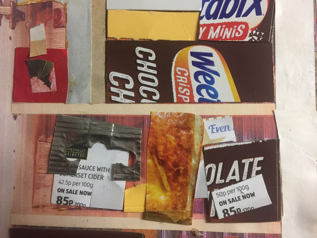
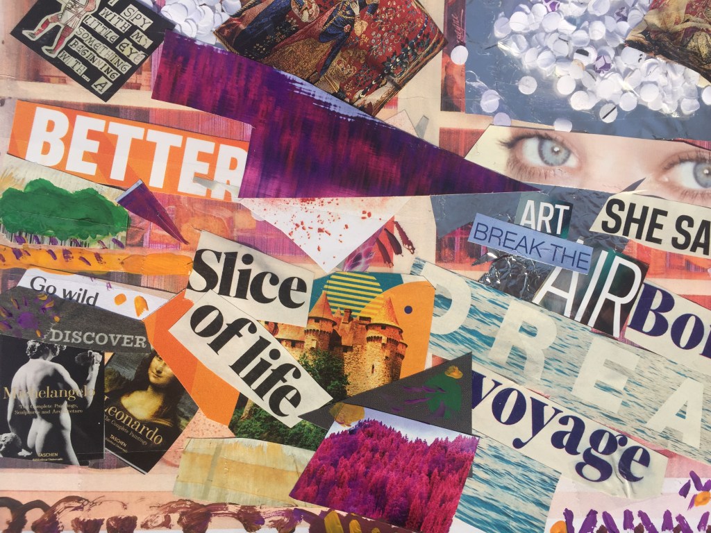
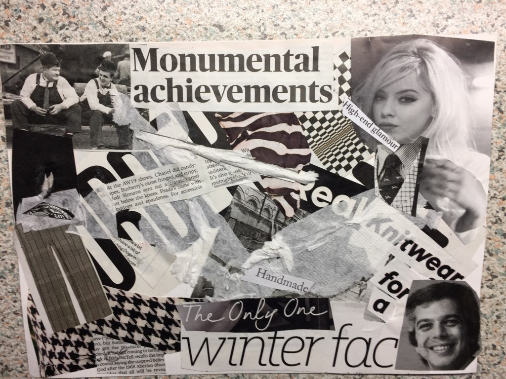
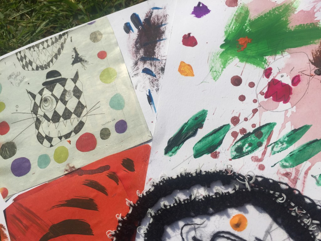
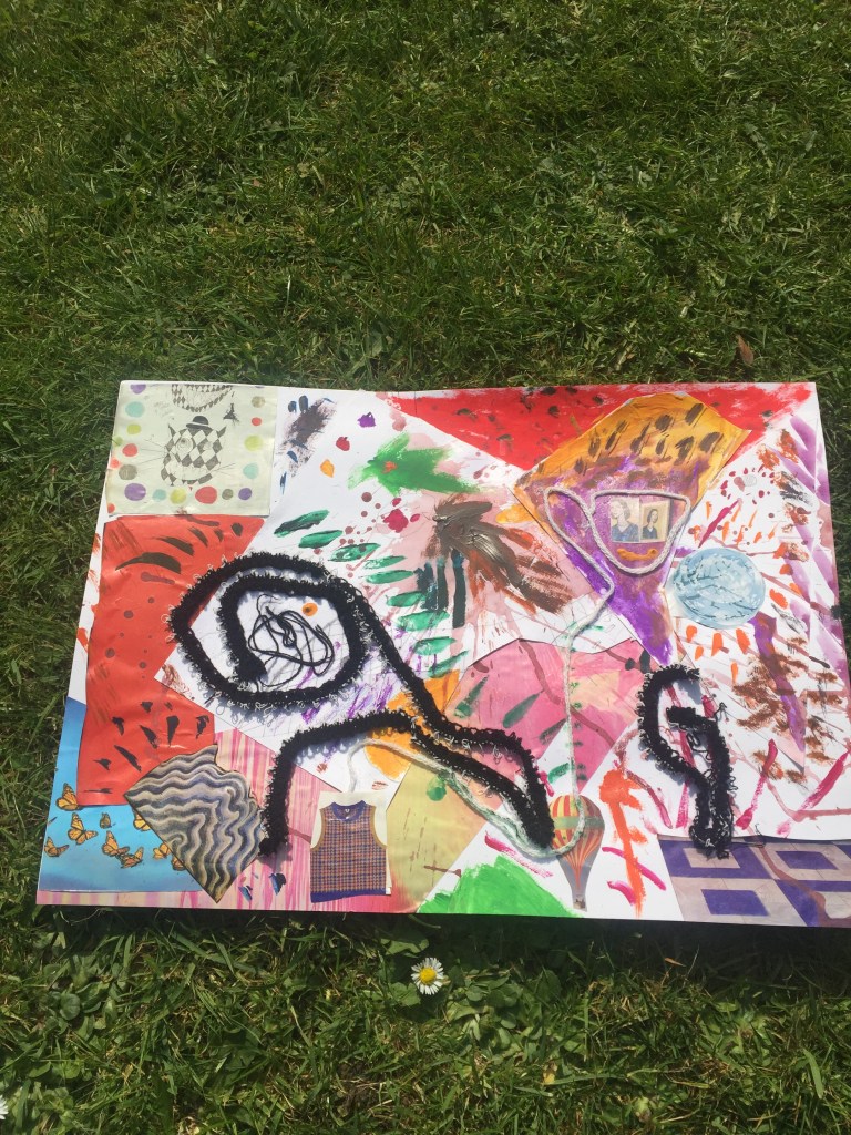
For my final piece of work I wanted to be more metaphorical :
I saw the open cupboard with my displays in as a window : it might contained food, which is the main element to keep us alive , but I’ve perceived it as a view, as frame from where you can look through and communicate with people’s hearts , people’s subconscious…
Using a print out of the original picture as a template again, where I can glue things on , I’ve noticed that it looks like as a comic book page, taking you from one block to the other, which helped me tell my story even better.
I’ve cut words I find really strong out and I’ve assigned them in such a way that can be read and perceived in many ways so anybody can make a different conclusion out of it.
Colour is again the main subject: using gauche colouring as well as different colours of magazine sheets .
I’ve played with layers and surface a bit by using cuttings of a hole puncher which they might represent ideas glued on foil (subconscious) and enclosed with sellotape(conscious) , standing on top of a pair of eyes representing a head.
I’ve placed an arrow (again) pointing on a word in a way it finishes a sentence off.
To my great surprise I found sellotape as a material really useful to work with as it doesn’t only put things together , but it adds transparency and sheen.


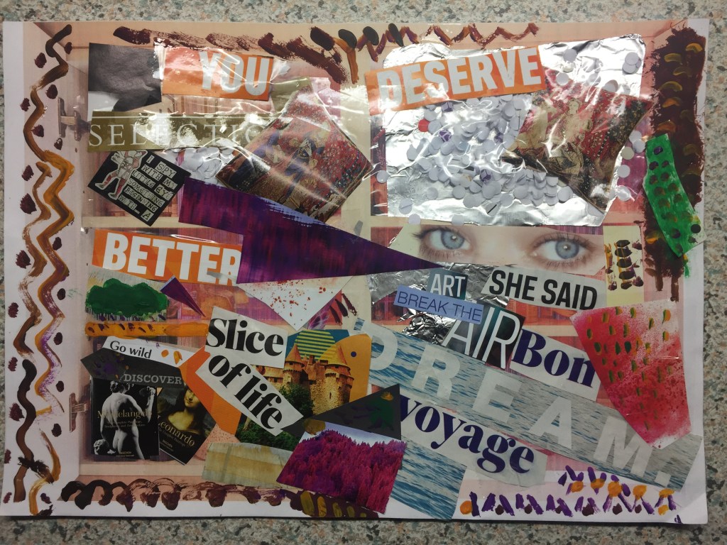
Working on these pieces was really challenging : At the beginning I was struggling to work how to process the idea ,the inspiration, to find a piece interesting for me to build onto and take it further.
But ,when I captured the picture , and made the necessary collage creating research ,the whole work flowed really well and to my great pleasure it was a bit of a therapy to me.
—————————————————————————————————————————————-
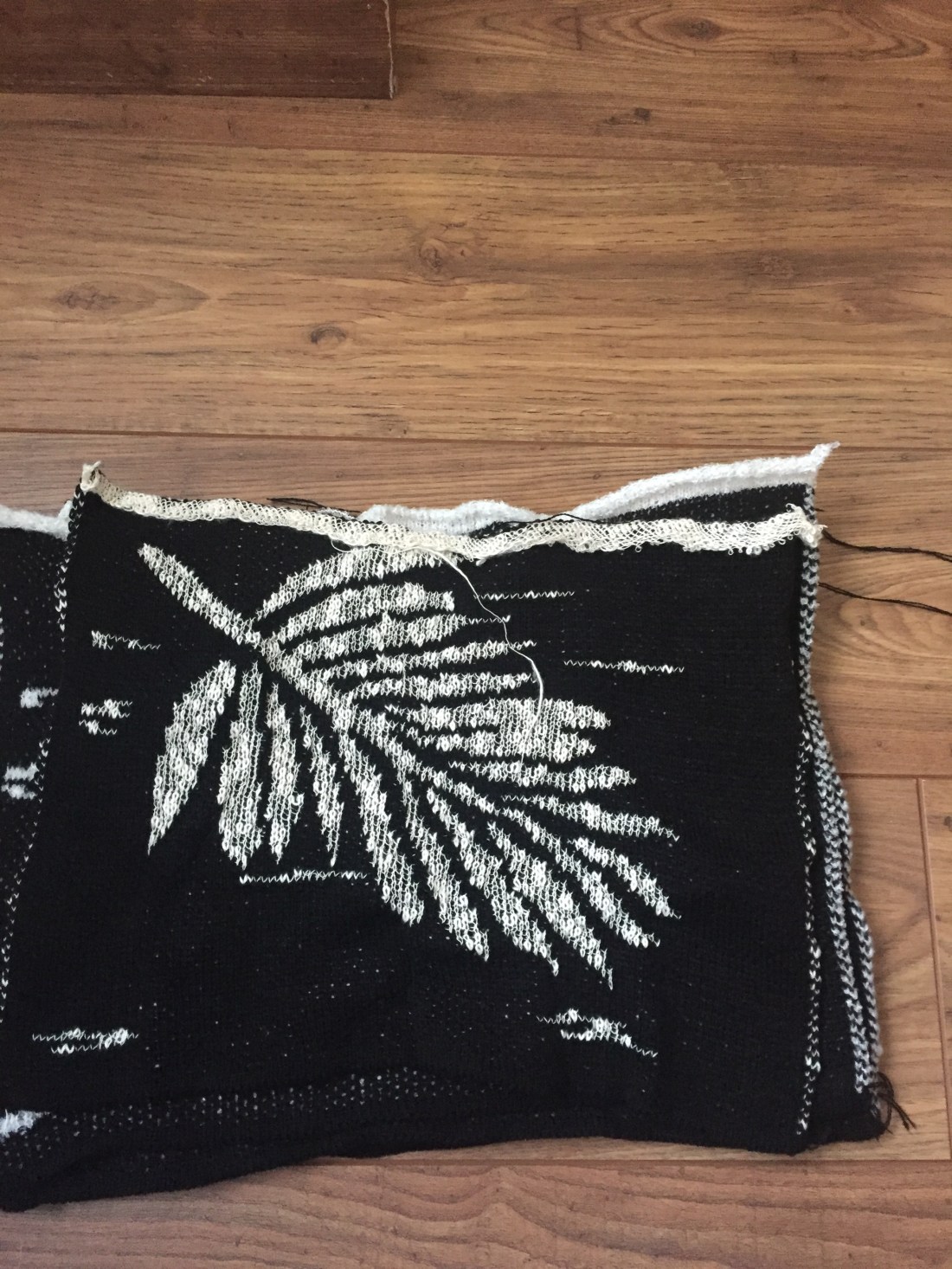
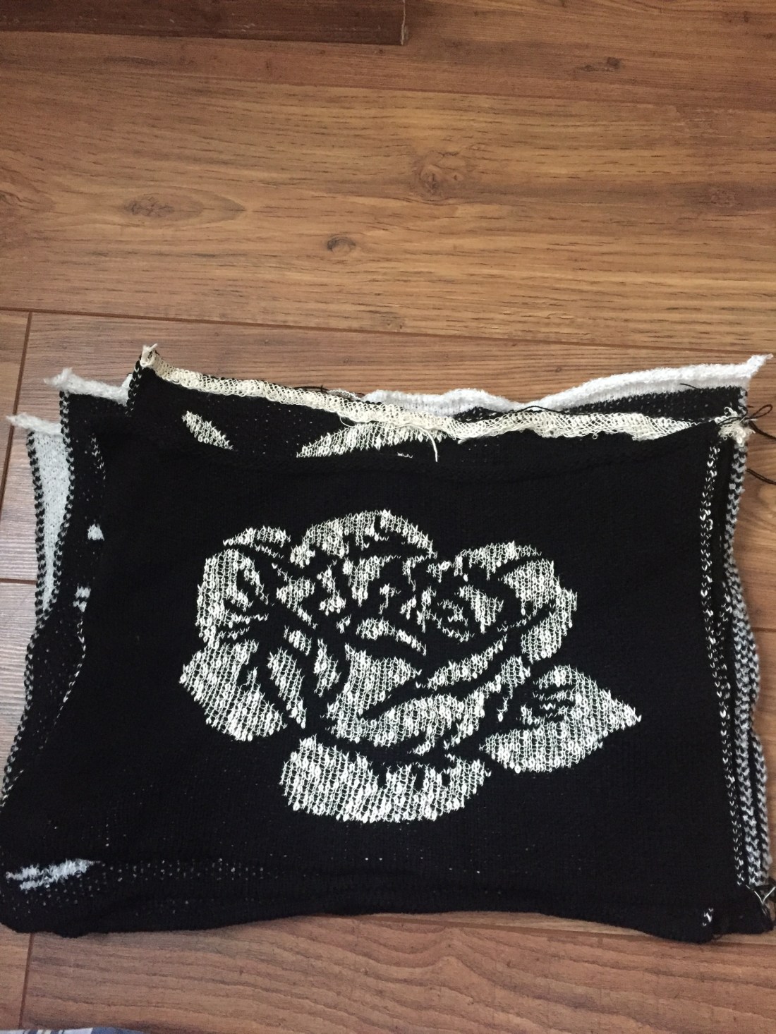
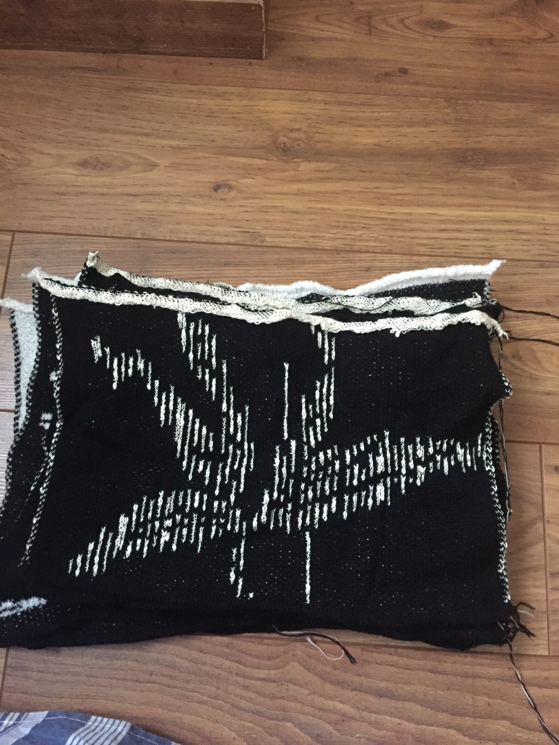
PART 2
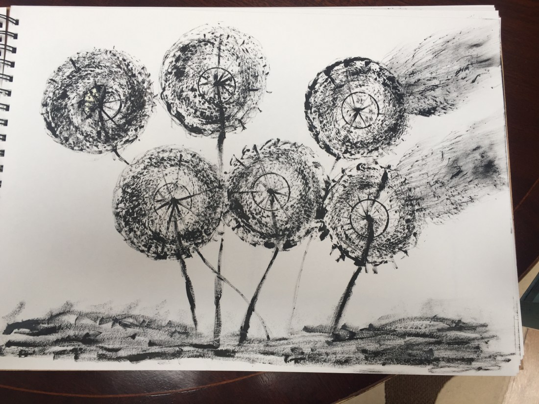
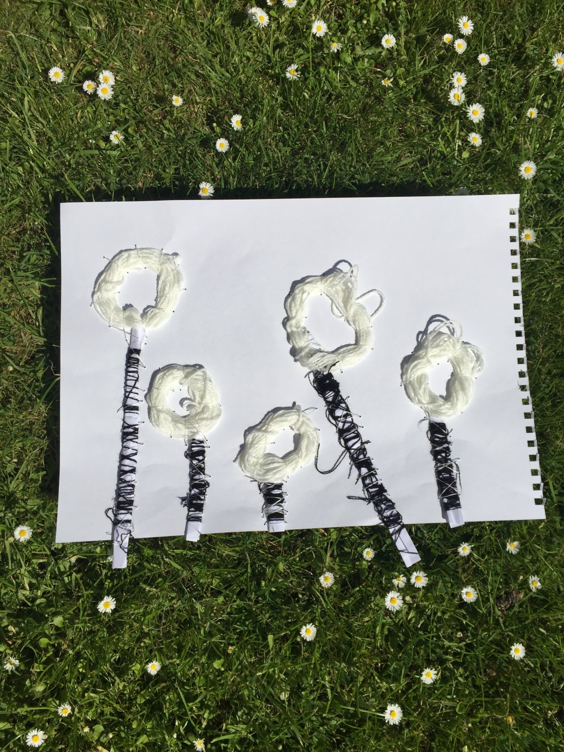
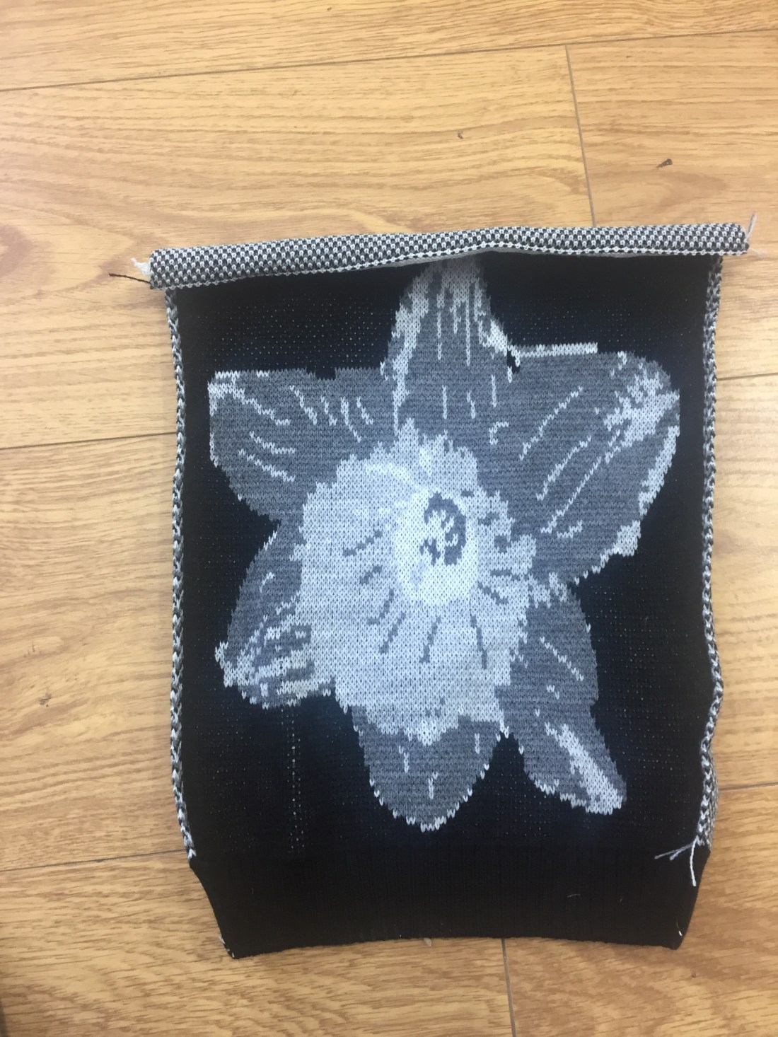
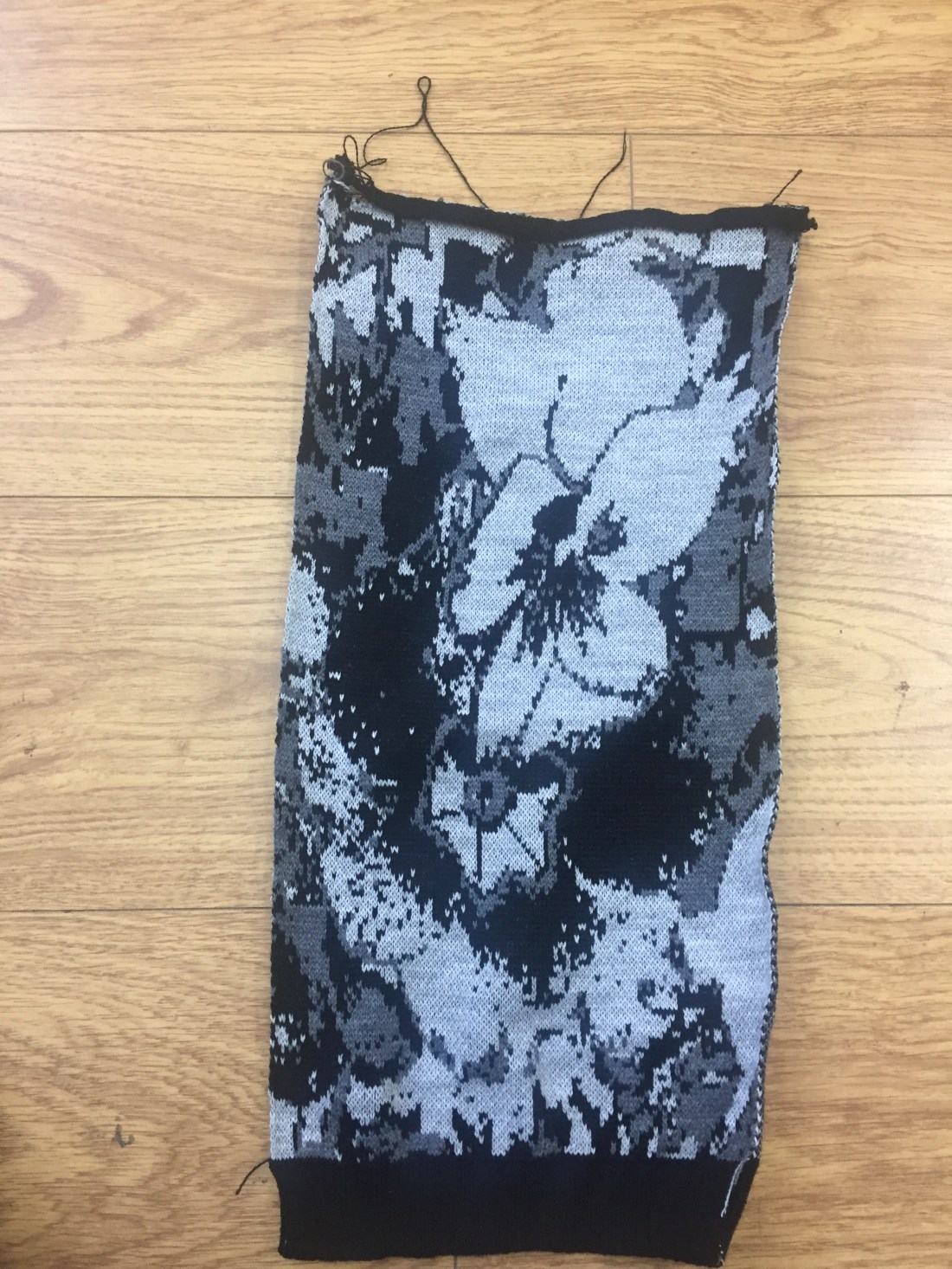
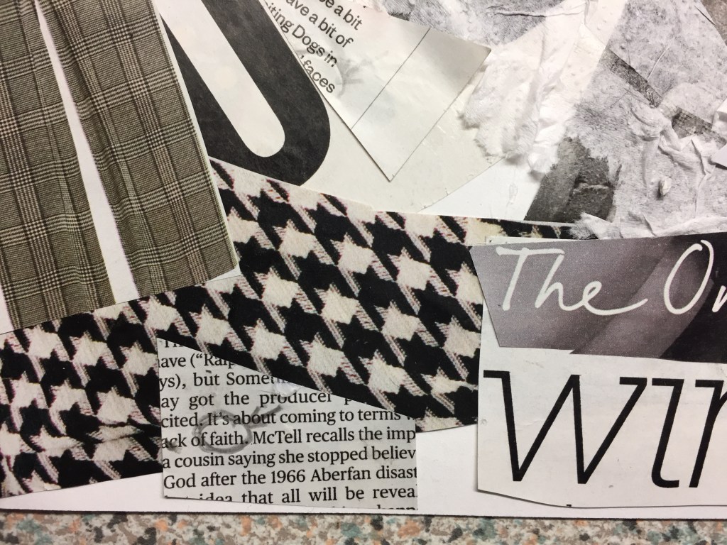
Using my last collage as a starting point and being asked to do a monochrome work based on one of my previous pieces I found myself working on the same concept unconsciously.
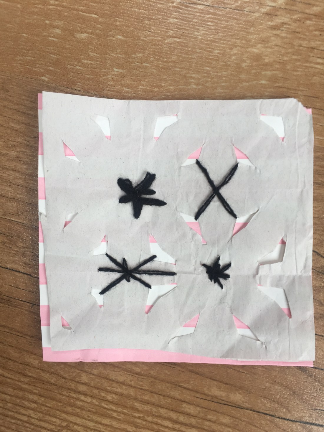
In addition, as I was working towards my piece, a dog tooth pattern caught my eye which is a basic monochrome design and made me look for more black/white patterns.
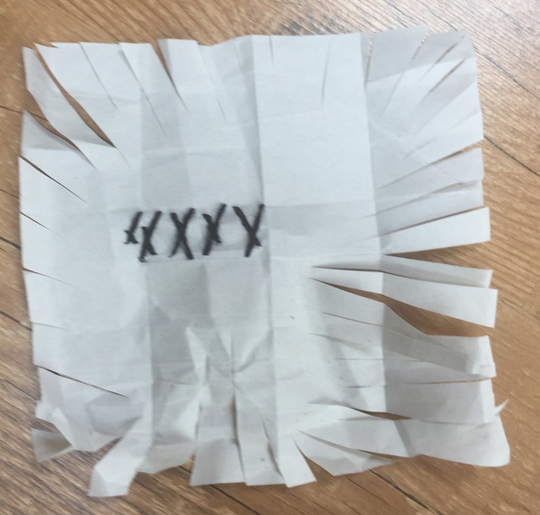
I’ve used mainly magazine sheets as well as tissue paper which I found really useful: It is transparent and flexible to use, especially when you want to do layering or create abnormal forms .

I’ve glued few text pieces on and I’ve highlighted words I find really strong in order to show that inspiration is everywhere : you can find it as long as you look closer…
———————————————————————————————————————————————————–
Taking the single colour project few steps forward and the open window to another world concept,I’ve asked myself how would looking through a glass into the sea floor look like?
Blue is the colour of my home country:Greece!
The sea and the blue sky shades are on its best especially on summer time!
So, I’ve created different pigments of blue and by playing with white paper again along with magazine pictures and matching colour cuttings and I’ve created my story…

the underwater world had always fascinated me.
Sea horse detail.
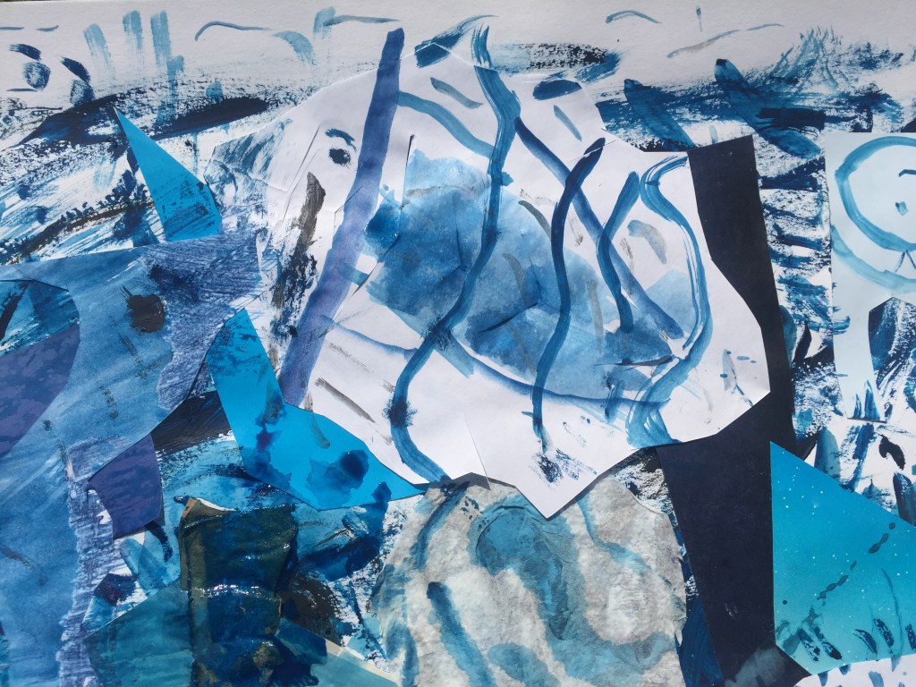

Layers of sea creatures swimming towards different directions.
—————————————————————————————————————————————————————————————
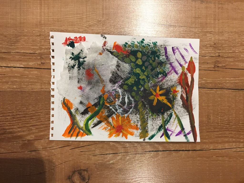
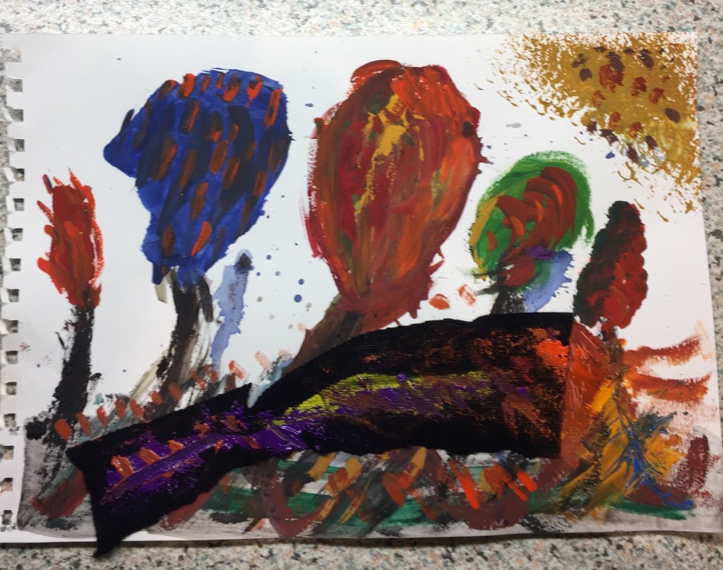
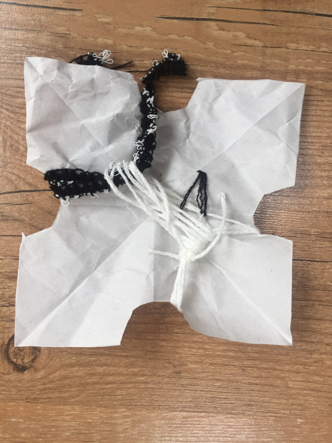
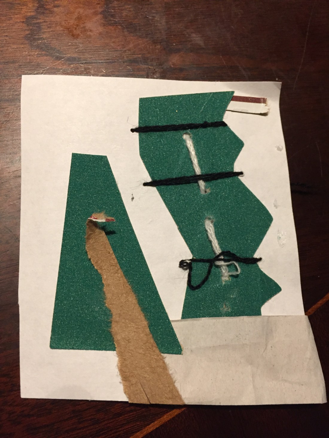
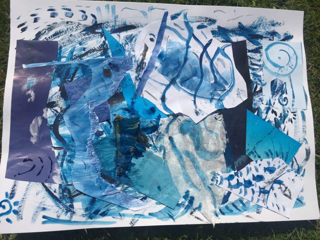
For my final piece I wanted to push the boundaries as much as possible.
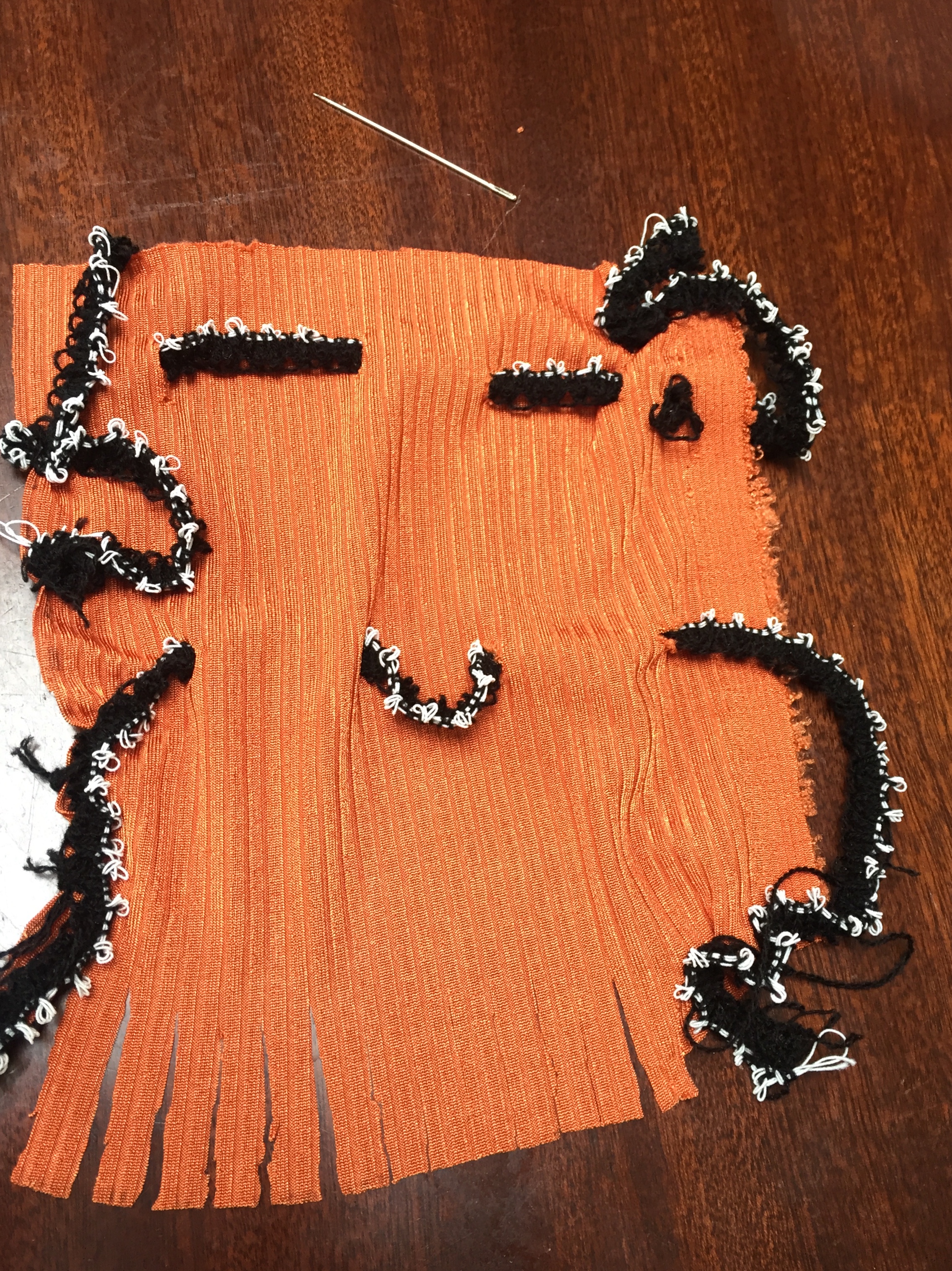
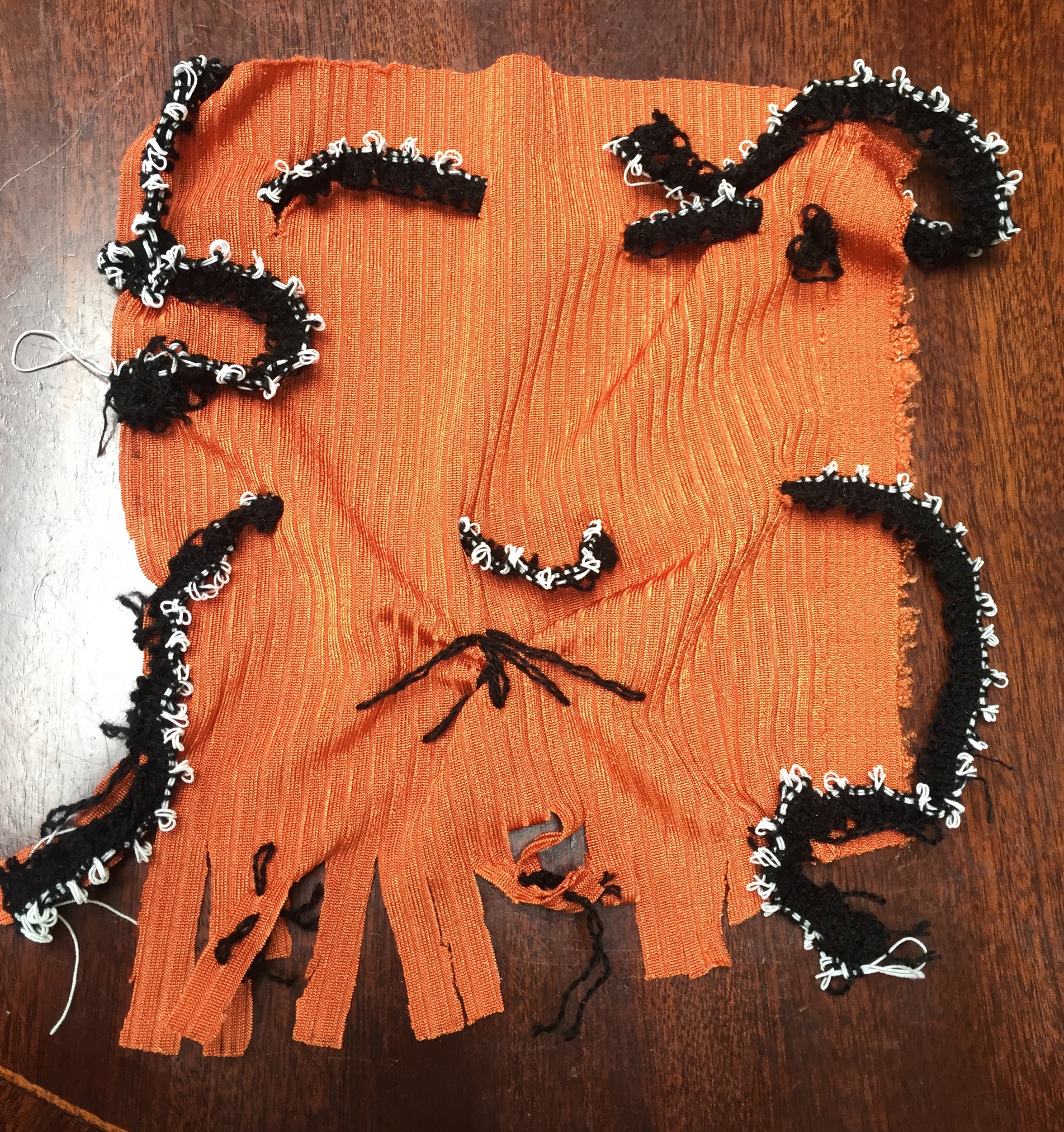
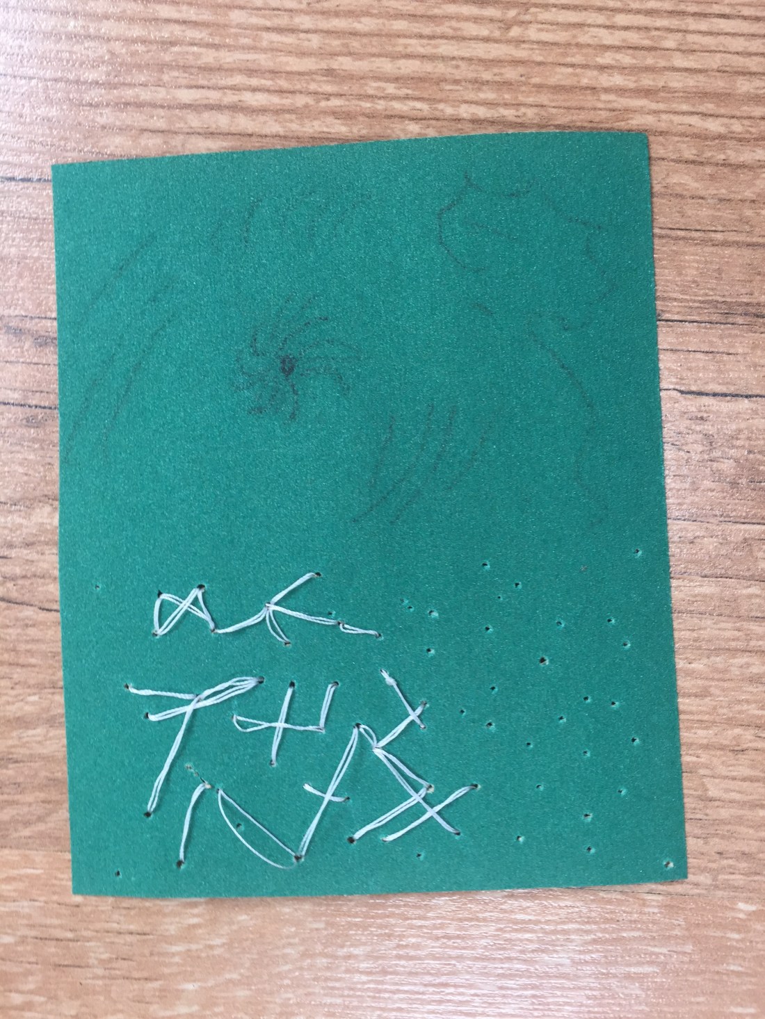
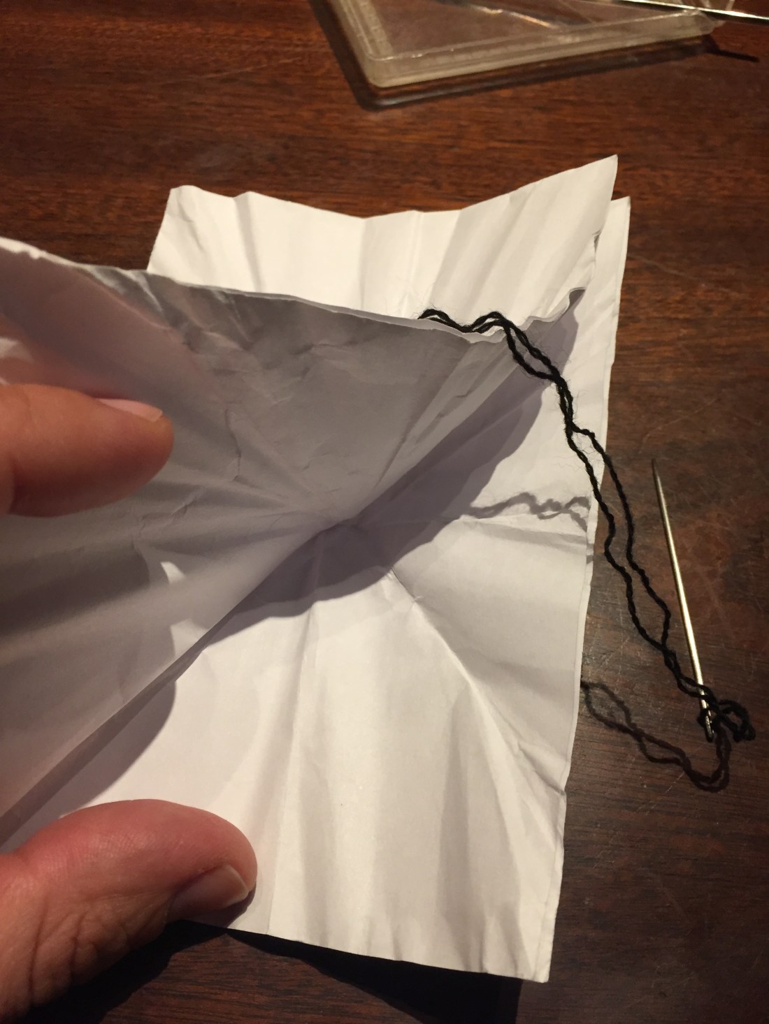
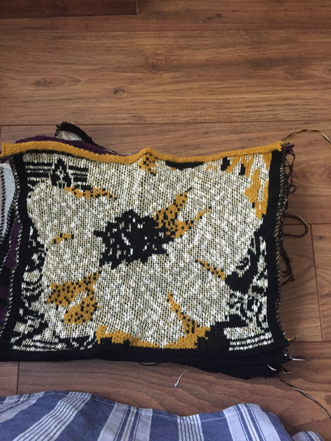
I tried to build a ”creative chaos” using different colours, cuttings and materials: Yarn, knitted ribbon, collage pieces, mark making drawings being cut out and presented in a different way as well as gauche cols along with brushes of different sizes.
Colour again as the epicenter of my study.
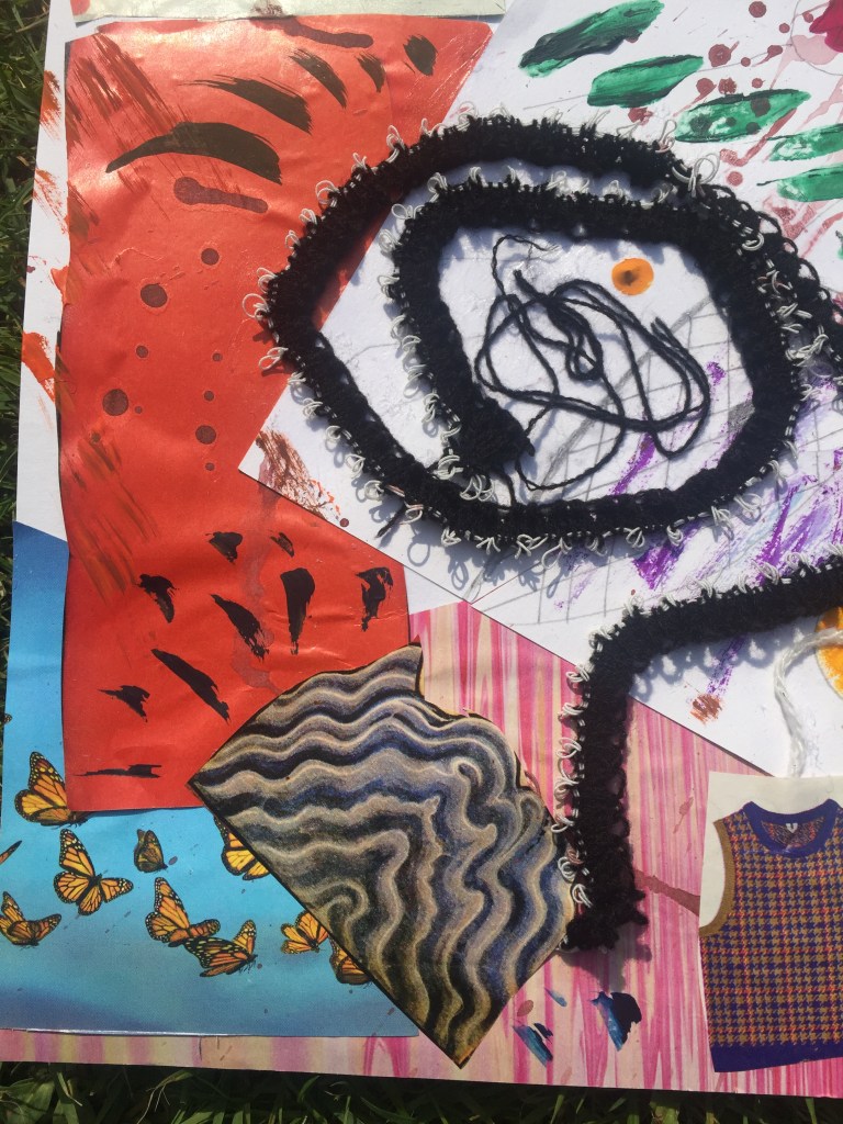
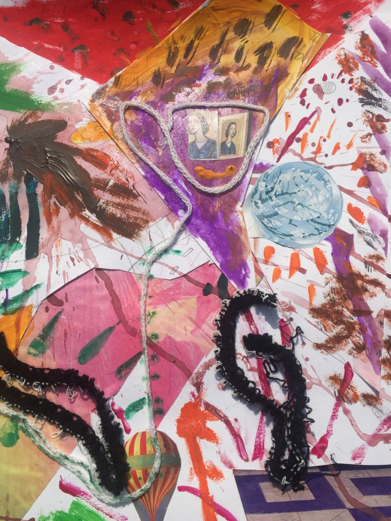
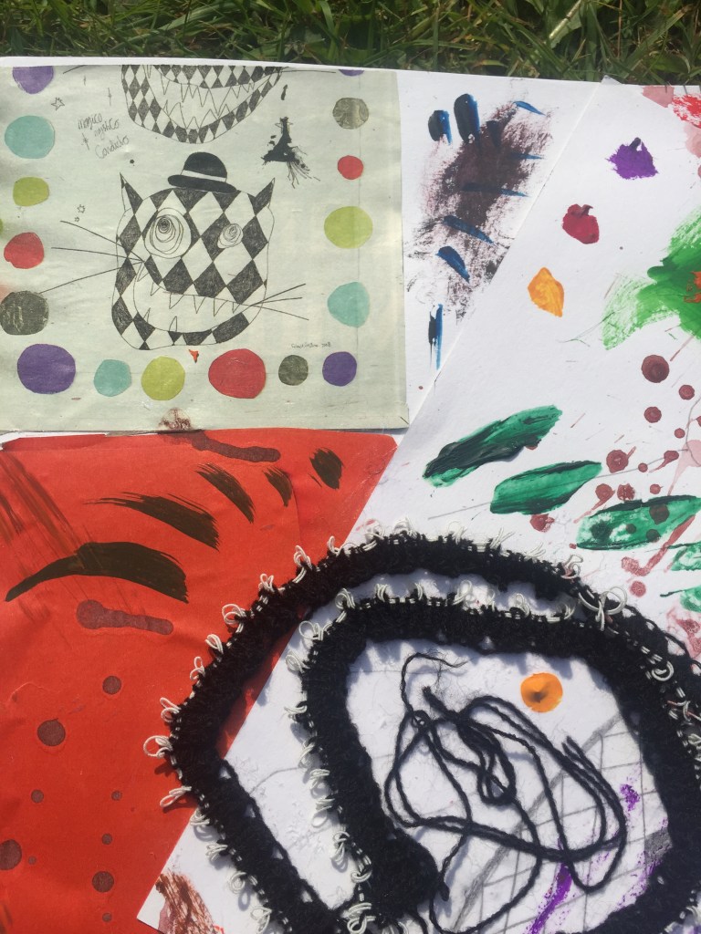
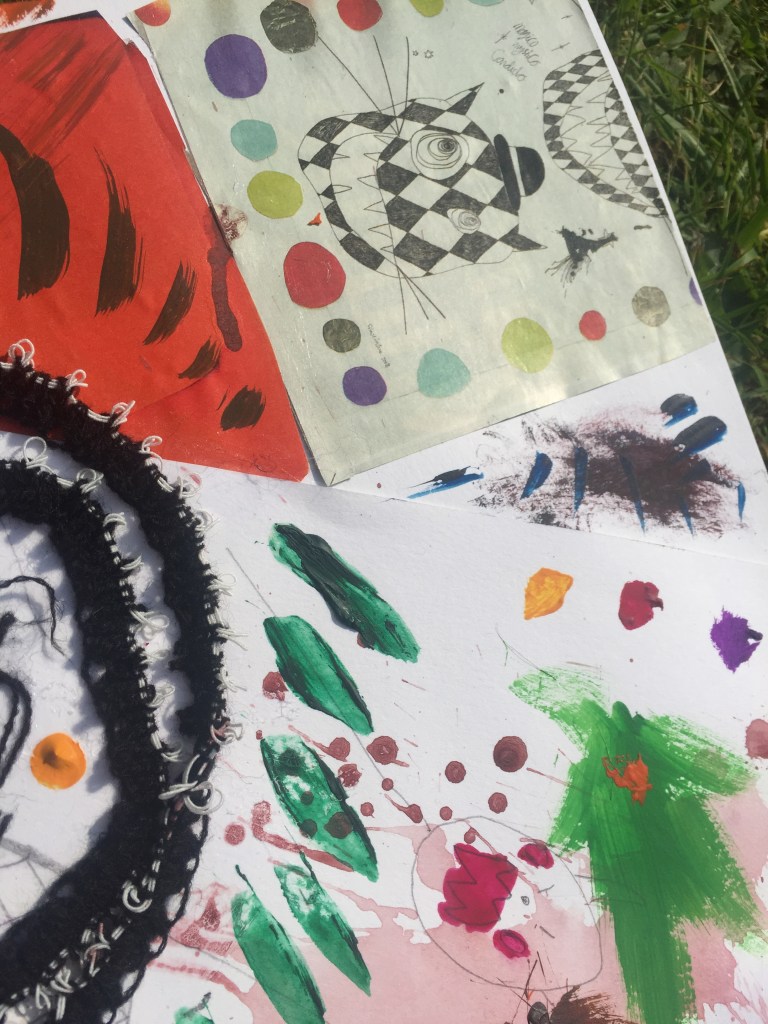


The concept as a whole.
———————————————————————————————————————————————————–
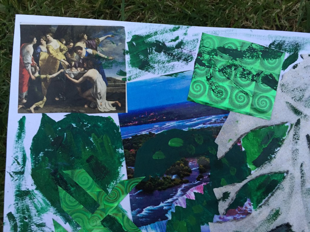
Additional work:
Following my tutor’s advice to push and explore my limits a bit further I’ve created extra pieces of work by using different materials and different techniques. Colour and the use of it is again my main inspiration .
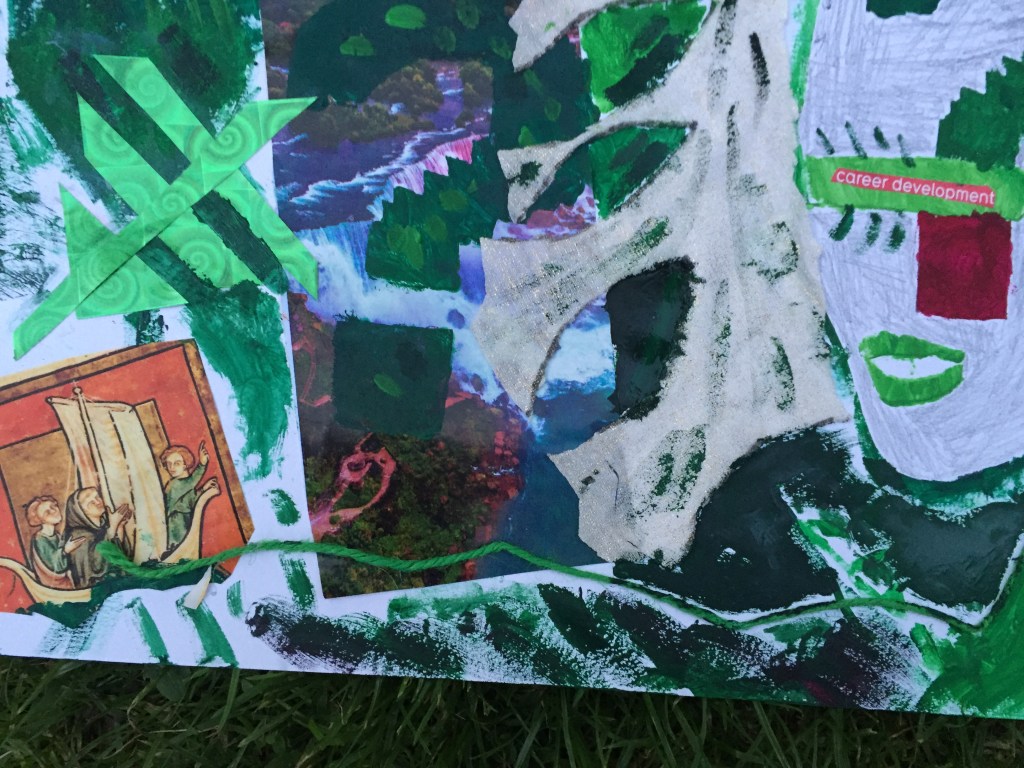
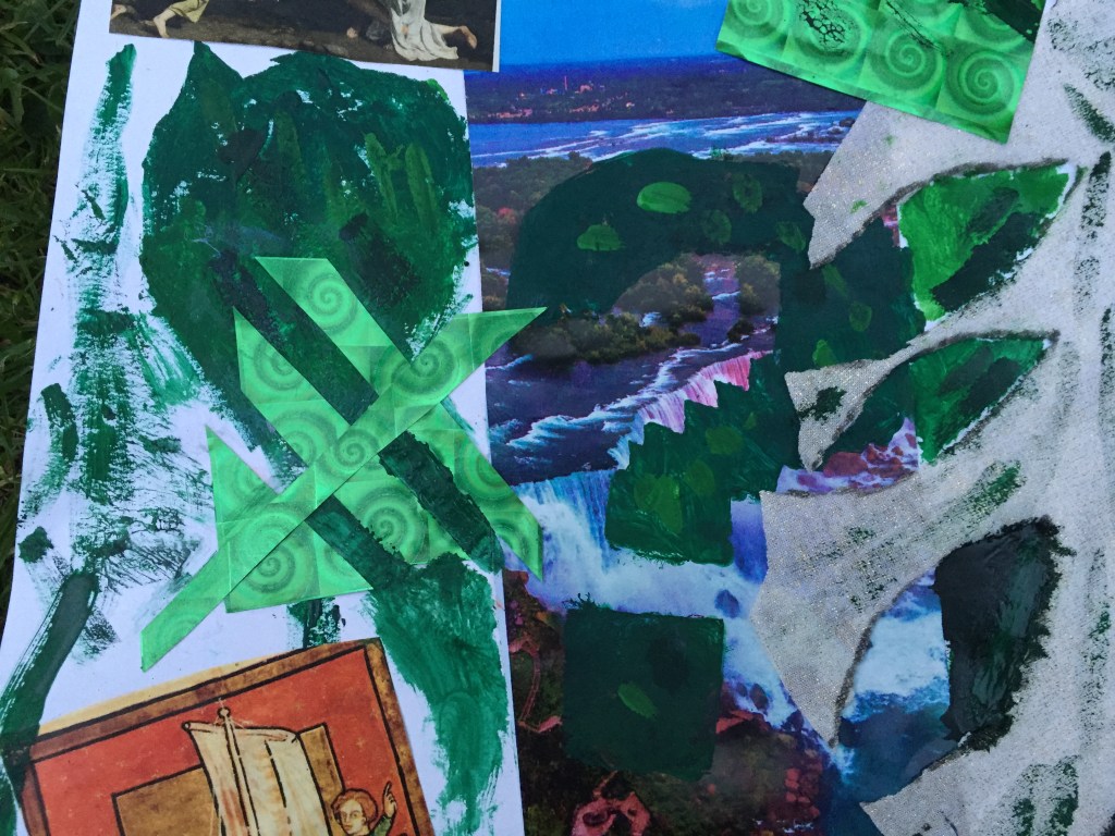
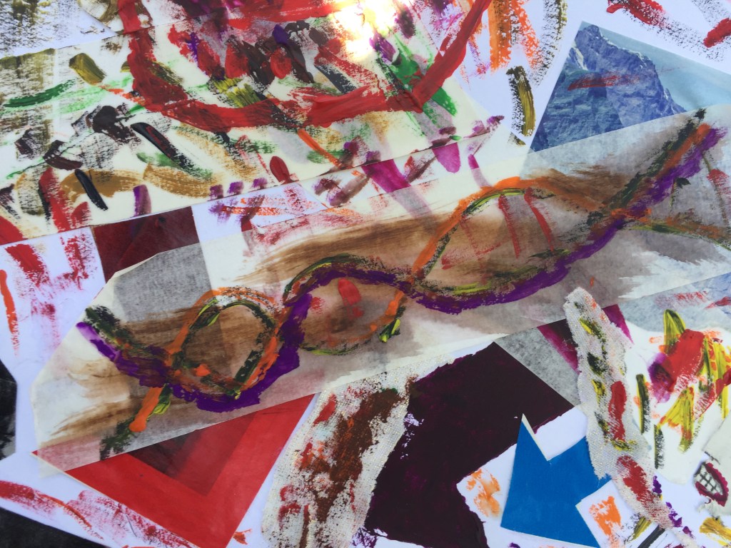
The first piece of work is divided in two sections :
The left side is dedicated to the past where people (top left corner) used to discuss and sometimes argue about the uncharted, the unexplored world so they are pointing at the waterfall direction with a big exclamation mark representing the unknown where at the bottom is a group of explorers sailing for the world to be discovered.
On the right side there is a face representing the modern person blinded by career development and wealth who doesn’t care about earth’s wonders (wonders that people, from the left section ,spend their lives to explore it) but wants to take advantage and exploit nature as much as possible .
At the bottom there is a green string bonding the past with the present.
I wanted to work and explore green colour this time.
I’ve mixed various shades together as well as with white.
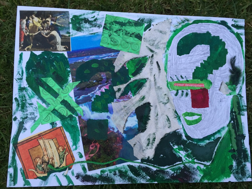
I’ve attempted to use stencil painting technique : it was interesting of how you can make forms and shapes but to my great surprise I realized that gauche creates colour bleeding which I thought it was a good feature eventually.


———————————————————————————————————————————–
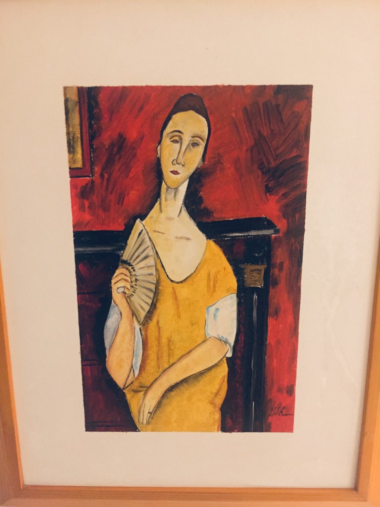
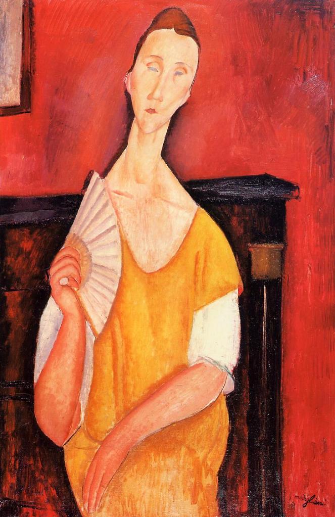
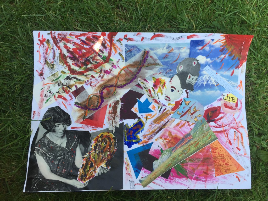
When I was going through magazines to get inspiration the following picture captured my attention.
A young lady holding an old mask. The way she is looking at it me made me wonder :What if she doesn’t know what it is and what it represents?
Masks had many uses : from been worn by hypocrites (word originally used to describe actors) in ancient Greek theaters ,to impersonate deities in many civilizations across the globe , making it an work of art and intelligence.
Taking this forward I’ve removed the mask and I’ve glued it a different position.
On the blank space I wanted to be as colourful as possible showing confusion of the person holding it.

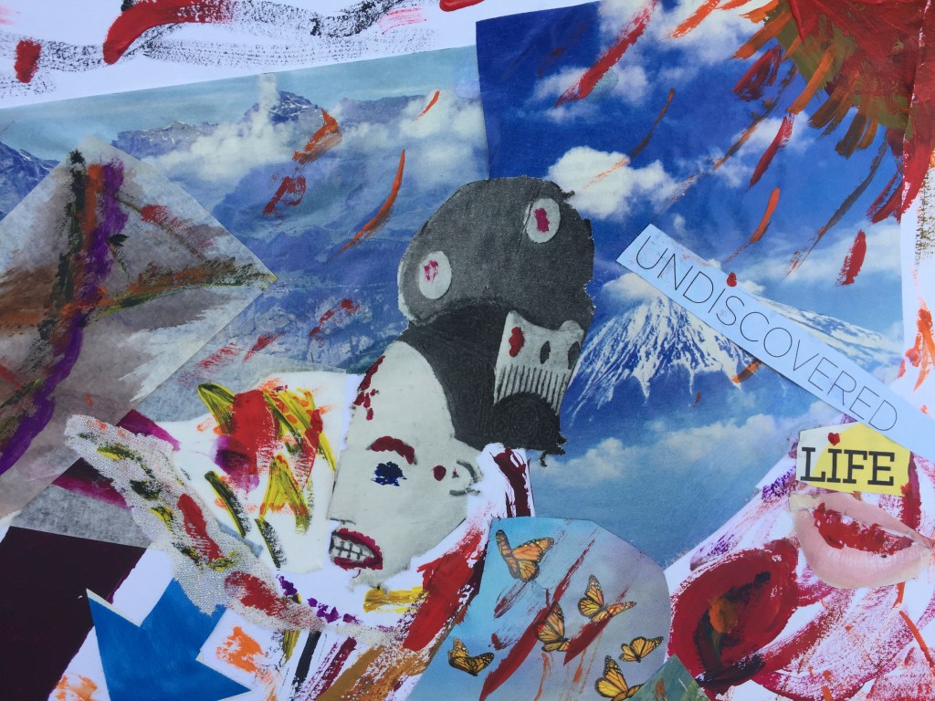
top right corner :The sun over mountain Fuji in Japan.
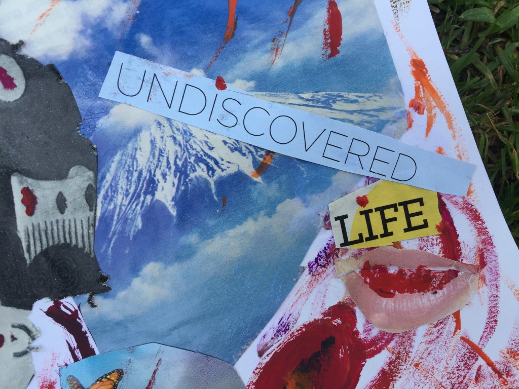
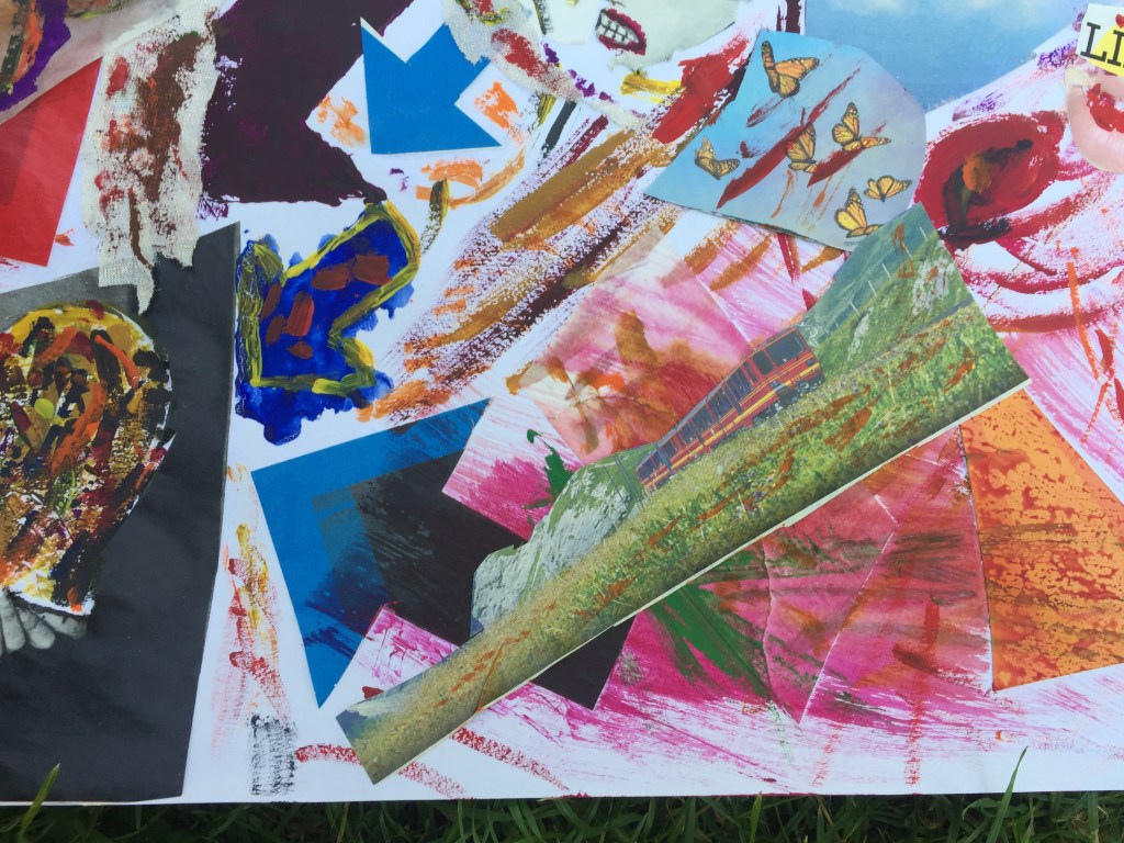
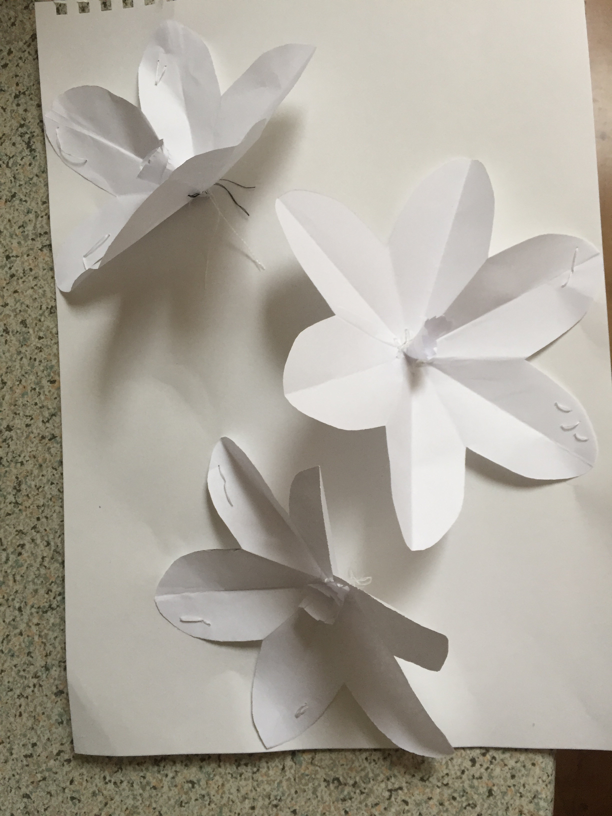
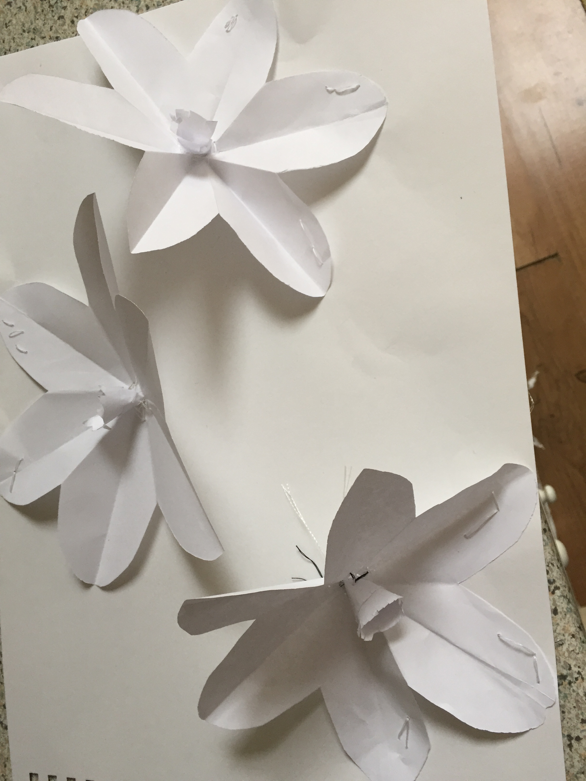
Butterflies is what you get when you discover something new in the inside or the outside world.
Synopsis of 3.4
Having finished the whole assignment and looking back on the project that I’ve been working on over the last three months , I have a great feel of accomplishment and fulfillment. I found collage along with colour as the best way to express myself : the layered detail can work in many ways in my mind and the more I observe, I realize things I didn’t notice in the first place.Also, being able to use different materials , different textures, pictures , cuttings , words , even different ways of putting things together makes me understand the potential of this way of expressing myself and how useful it can be going forward. It is a great process that soothes my mind , brings me peace and above all a fantastic sense of achievement…