Author: alexanderpapanikolaou
OWN COLLECTION
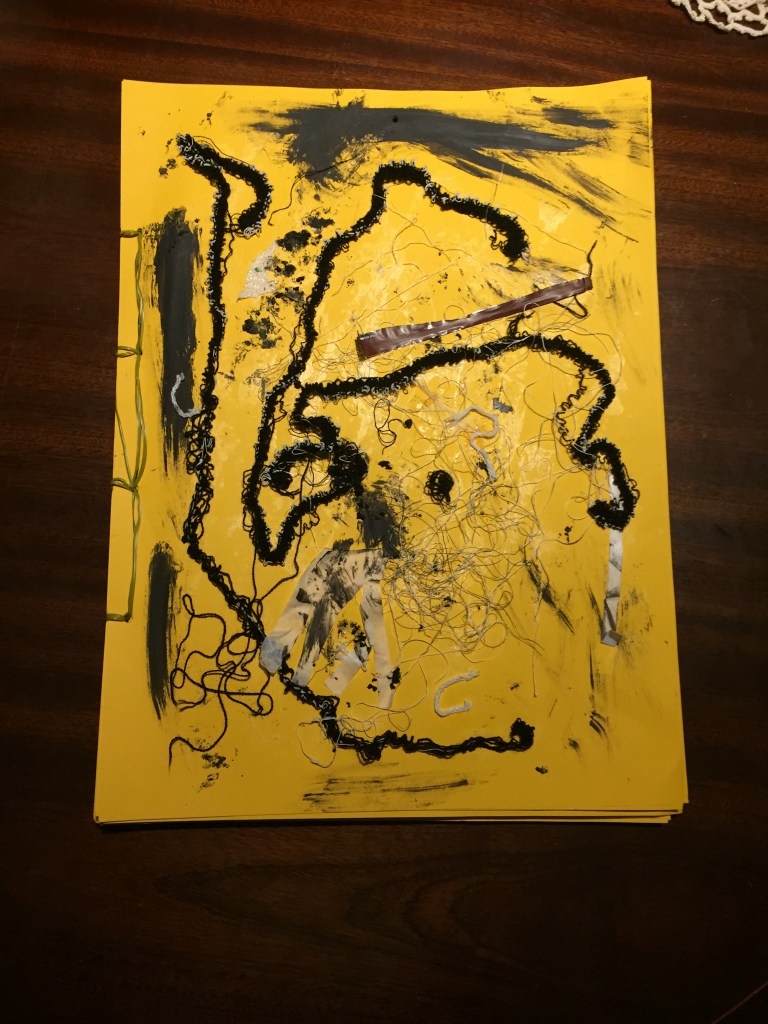
Using Japanese bonding ,I’ve managed to create my own book:It is a selective collection of my work .
My intention was for it to look as hand made as possible but also ,old and used -an item someone is carrying in his bag to show.
I’ve tried to arrange my work using colour as the main criterion .


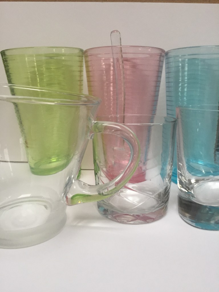
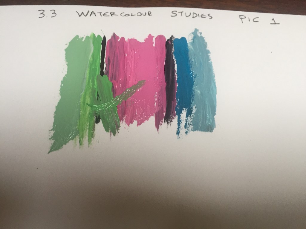
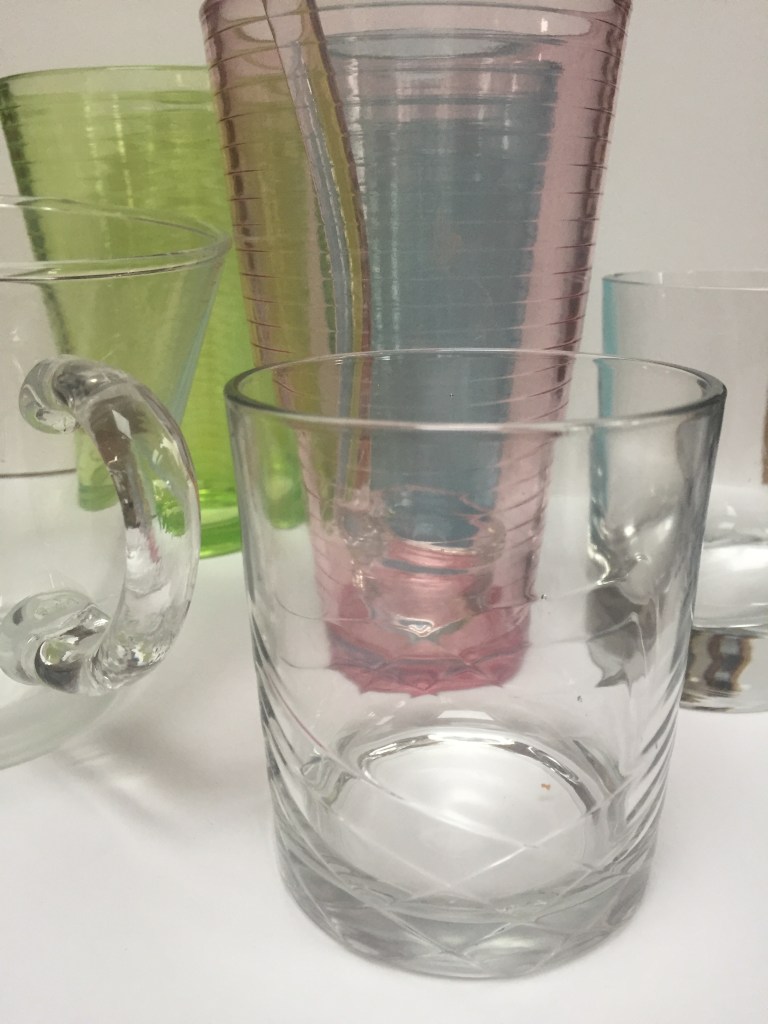
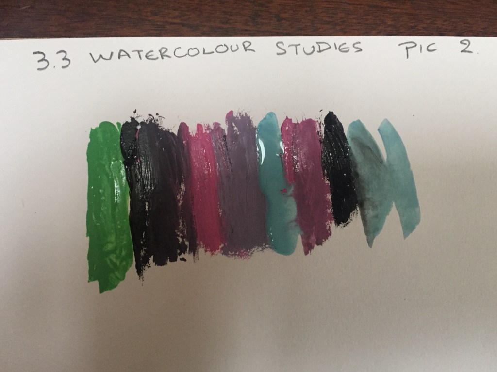
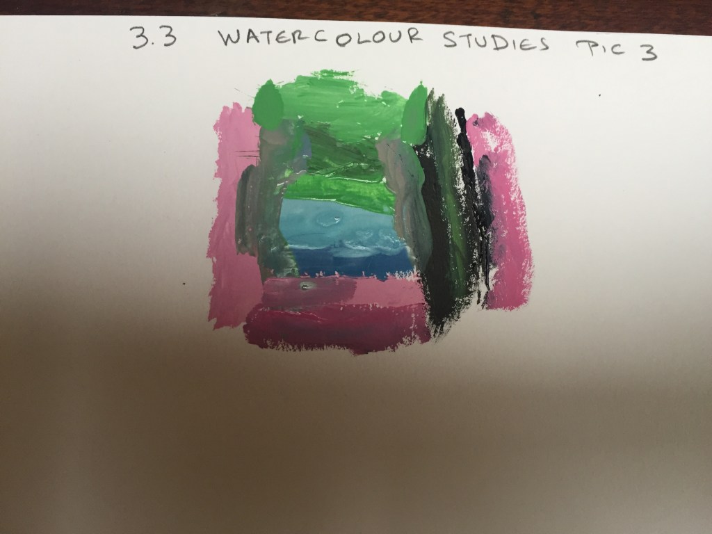
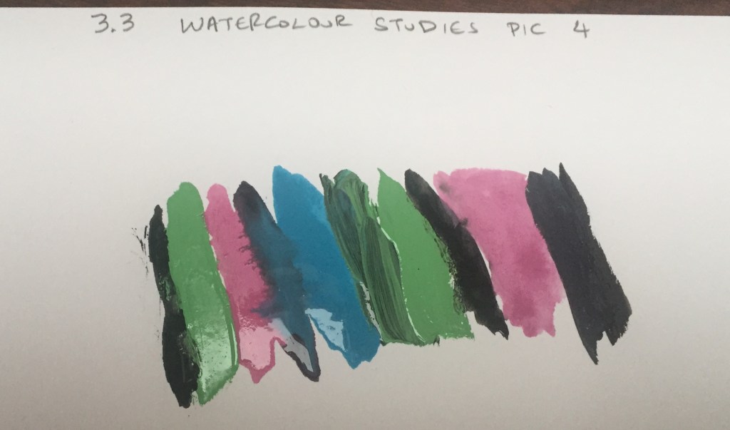
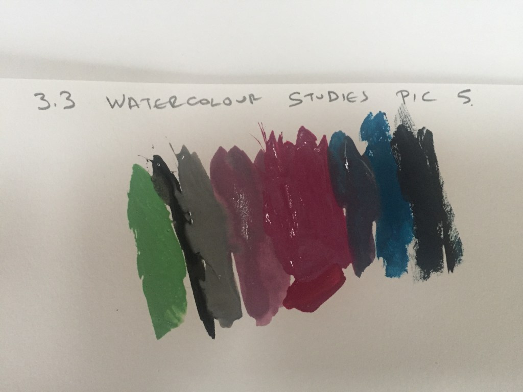
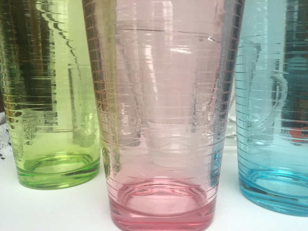
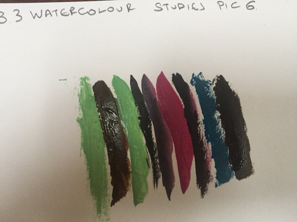
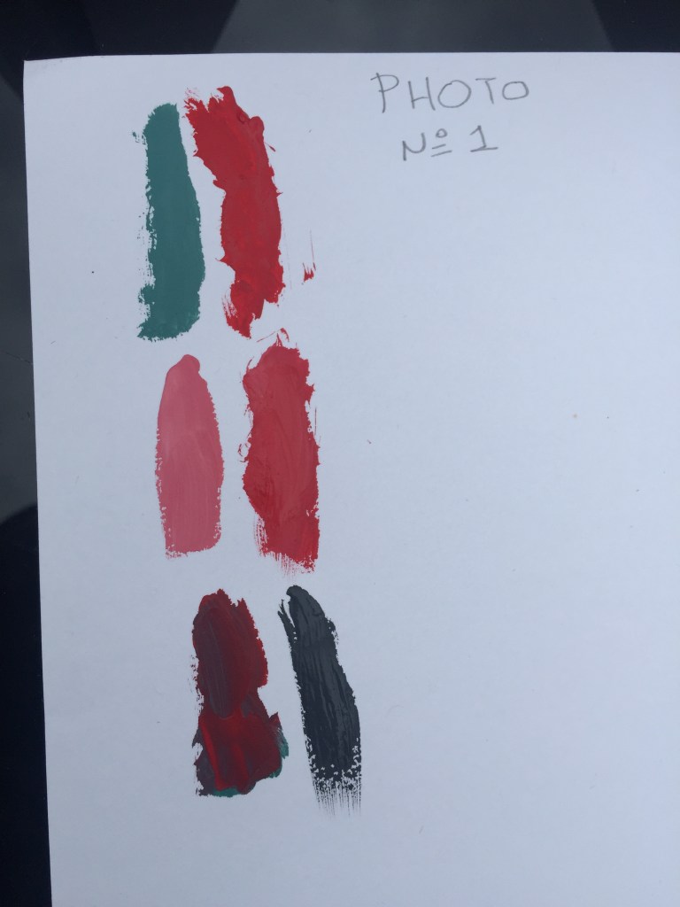
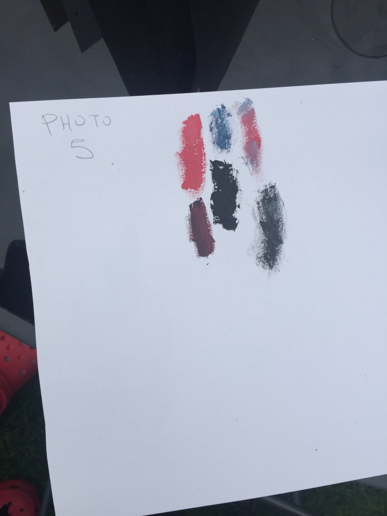
3.3 Watercolour studies
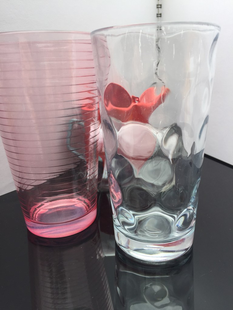
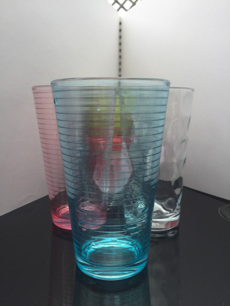
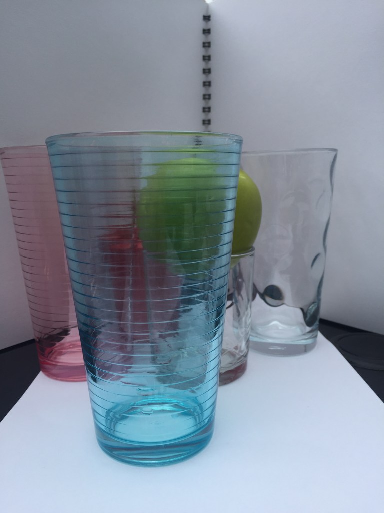
I’ve attempted to capture the different colours from glasses aligned as well as how the colour looks when shades merge .On top of that, to make it look more interesting and challenging, I found a transparent sauce serving utensil with a matching sauce spoon which displayed a different perspective and added more curves and depth to the picture and made the colour follow it’s shape.


———————————————————————————————————————————————————-
Following my tutors instruction , I’ve added extra work on this assignment.
To add a more colour depth and variety I’ve used a plastic green apple and a red sauce utensil with a light blue handle always sitting on the back.
I thought what if I use the same glasses, but on a black surface with a white background?
I realized that colours tended to look darker.

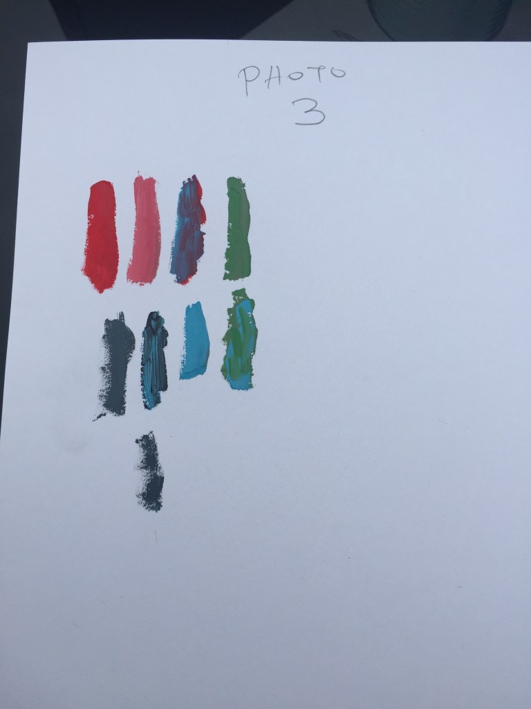

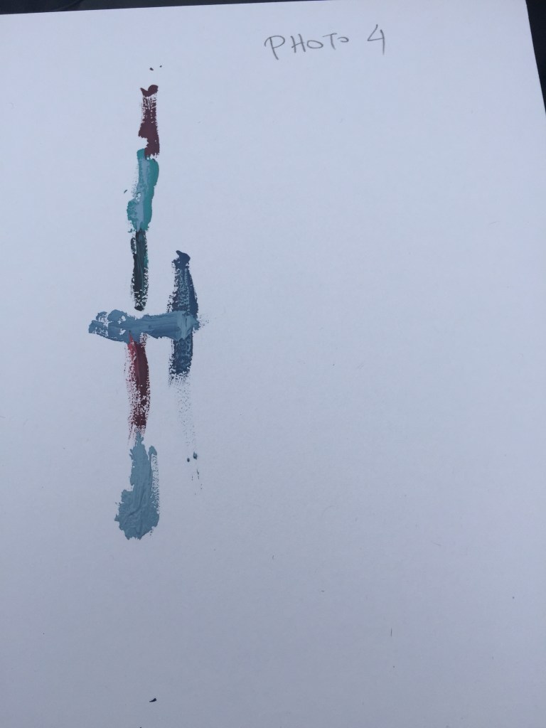


Assignment 3.3 worked for me really well eventually. My main gain was regarding how the colour works in different environments and how shades change through semi transparent surfaces . Playing and observing colours was an exciting expedience .
REFLECTION ASSIGNMENT 1
Final assessment:
On the first, introductory part of my course, I had the chance to start thinking outside of the box.
All these years I was creating fabrics and stitches without having
on the back side of my head the creation element I’ve used in this course . It was sort of a revelation to me as I’m working in a fast paced environment were I really haven’t got time for second thoughts, time to use my imagination in a whole or look back and rework on what I’ve created or even oversee what I’ve done in a different perspective.
Especially in the task that we had to draw with our hands closed or with our left hand, I had the feeling of being free from any kind of restriction, were time didn’t matter as much as the joy of playing about with your imagination , a sheet of paper and a marker.
I faced two things I’m not familiar with: craftsmanship were I had to create a collage and hand drawing which is something I haven’t practiced since I was a child.
I managed to master these ”fears” and finish my tasks after working around them where I realized how much I enjoyed doing this course ,what a great choice to take textiles it was and how many things I can gain not only as a student but more than anything else as a person…
FIRST ASSESSMENT FEEDBACK
Overall Comments
Congratulations on completing this assignment Alexander. Like we discussed in your Tutorial, there are a few aspects in your work that you need to be spending more time on.
I am going to highlight the main points of action. First of all it would be good if you could send your work to me for each assignment, I only received a few drawings of your Introductory project this time which is not relevant to Part 1.
In this first stages of the course I would like you to spend more time on each part of the journey: Useful and relevant Primary and Secondary Research, Drawings and Paintings coming from your sources, Learning techniques and generating a broad number of textile/material experiments rather than focusing on creating finished professional machine samples. Like you mentioned on your Learning Log and on our conversation, you are finding it difficult to come out your comfort zones. As a professional Knitting technician, you are able to produce very good and well finished machine jacquards, that is the reason why I think you should be trying to work differently to what you are used to and focus on learning and improving what it is new for you and those aspects of your work where you feel less comfortable. I think by working this way you will be able to create more exciting work and you would be able to combine your new skills with the ones you already know in future approaches.
Learning Log and Research
Context, reflective thinking, critical thinking, analysis
Your Research on this Assignment is not enough, both your Pixel generated drawings using a software and Machine jacquards have been developed from flowers of images found on the internet. I would like you to collect a lot of good quality Images and information from different Artists, Designers, Creatives, Art Periods and Visual culture from books, magazines, Online, Exhibitions, anything that inspires you and that could be useful to each assignemnt. All of this can be posted on your Learning Log, you can also printed and send it to me to review at the end of each assignment. Also make sure that your Paintings and Textile approaches come from your own sources, I think taking photographs can help you and give you ideas to develop future experiments and develop future work.
I would also like you to spend more time on your Learning Log, Make sure that your photographs have a footer with relevant information and that each exercise its clearly updated with good photographs of your work.
Engagement with textile techniques
Demonstration of technical and Visual Skills, Quality of Outcome, Demonstration of Creativity
You have learned some new techniques, working with paper and you have also developed some Knitted Jacquards. There is evidence in your work that you can generate very professional machine jacquards, but working this way is stopping you from using other techniques and engaging with hand made textile techniques. I would like to encourage you to take risks, and start experimenting and generating a lot of small experimental swatches instead of putting your time towards finished looking pieces.
I would like you to think about introducing loads of different materials and yarns, to use different qualities, textures, colours, thickness…
Make sure that your work is well presented, mounted on paper and clearly labelled with important and relevant information of each piece. Some of your Paper manipulations have a written on top of them, the information is confusing and hard to read and it also distracts from your pieces, always mount your work on paper in a form of presentation and attach a label to each piece of work.
If you are particularly interested in Knitting, I would like to look into Artists that work using knit in different fields, Art, Public Space, Interiors, Fashion, Arquitecture… That can also be inspiring to you when using other textile techniques.
– Ana Teresa Barboza >>> FLORAL -TEXTILE
– Vanessa Barragao >>> RUGS
– Anita Bruce >>> CROCHET CORAL REEF
- Freddie Robins >>> FULL BODY KNITS
- Jacqueline Fink >>> EXTREME COAARSE KNITS
- Ellen Schiffman >>> FIBER PAINTING
- Barbara DePirro >>> KNITTED FLOWERS AND ROOTS
- Toshiko Horiuchi >>> TEXTILE PLAYGROUND
- Joan Dulla >>> CROCHET WIRE JEWELRY- FOOD-LAB ANIMALS
- Carol Milne >>> KNITTED GLASS
- Channing Hansen >>> KNITTED PAINTINGS
- Stephane Martello >>> CROCHET KNITTING
- Alexander McQueen
Drawing and Painting
Demonstration of technical and Visual Skills, Demonstration of Creativity
Drawing helps you to plan prior you make and also to understand and learn more of what you have created after your making. You submitted some drawings from your introductory project, most of them are quick and poor quality drawings of jumpers but it starts becoming more interesting when you use collage adding some unusual papers. You should be spending a lot more time on it.
You have developed some drawings digitally using a pixel programme to develop jacquards, all those drawings are inspired on images of flowers found online. I would like you to start drawing life and draw and paint directly from your own sources, spending a lot more time on each painting. Think about engaging with different techniques and mix techniques, Watercolour, different pencils, rottings, Gouache, Acrylics, Chalk, Pastel colours… At the moment all your drawings are either digitally created or developed on A4 thin paper, I would like to encourage you to use different papers and surfaces to paint on, think about papers specific to the technique you are using, Watercolour paper, Drawing paper… Think about the thickness of the paper, opacities, textures, recycled paper. You can also reuse card or paper from waste, newspapers, magazines, plastics… and use it to create collages or to paint on them.
Like I mentioned in your tutorial, I would like to recommend you a book, “How to draw with the right side of your brain”. Betty Edwards. This will give you ideas and help you improve your Drawing and Painting skills. Another interesting book is “How to Draw What You See” by Rudy De Reyna.
Well done Alexander, Looking forward to your next Assignment.
| Tutor name | Pere Bruach |
| Date | 9th March 2019 |
| Next assignment due | 15/04/2019 |
1.8
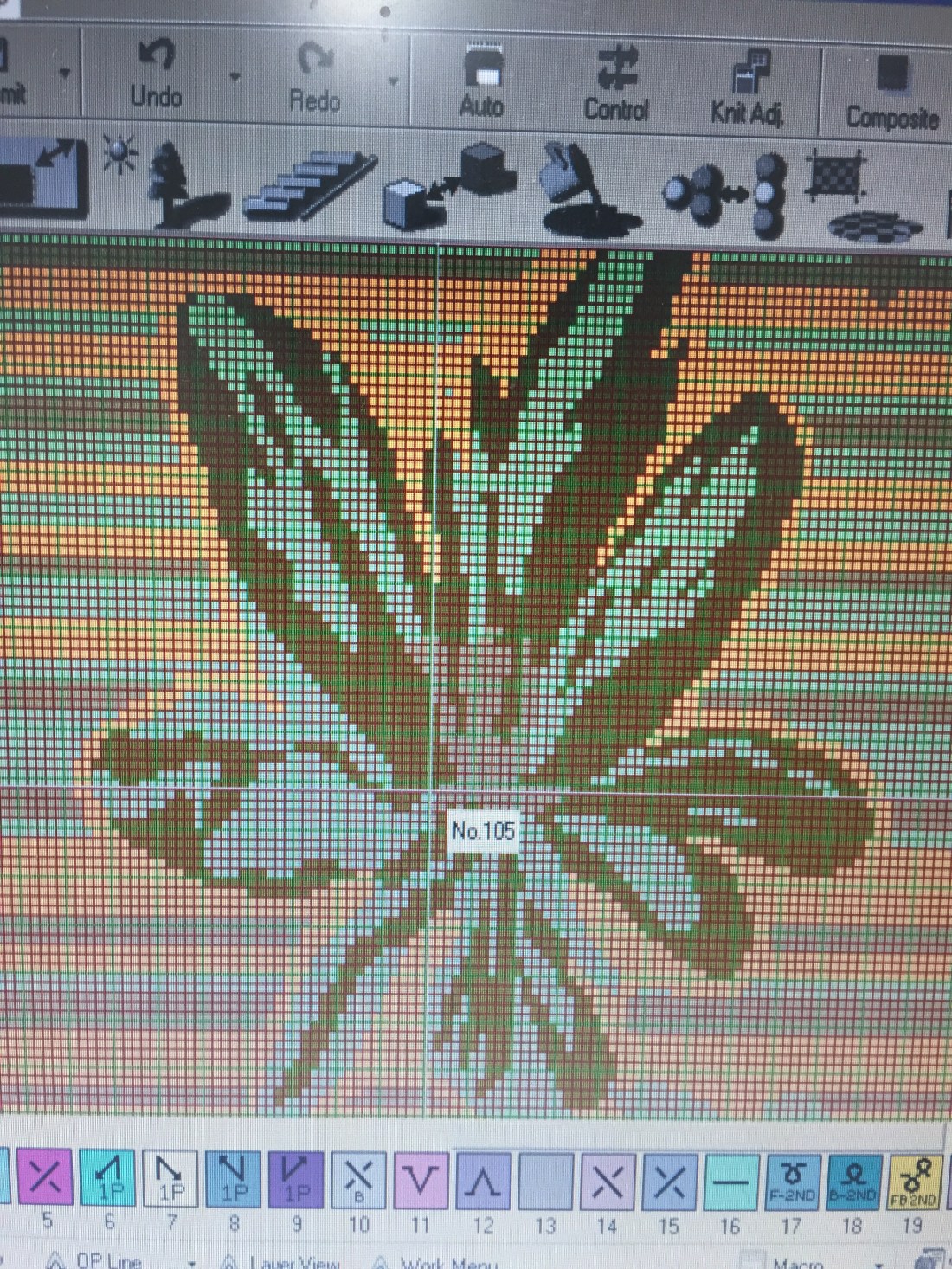
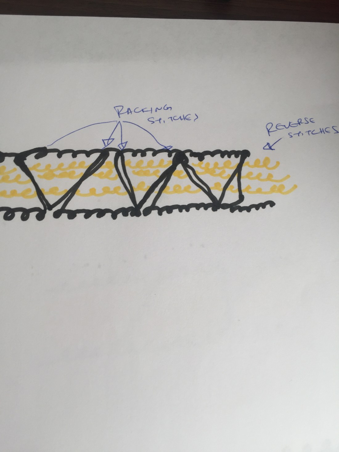
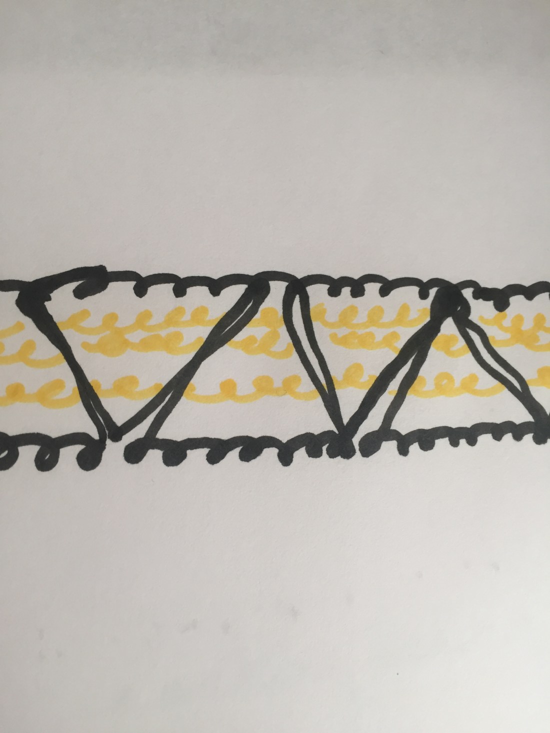
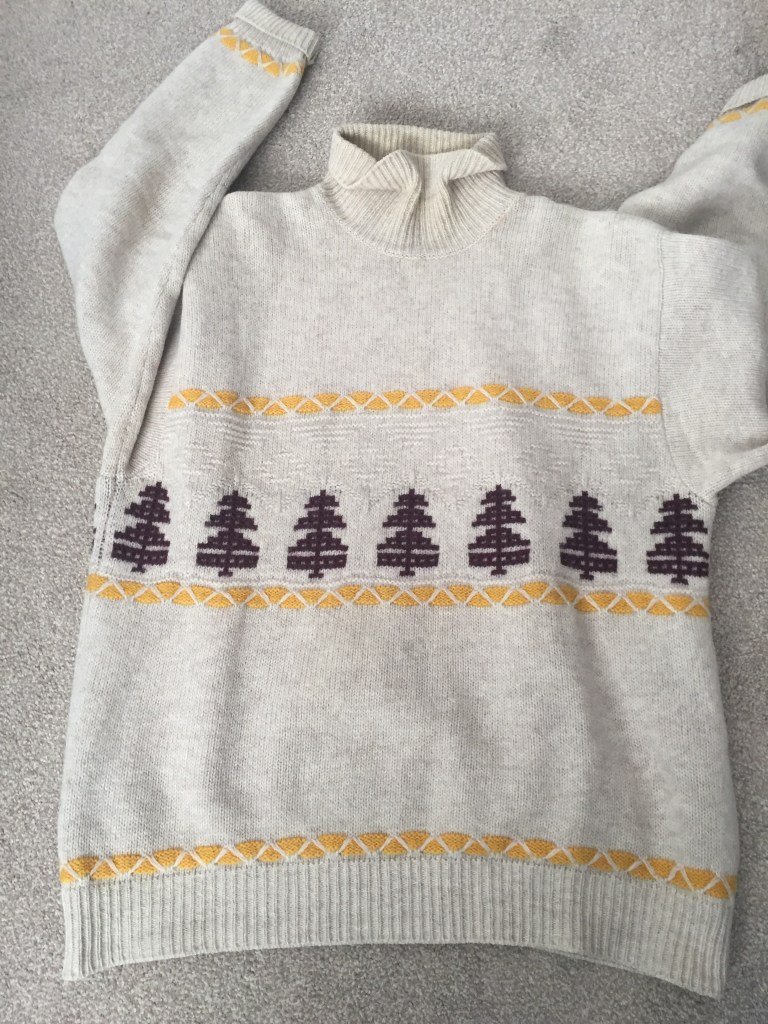
1.8 PORTRAYING BY DRAWING
At last ! I’m able to use the computer!
The only way of drawing I can perform, understand and deliver is by grid drawing, a sort of mosaic creating kind of thing:
My problems where two:
firstly how to portray a physical design and to convert it into a two/ three color jacquard.
second hurdle I had to overcome was to find a way to transfer the .tif file I’ve created into the blog as drag and drop didn’t work.
Finally I found out that .gif file was acceptable but with the down side of not having a clear picture (that’s why all pics are a bit blurred).
my goal was to create physical looking graph which can be used by a knitting machine and convert it into fabric if required.


1.7
1.6
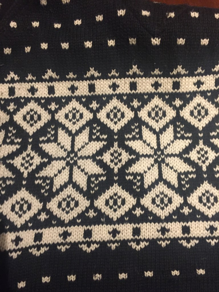
Exercise 1.6 Detail and definition
The purpose of this assignment is to capture details on the selected fairisle styles.
Again, I have to manage the difficulties I encounter that have to do with drawing.
In this exercise I went really deep into the details.
I tried to capture stitch details like a magnifying glass .


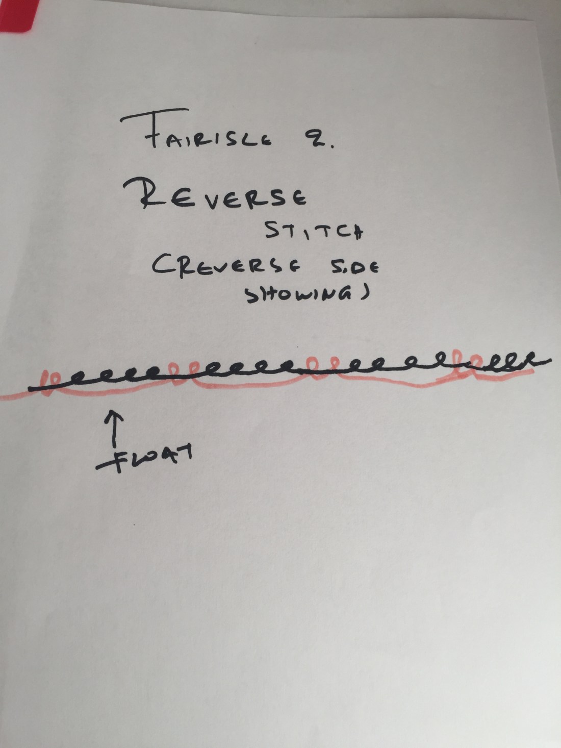
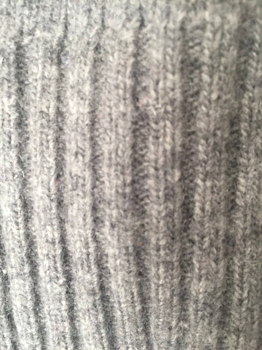
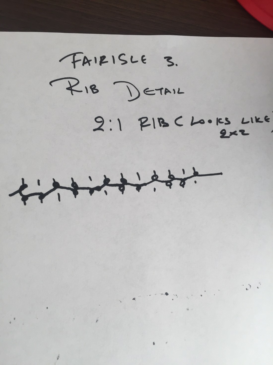
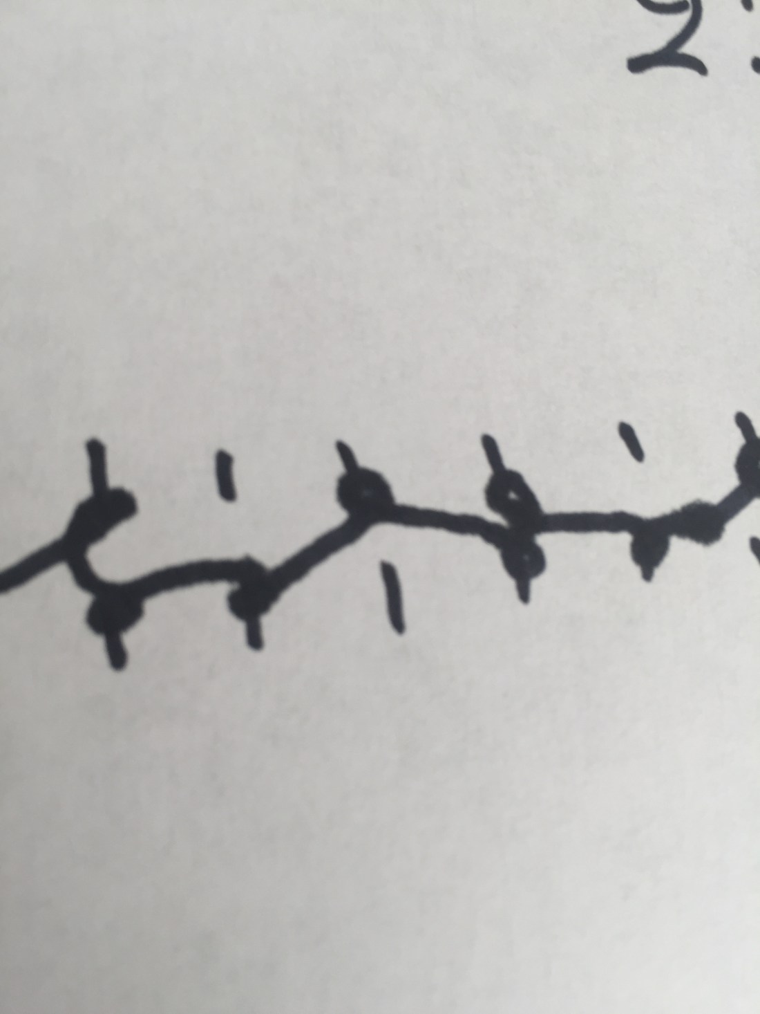
knitting construction detail 2×1 (2×2) rib.
1.5
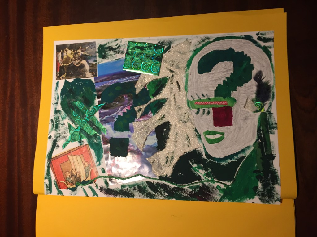
Exercise 1.5 Collage and creases
Pare down to the essence, but don’t remove the poetry. (Koren, 2008, p.72)
WABI-SABI :the art of simplicity.
Poetry ,in my opinion, is a form of wabi-sabi .
It’s the art of trying to say and imply many using only few lines.
In modern Greece there is a phrase left from the ancient times: << LAKONIZEIN ESTI FILOSOFEIN>> and it is about the ancient Spartans who were living a simple yet glorious life. The meaning of the saying is that if you live like a Spartan you tend to live like a philosopher!
It’s really hard to achieve simplicity , especially when it comes to apparel designing.
On the other hand simple things are the most popular and have the best sales !
People love them because it’s easy to see the concept behind and the use of them.
So, trying to achieve wabi-sabi is trying to infiltrate, get to the core and make the most of everything .
TASK:
Again something I’ve never done before!
A collage!
It took me several days and time of research to understand what I need to do, as well as I had to short of “squeeze” my brain to put things in order.
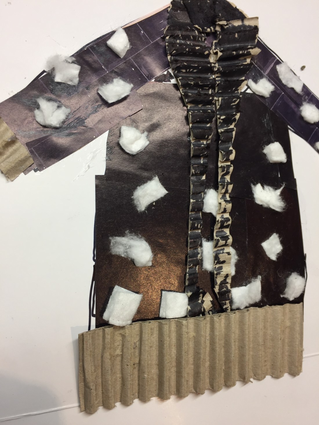
Finally , I managed to come out with two decent designs trying to present as many features of two of my garments possible:
I’ve used carton to show the rib stitch detail as well as cotton wool to show the fluffy and hairy effect of one of the fabrics:

style one:
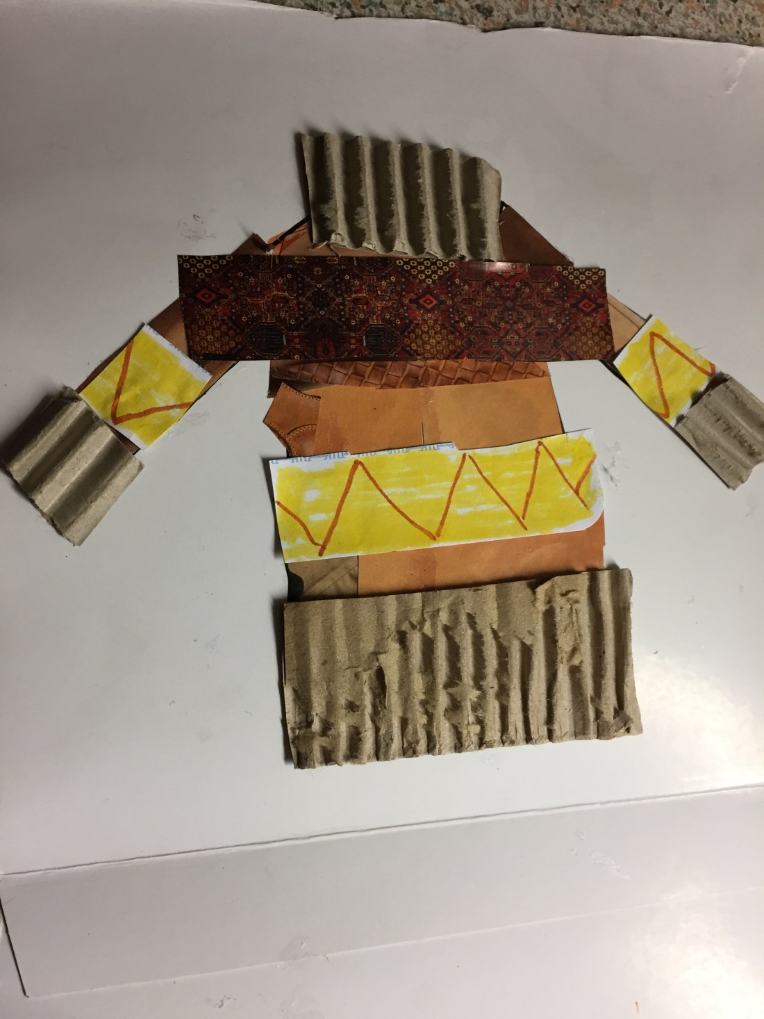
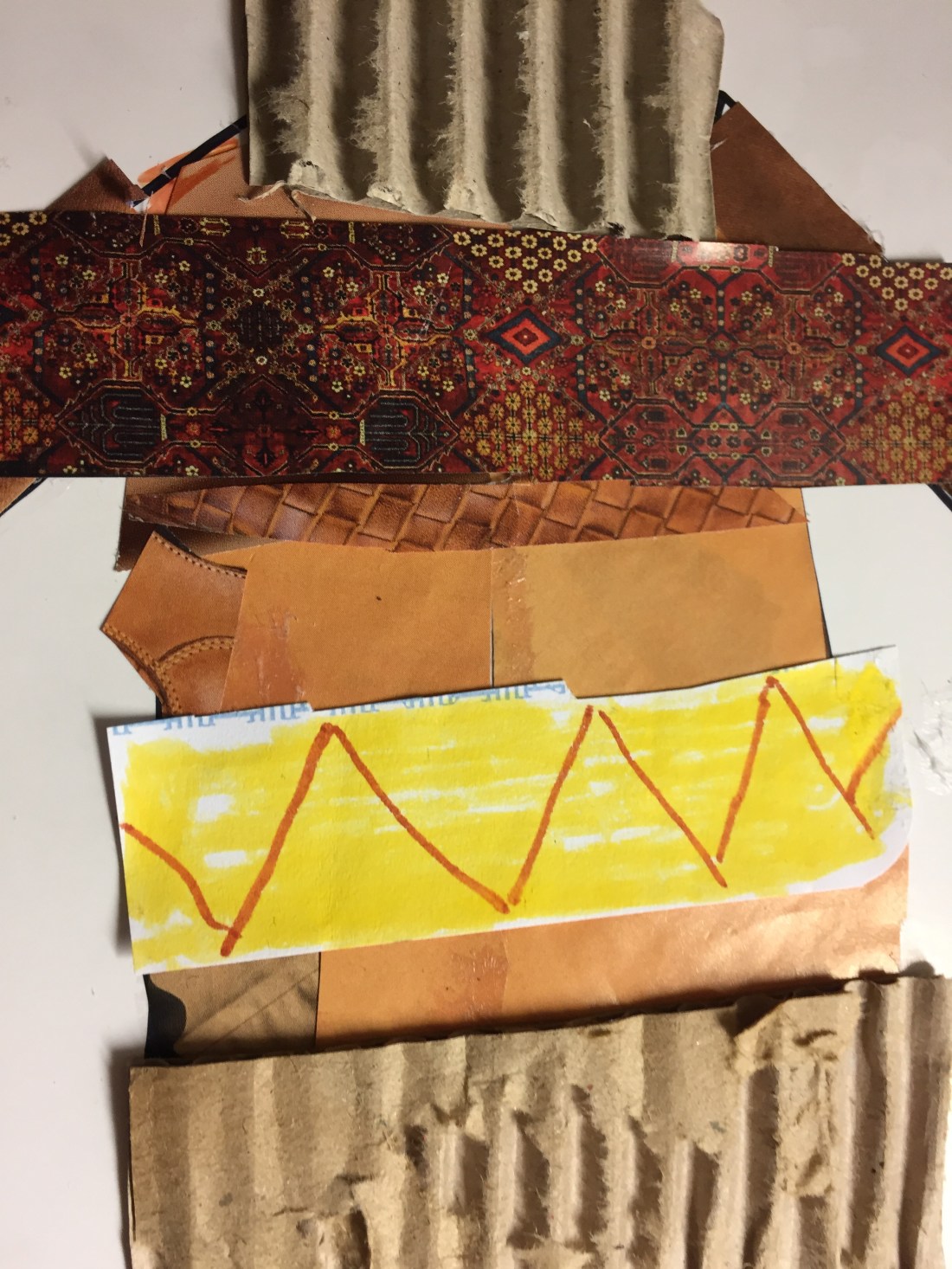

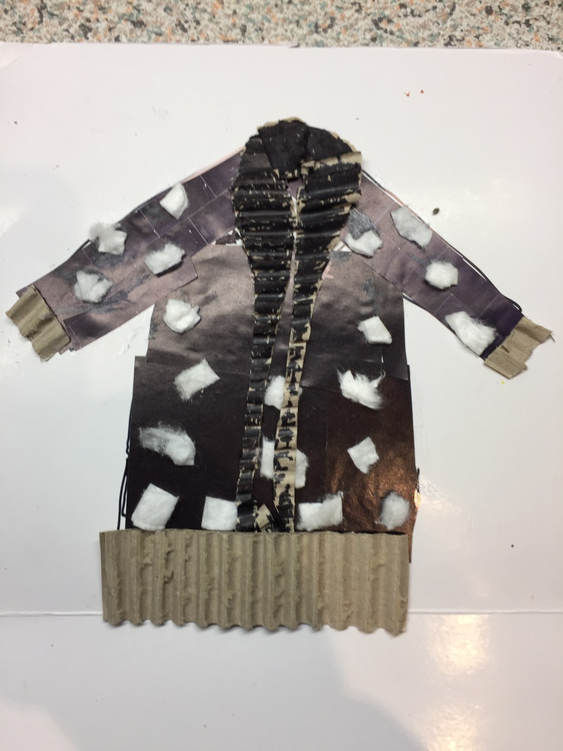
style two: shawl neck wool cardigan.

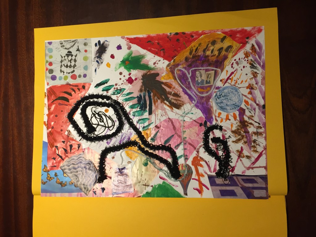
REFLECTION ON ASSIGNMENT 3
Assignment 3 had been a roller-coaster :each time I was starting to work on a new project I was feeling like I was going down ;then, when I was getting my self comfortable finding my way through it, I was having great boost of confidence getting excitement and fulfillment. I’ve learned so much and the most important thing is I’ve realized that there is a lot more to discover and more tools to take on board.
My main strengths are my textile background and my vivid imagination: doing my work I had got a lot of inspiration from paper cutouts where (my imagination) had been triggered by colour and the relation with it. I’ve created pieces I’m really proud of and best of all reflect on my feelings creating them.
By the end of the assignment , on the last few pieces, I felt I wanted to do more, tell a story, I wanted to communicate my feelings whilst I was working on my project and to my great satisfaction the tools I was using and studying on did a brilliant job.
Main gain of this part of my journey is that I have discovered collage in particular as a way to express myself and to my great surprise how it works with gauche colours on different surfaces and paper textures.
Still more to come .
Getting ready for assignment 4 .
RESEARCH POINTS
RESEARCH POINT 1
Research the colour work of some textile artists and designers, starting with the names listed below.
-Voyage Decoration
-Wallace&Sewell
-Paul Smith
-Marimekko
-Cole & Son
-Vlisco
-Mary Katrantzou
-Norma Starszakowna
-Ptolemy Mann
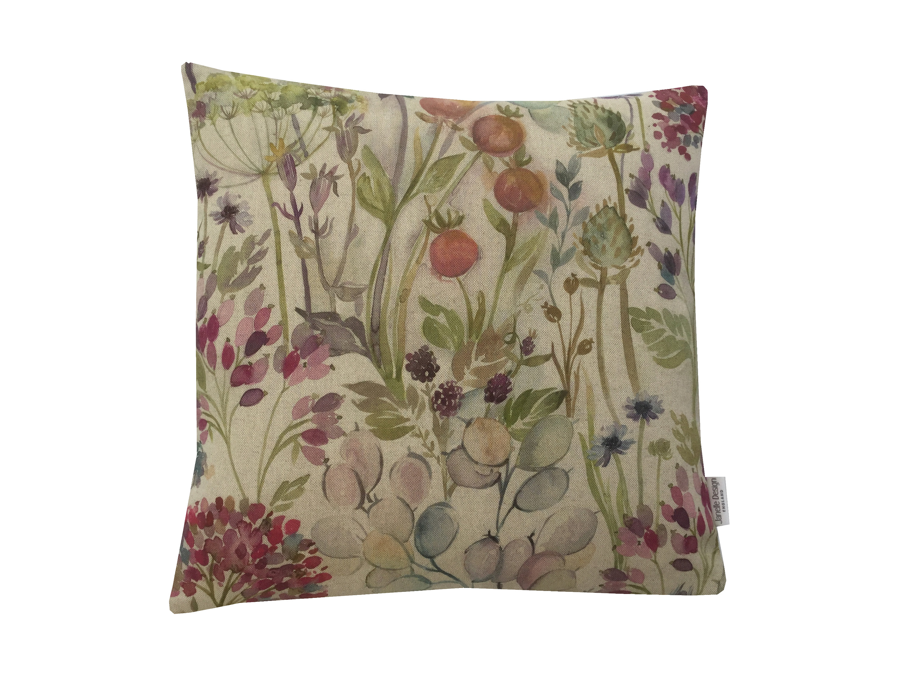
Voyage Decoration
footage copied from Voyage Decoration web site
Interior design fabrics made to create cushions and furniture upholstery: the painting style is bold with playful shaping, detail and content, using an opulent colour palette portrays richness and personality making you feel welcome in a cozy and relaxing environment.
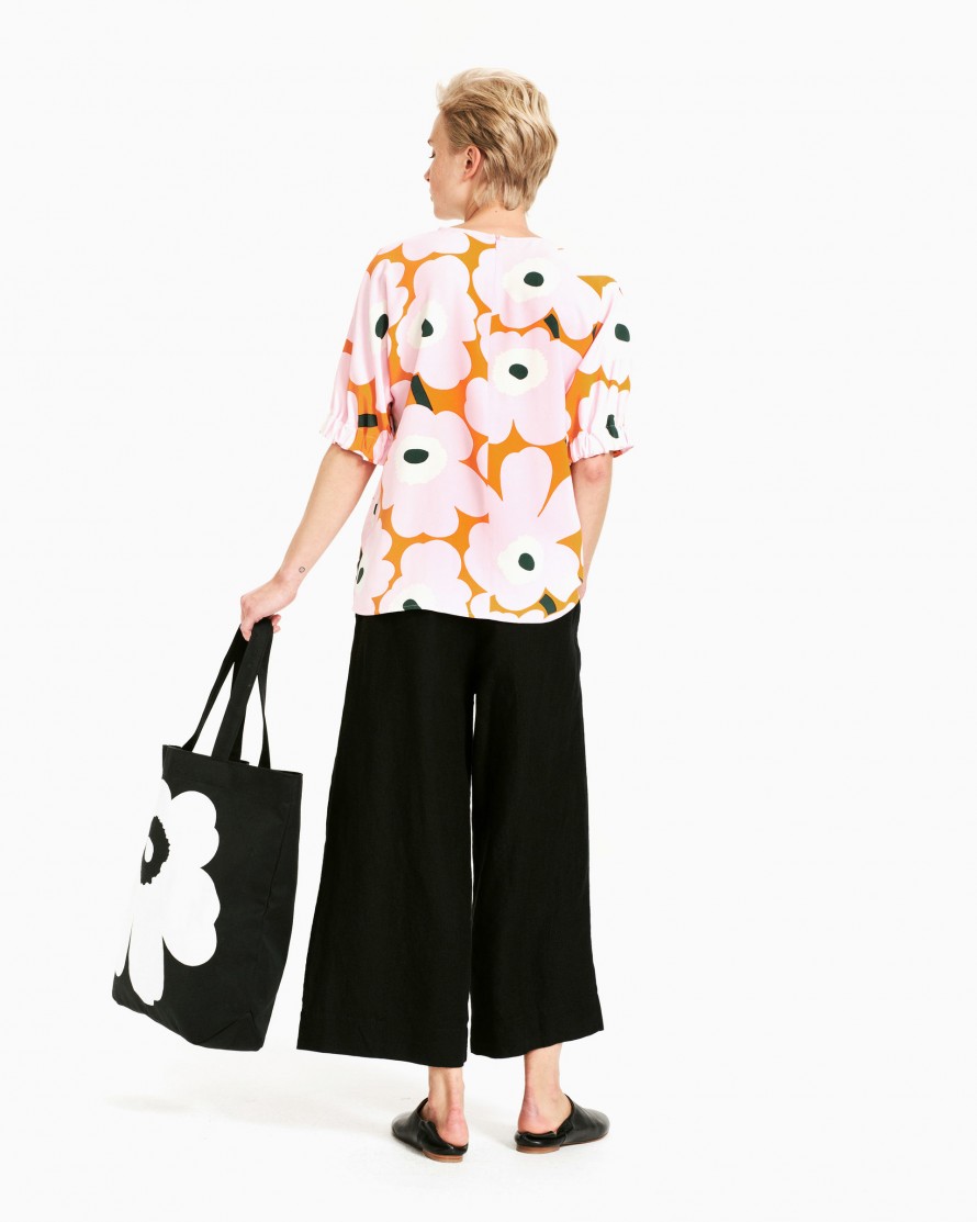
Marimekko
Marimekko is a Finnish lifestyle design house celebrated worldwide for its original prints and colours :there are monochrome designs as well as really vivid and bright colour prints which create a great contrast and colour coordination.
footage copied from Marimekko web site
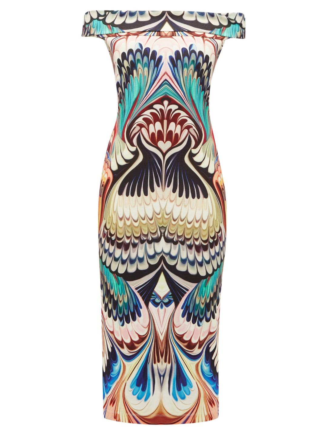
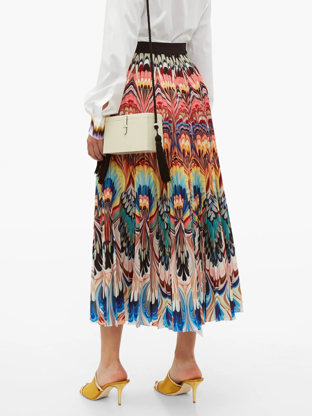
Mary Katrantzou
Mary Katrantzou– or as fashion world likes to call her, Queen of Prints – is unrivaled in her innovative, architectural approach to fashion design.
Her catchy and bold colour coordination along with carefully selected prints and jacquard patterns create a unique handwriting.
Colours are bold and in proportion either they are in colour block designs or stripes:
footage copied from Katrantzou web site

Wallace & Sewell
Wallace&Sewell are renowned for their range of quality throws and blankets and scarves.Inspired by paintings, they create individual contemporary fabrics with strikingly bold, asymmetric blocks and stripes of varying scales.
Cole & Son
Wallpaper inspired fabrics , colours used to give a dramatic and loud outcome: Colour is celebrated at it’s best used as a background as well as the main element.
Footage copied from Cole & Son web site

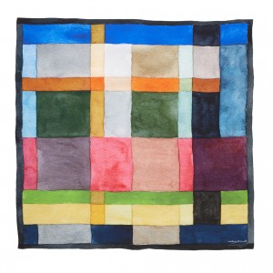
Norma Starszakowna
The artist has used colour to help convey her feelings about Scotland’s history and achievements – there are dark tones of Celtic standing stones and local mining industries, greens and blues of agricultural land and seascapes, bright colours of philosophy, education, science and medicine through to the gold and silver that the artist uses to convey her feelings about the Scottish Enlightenment period.
source of the footage Victoria and Albert Museum

source: Victoria and Albert Museum
Paul Smith
Sir Paul Smith is almost the last of the great indie designers. A gentleman who has built a global brand on style and cool clothes. His signature design include stripes: lots lots of stripes in different colour and different size in order to avoid repeat as much as possible.
footage from Paul Smith website


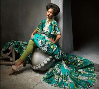
Vlisco
Vlisco has been designing and manufacturing distinctive fabrics loved by African women since 1846. Inspired by Africa, made with a technique derived from Indonesian Batik, designed in the Netherlands, Vlisco’s heritage and design signature is a multicultural melting pot of beauty and industrial craftsmanship.
footage from Vlisco website.
Ptolemy Mann
Ptolemy Mann is a rug designer with a unique handwriting , working in collaboration with Julian Blair with whom she is sharing the same passion.
Her designs are colourful and unique inspired by weavers and dyers from India and Nepal.
footage taken from Ptolemy Mann website.

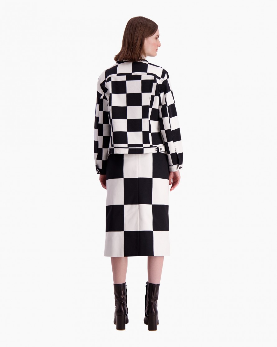
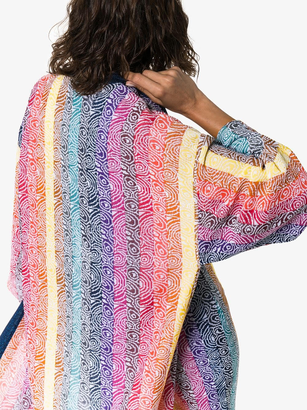
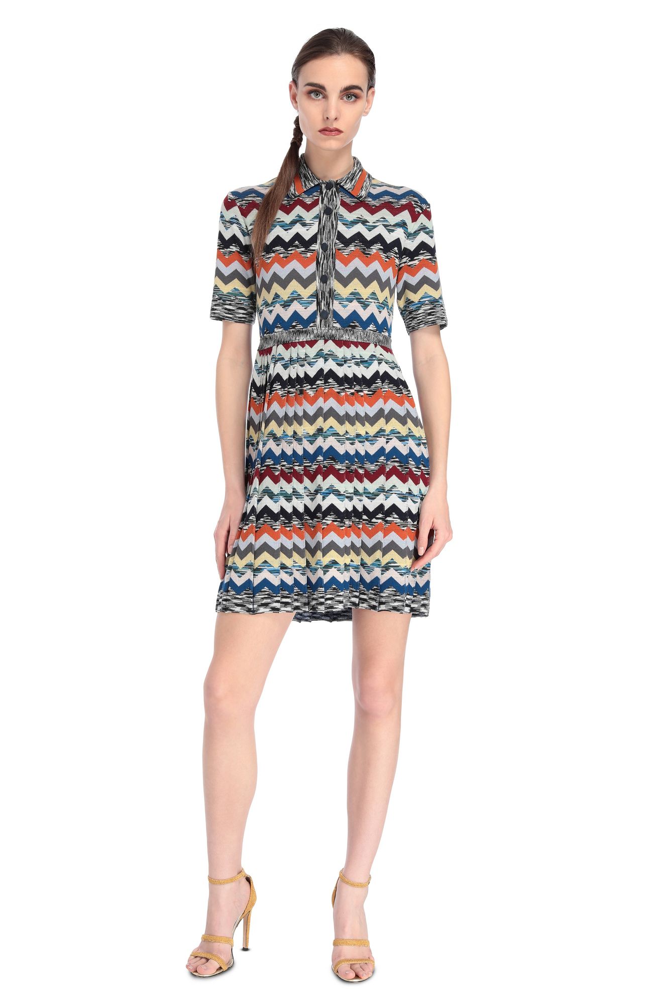
MISSONI
colour in its best!
Missoni has a unique way of using colours and colour combinations in order to create high end fashion items.
Starting with a few simple chevron-patterned wovens produced in a small factory in Gallarate, Italy pioneered the now widely used space-dying technique for yarn — still the magic ingredient in the house’s signature kaleidoscopic knits.
footage taken from MISSONI website
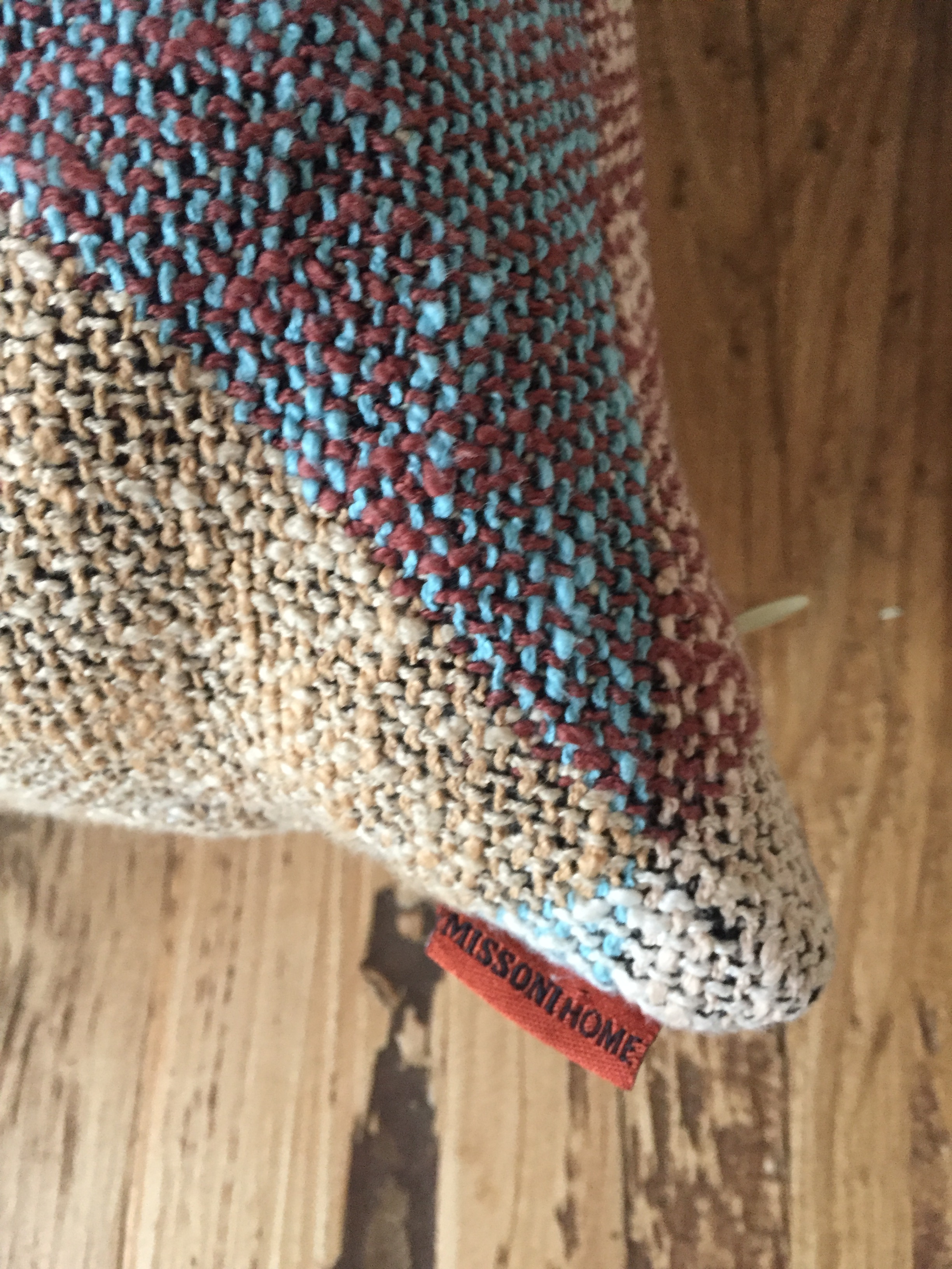
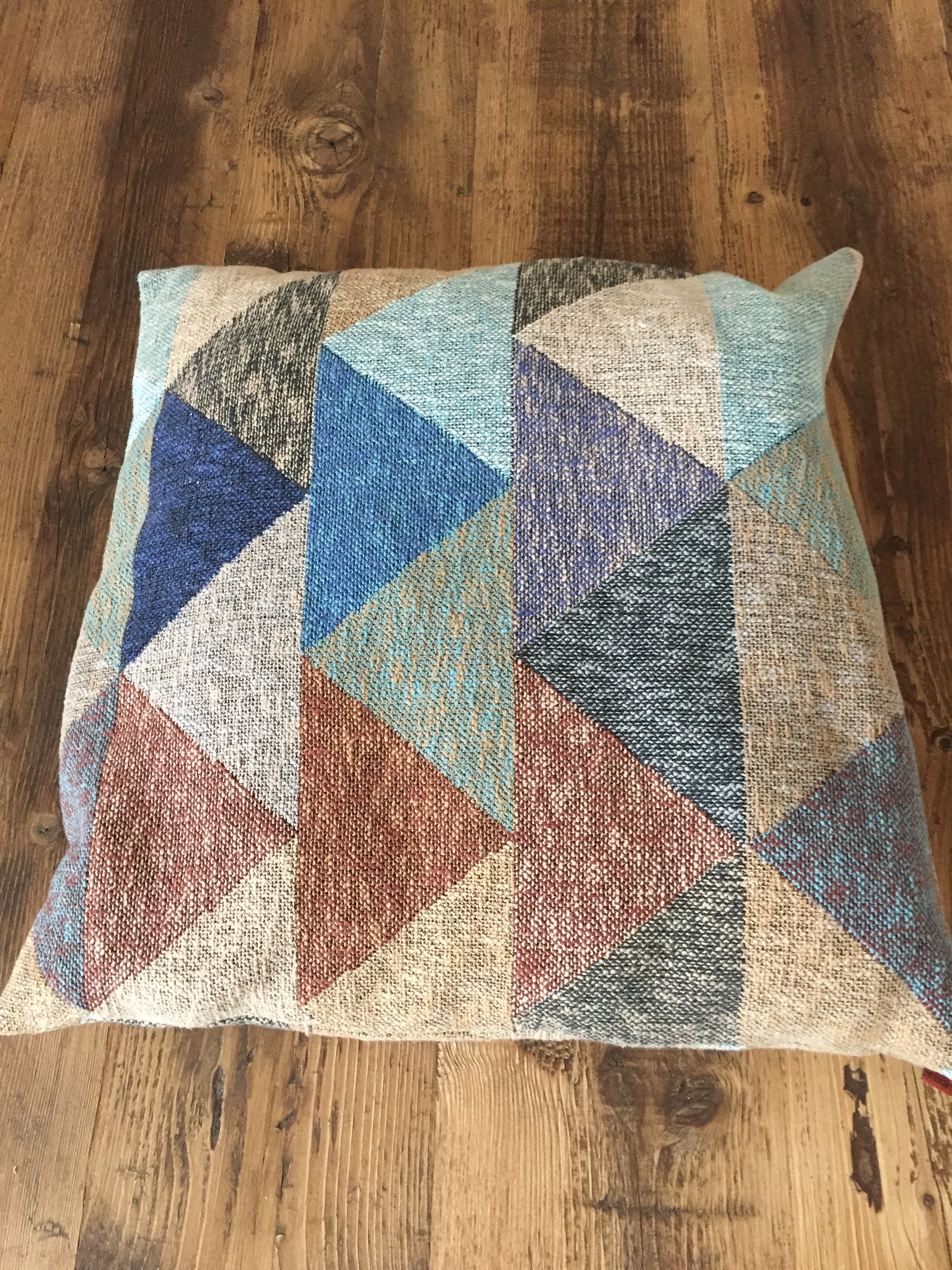

These pillow pictures come to compliment my comments regarding Missoni handwriting: no matter the product , colour selection plays significant role to the design house and shows the unlimited colour coordination possibilities.
